Style combination · Contrasts
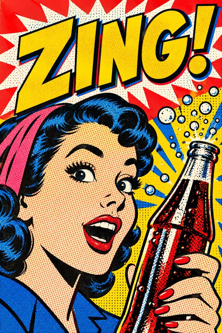
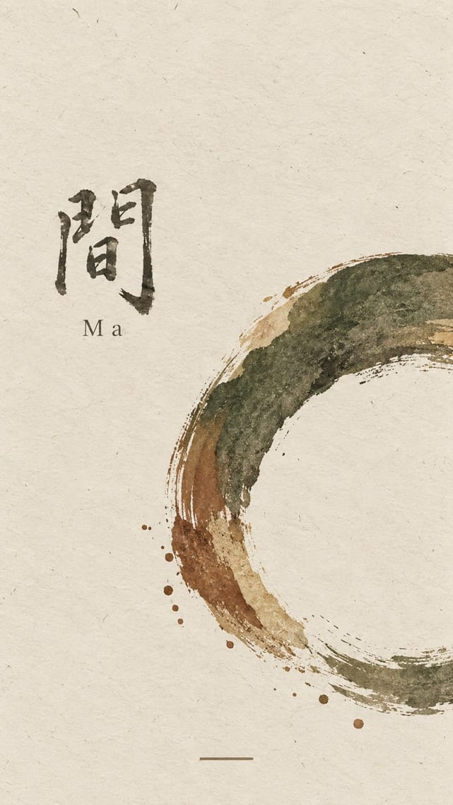
Pop Art Graphics × Ma
Where Pop multiplies glossy commodities, wabi-sabi values the single worn object; use one to puncture the mood of the other.
01
What each style brings
Each part of the design comes from the style with the stronger say in it, and each style gives at least two.
Pop Art Graphics Ma & Wabi-sabi Aesthetics
- Type from Pop Art Graphics
- Colour from Pop Art Graphics
- Form from Ma
-
Pop Art Graphics avoids non-representational: this is where the two pull against each other, which is the point of the contrast.
- Composition from Ma
- Surface from Pop Art Graphics
02
The type
Open fonts standing in for each style’s own type, which is often hand-drawn or commercial.
Display · Pop Art Graphics
Quiet
Bangers; Pop Art Graphics used Comic-book hand lettering and Franklin Gothic
Text · Ma
A Japanese aesthetic rooted in Zen and the wabi tea ceremony that prizes austerity, imperfection, impermanence and the charged interval (ma) between things. In graphic design it appears as vast empty grounds, a single off-centre element, muted natural colours, visible material texture and the unrepeatable brush mark, from ink painting to Muji's 'emptiness'.
Shippori Mincho; Ma used Bokuseki and Sōsho cursive kana and kanji
03
The colours
The ground and leading colours come from Pop Art Graphics, with a counter-accent from Ma. The ink reads on the ground at 4.5:1 or more.
Pop Art Graphics Ma & Wabi-sabi Aesthetics
-
#fbf8f0ground · 36% -
#111111ink · 14% -
#ffd400accent · 18% -
#7d4e3aaccent · 14% -
#e10600accent · 10% -
#b9a88aaccent · 8%
As CSS
:root {
  --ground: #fbf8f0;
  --ink: #111111;
  --accent-1: #ffd400;
  --accent-2: #7d4e3a;
  --accent-3: #e10600;
  --accent-4: #b9a88a;
  --font-display: "Bangers", sans-serif;
  --font-text: "Shippori Mincho", serif;
}
04
The two styles
05
More combinations
With Pop Art Graphics
- International Typographic Style Contrasts · Set one loud appropriated Pop image inside a strict grid with a neutral grotesque so the irony reads as deliberate rather than chaotic.
- Guna Mola Pairs well · Guna women redraw brand logos and cartoons (RCA Victor, Bullwinkle) in reverse appliqué; let that act of translation inspire Pop work, but buy or commission molas rather than imitating them.
- Neo-Brutalism Pairs well · Lift Pop's thick black outlines and flat primaries into UI cards and buttons for a confident, comic-strip interface.
- Risograph & Indie Print Culture Pairs well · Print Ben-Day dot screens in fluorescent pink and yellow riso inks to give Pop's mass-media imagery a small-run, handmade warmth.
- Screenprinted Gig & Alt-Movie Poster Pairs well · Shepard Fairey called Kozik 'the punk rock Warhol'; take Pop's appropriated cartoons and halftones and give them a gig poster's single idea and hand-lettered title.
- Finnish Bold Print (Marimekko Modernism) Pairs well · Contemporaries in saturated flat colour at a giant scale; borrow pop's isolated, enlarged object for a poster, but drop its halftone and irony to keep Marimekko's sincerity.
- Superflat Contrasts · Both turn commodities into art; take Pop's repetition and frontal commodity but swap its halftone and off-register silkscreen for Superflat's smooth vector fills and anime characters, so the print process disappears.
- Woodland School (Legend Painting) Contrasts · Both arrived in screenprint with flat colour behind a black line in the 1960s and 70s, but Pop quotes consumer images with irony and halftone, while Woodland prints carry legend and vision with none of either.
With Ma
- Minimalist Graphic Design Pairs well · Add one rough material or brush mark to a minimalist layout so its emptiness feels lived-in rather than sterile.
- Japanese Postwar Modernism Pairs well · Use a modernist grid but leave whole modules empty, the way Tanaka and Hara let ma structure the page.
- Memphis Design Contrasts · Memphis is loud, synthetic and glossy; set one Memphis squiggle on a vast wabi ground only if you want deliberate friction.
- Scandinavian Functionalism Pairs well · Both prize natural materials and restraint; combine Nordic clarity with wabi irregularity for warm, quiet identities.
- Uli & Nsibidi Line and Sign Tradition Pairs well · Both make the empty interval carry meaning and place a few elements off-centre in earth colours; uli supplies a living line and named signs where wabi-sabi supplies texture and a single mark.
- Slow-Living Editorial (the Kinfolk Look) Pairs well · Leonard Koren, author of the 1994 book on wabi-sabi for designers, joined Kinfolk's editorial board in 2016; add a cracked bowl, raw linen or an off-centre object on a bare ground to make the calm less styled and more lived-in.
- Korean Commercial Calligraphy (Kaelligeurapi) Pairs well · Give one brushed word a wide, quiet field of paper-toned space so its dry streaks and pooled ink read as the whole design.
- Rinpa & Saga-bon Contrasts · Both come from Kyoto's tea culture (Kōetsu also made Raku tea bowls), but wabi-sabi wants rough clay and empty paper where Rinpa wants gold leaf and malachite; one bare field can serve either, so choose the material that fills it.