Style combination · Pairs well
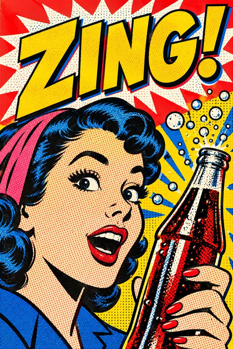
Guna Mola × Pop Art Graphics
Like Pop, molas absorb brand logos and cartoons; borrow that omnivorous attitude for a campaign, but commission Guna makers rather than faking the cut-cloth look.
Guna women redraw brand logos and cartoons (RCA Victor, Bullwinkle) in reverse appliqué; let that act of translation inspire Pop work, but buy or commission molas rather than imitating them.
01
What each style brings
Each part of the design comes from the style with the stronger say in it, and each style gives at least two.
Guna Mola Pop Art Graphics
- Type from Pop Art Graphics
- Colour from Guna Mola
- Form from Guna Mola
- Composition from Guna Mola
- Surface from Pop Art Graphics
02
The type
Open fonts standing in for each style’s own type, which is often hand-drawn or commercial.
Display · Pop Art Graphics
Yay!
Bangers; Pop Art Graphics used Comic-book hand lettering and Franklin Gothic
Text · Guna Mola
The reverse-appliqué blouse panels of Guna women in Panama, made by cutting through two to seven stacked layers of cotton so that every shape is ringed by echoing bands of the colours beneath. Fields are packed with filler slits, sawtooth edges and mazes. The imagery runs from abstract ancestral designs and animals to Bible stories, cartoon characters, brand logos and party slogans, all redrawn in the same contour-echo idiom.
Archivo; Guna Mola used Letters cut through the cloth layers and outlined by echo bands, as in political and lettered mola panels and Brand wordmarks and cartoon lettering redrawn in reverse appliqué
03
The colours
The ground and leading colours come from Guna Mola, with a counter-accent from Pop Art Graphics. The ink reads on the ground at 4.5:1 or more.
Guna Mola Pop Art Graphics
-
#121212ground · 36% -
#f2c12eink · 14% -
#ee7a1faccent · 18% -
#ffd400accent · 14% -
#c8262eaccent · 10% -
#e10600accent · 8%
As CSS
:root {
  --ground: #121212;
  --ink: #f2c12e;
  --accent-1: #ee7a1f;
  --accent-2: #ffd400;
  --accent-3: #c8262e;
  --accent-4: #e10600;
  --font-display: "Bangers", sans-serif;
  --font-text: "Archivo", sans-serif;
}
Use it with care
Guna Mola: The mola is the everyday and ceremonial dress of Guna women and an emblem of Guna identity and autonomy, defended in the 1925 revolution against a Panamanian ban on Guna dress; many motifs draw on Guna cosmology and oral history, and early sergan designs have been studied and reclaimed by Guna representatives. Treat it as a community's living dress, not a decorative print: buy or commission molas from Guna makers and cooperatives, credit them, keep paired panels together, and do not print imitation 'mola' patterns on merchandise. In Panama, Law 20 of 2000 protects Guna dress as collective intellectual property and bars its industrial reproduction, in whole or in part, without official authorisation and the prior consent of the Guna general congresses.
04
The two styles
05
More combinations
With Guna Mola
- Batik Pattern Tradition Contrasts · Batik builds pattern by resist-dyeing, molas by cutting and sewing; never render a mola as a printed texture, because the stepped, stitched edge is the whole point.
- Psychedelic Poster Pairs well · Wrap a headline in concentric echo bands of flat colour, the mola principle, to get psychedelic vibration from stacked layers instead of melting line.
- Chinese Paper-Cut (Jianzhi) Contrasts · Molas cut through stacked layers of cloth and stitch the edges, so colour builds in echo bands; paper-cut stays one flat layer of colour seen against light.
- Kanga (Swahili Message Cloth) Contrasts · Both are women's dress that takes in party slogans, logos and portraits, but a mola is hand-cut reverse appliqué packed edge to edge with echoing contour bands, while a kanga is a factory print with flat fields, an open, centred motif and its message in one plain box.
- Fante Asafo Flags (Frankaa) Contrasts · Both are hand-cut cotton appliqué in saturated colour that absorbs foreign images, but a mola packs every gap with slits and echoing contour bands, while an asafo flag leaves a plain ground around a few silhouettes so the scene reads from across a street.
With Pop Art Graphics
- International Typographic Style Contrasts · Set one loud appropriated Pop image inside a strict grid with a neutral grotesque so the irony reads as deliberate rather than chaotic.
- Ma & Wabi-sabi Aesthetics Contrasts · Where Pop multiplies glossy commodities, wabi-sabi values the single worn object; use one to puncture the mood of the other.
- Neo-Brutalism Pairs well · Lift Pop's thick black outlines and flat primaries into UI cards and buttons for a confident, comic-strip interface.
- Risograph & Indie Print Culture Pairs well · Print Ben-Day dot screens in fluorescent pink and yellow riso inks to give Pop's mass-media imagery a small-run, handmade warmth.
- Screenprinted Gig & Alt-Movie Poster Pairs well · Shepard Fairey called Kozik 'the punk rock Warhol'; take Pop's appropriated cartoons and halftones and give them a gig poster's single idea and hand-lettered title.
- Finnish Bold Print (Marimekko Modernism) Pairs well · Contemporaries in saturated flat colour at a giant scale; borrow pop's isolated, enlarged object for a poster, but drop its halftone and irony to keep Marimekko's sincerity.
- Superflat Contrasts · Both turn commodities into art; take Pop's repetition and frontal commodity but swap its halftone and off-register silkscreen for Superflat's smooth vector fills and anime characters, so the print process disappears.
- Woodland School (Legend Painting) Contrasts · Both arrived in screenprint with flat colour behind a black line in the 1960s and 70s, but Pop quotes consumer images with irony and halftone, while Woodland prints carry legend and vision with none of either.