Style combination · Pairs well
Kinetic Typography × Neo-Swiss Revival
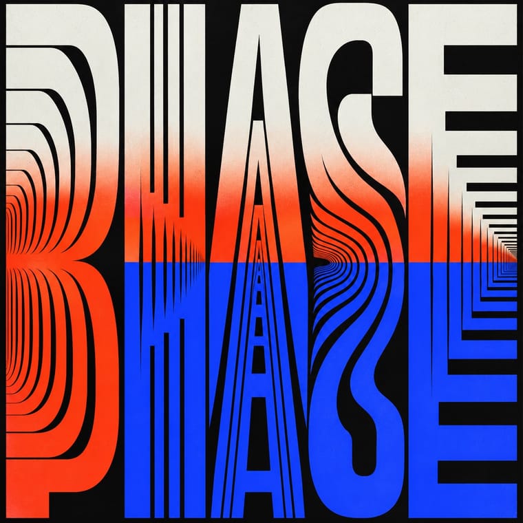
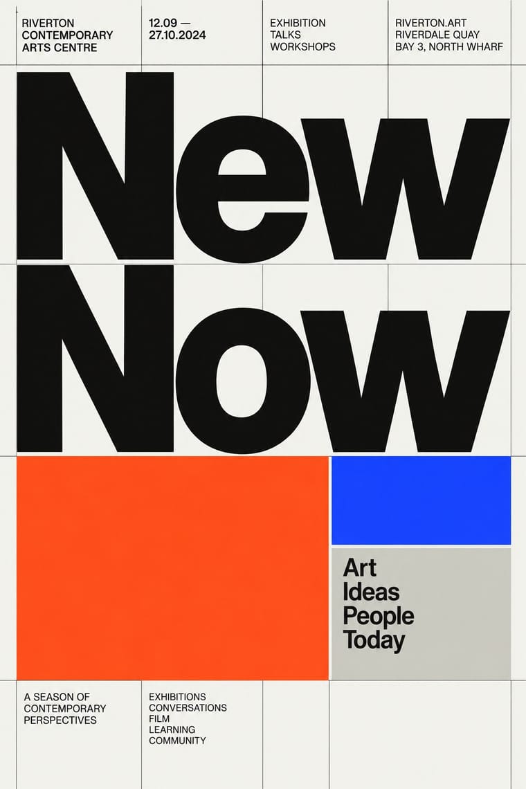
Animate a Swiss-revival grid of tight grotesque headlines and you have most of a kinetic identity; the grid keeps the motion legible.
Mix them and make something Kinetic Typography Neo-Swiss Revival
01
What each style brings
Each part of the design comes from the style with the stronger say in it, and each style gives at least two.
Kinetic Typography & Variable Type Neo-Swiss Revival
- Type from Kinetic Typography
- Colour from Neo-Swiss Revival
- Form from Neo-Swiss Revival
- Composition from Neo-Swiss Revival
- Surface from Kinetic Typography
02
The type
Open fonts standing in for each style’s own type, which is often hand-drawn or commercial.
Display · Kinetic Typography
Form
Inter Tight, standing in for Variable grotesques with weight and width axes (e.g. Roboto Flex)
Text · Neo-Swiss Revival
A contemporary revival of the International Typographic Style, fuelled by digital re-releases of neo-grotesques and by studios such as Experimental Jetset and Norm: modular grids, flush-left grotesque type, huge tightly set headlines and flat fields of black, white and one signal colour. It treats Swiss modernism as a living toolkit for posters, identities and the responsive web, sometimes with a knowing, citational wink.
Inter; Neo-Swiss Revival used Akkurat and Neue Haas Grotesk
03
The colours
The ground and leading colours come from Neo-Swiss Revival, with a counter-accent from Kinetic Typography. The ink reads on the ground at 4.5:1 or more.
Kinetic Typography & Variable Type Neo-Swiss Revival
-
#f5f5f0ground · 39% -
#111111ink · 15% -
#ff4a1caccent · 20% -
#1d3bffaccent · 15% -
#c8c8c3accent · 11%
As CSS
:root {
  --ground: #f5f5f0;
  --ink: #111111;
  --accent-1: #ff4a1c;
  --accent-2: #1d3bff;
  --accent-3: #c8c8c3;
  --font-display: "Inter Tight", sans-serif;
  --font-text: "Inter", sans-serif;
}
04
The two styles
05
More combinations
With Kinetic Typography
- Generative & Dynamic Identities Pairs well · Drive the variable axes with data or sound so the type responds to input rather than merely looping.
- Renaissance Book Typography Contrasts · The still, centuries-old reading page is the opposite pole; keep long text static and reserve motion for display.
- Czech Poetist Book Design (Devětsil) Pairs well · Teige's Abeceda posed a dancer as each letter; borrow its body-as-glyph idea to give motion type a human performer.
- Demoscene Graphics (Cracktros, Demos & Text-Mode Art) Pairs well · The sine scroller is an early kinetic type system; set greetings or credits as a waving bitmap scroller over raster bars for event openers and title sequences.
- Danmaku Bullet-Comment Overlay Contrasts · Kinetic type is one designer's choreographed letters; danmaku is hundreds of identical-default lines from strangers. Decide whether motion type should feel authored or crowd-made before borrowing either.
- Korean Variety-Show Captions (Yeneung Jamak) Contrasts · Borrow a brief scale change for one emphatic caption, but keep live-action performers as the subject: the atlas's kinetic identity style makes moving letters the picture, whereas variety captions comment on footage and often simply cut in and out.
- Lucerne Poster Scene (Neubad & Südpol Posters) Pairs well · Lucerne's twisted and warped letters are already halfway to motion (The Notwist also ran as an animated poster); animate the construction for screens while keeping the printed F4 as the still.
With Neo-Swiss Revival
- Risograph & Indie Print Culture Pairs well · Print neo-Swiss posters in two riso spot inks to add grain and warmth to a strict grid.
- Acid Graphics / New Ugly Contrasts · Acid graphics' chrome chaos is the opposite pole; one liquid-metal element can puncture a too-polite grid.
- Brutalist Web Design Pairs well · Expose neo-Swiss grids with raw HTML defaults and visible borders for a stripped, contemporary web voice.
- Victorian Letterpress & Wood Type Contrasts · Victorian wood-type eclecticism is the history Swiss typography rejected; a single wood-type headline can warm a cold grid.
- Seoul Independent Graphic Design (Small-Studio Scene) Contrasts · The Seoul studios share Neo-Swiss's Dutch and Swiss roots (Mevis & Van Deursen, Jude Kang's studies in Switzerland, Favorit Hangul extending the Swiss foundry Dinamo's Favorit), but Neo-Swiss sets one Latin grotesque flush left on a modular grid, while the Seoul studios centre their text, repeat circles and letters as objects, and make Hangul, reshaped and set beside Latin, the main material.
- Blue Note Jazz Sleeve Modernism Contrasts · The atlas's nearest genome: both blow a grotesque up to fill the format on a white ground with one signal colour, but Swiss revival locks it to a modular grid, flush left, in one neo-grotesque; Blue Note crops and tints a documentary photograph, mixes in Ultra Bodoni and Clarendon, and squeezes, warps and runs words off the edge by eye. Choose Blue Note when the type should swing rather than align.
- Lucerne Poster Scene (Neubad & Südpol Posters) Contrasts · Neo-Swiss keeps the grotesque intact on a modular grid for identities and the web; Lucerne keeps the grotesque only for the small print and distorts the title itself, poster by poster. Choose neo-Swiss for a system, Lucerne for a one-off event.
- Emigre & Early Digital Type Contrasts · Neo-Swiss restraint is the foil to Emigre's typographic overload; one Emigre display face in a neo-Swiss layout adds personality.