Style combination · Pairs well
Czech Poetist Book Design × Kinetic Typography
Abeceda's dancer-as-letter photographs are a print ancestor of type that moves; borrow the idea of a body performing each glyph for motion identities.
Teige's Abeceda posed a dancer as each letter; borrow its body-as-glyph idea to give motion type a human performer.
Mix them and make something Czech Poetist Book Design Kinetic Typography
01
What each style brings
Each part of the design comes from the style with the stronger say in it, and each style gives at least two.
Czech Poetist Book Design (Devětsil) Kinetic Typography & Variable Type
- Type from Kinetic Typography
- Colour from Czech Poetist Book Design
- Form from Czech Poetist Book Design
- Composition from Czech Poetist Book Design
- Surface from Kinetic Typography
02
The type
Open fonts standing in for each style’s own type, which is often hand-drawn or commercial.
Display · Kinetic Typography
Yay!
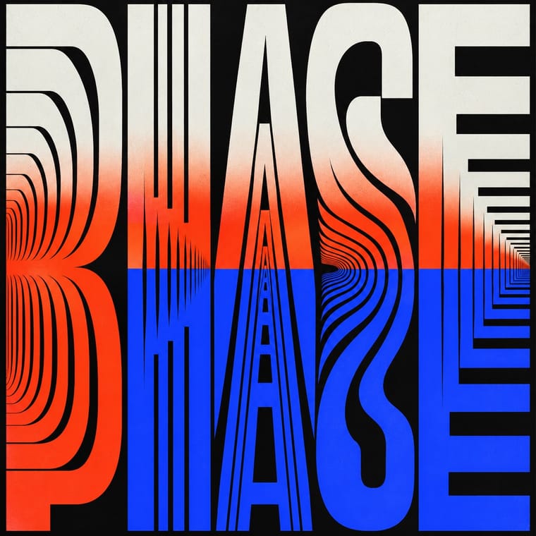
Inter Tight, standing in for Variable grotesques with weight and width axes (e.g. Roboto Flex)
Text · Czech Poetist Book Design
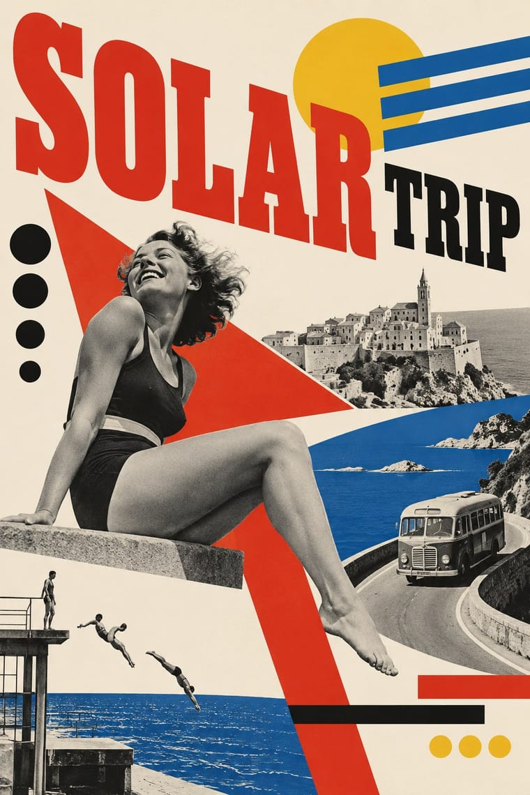
The book and magazine design of the Czech Devětsil circle, where Karel Teige and his colleagues turned constructivist tools (asymmetry, sans and slab capitals, heavy bars, photomontage) toward Poetism's lyrical celebration of travel, cinema, jazz and the circus. Covers and 'picture poems' set type among postcards, ocean liners and aeroplanes, and in Abeceda (1926) a dancer's body poses as each letter of the alphabet.
Inter; Czech Poetist Book Design used Jobbing grotesque capitals from Prague print shops and Egyptienne slab-serif display capitals
03
The colours
The ground and leading colours come from Czech Poetist Book Design, with a counter-accent from Kinetic Typography. The ink reads on the ground at 4.5:1 or more.
Czech Poetist Book Design (Devětsil) Kinetic Typography & Variable Type
-
#f2ebdcground · 36% -
#161514ink · 14% -
#e9b52caccent · 18% -
#ff3d1faccent · 14% -
#2b3dffaccent · 10% -
#2459a6accent · 8%
As CSS
:root {
  --ground: #f2ebdc;
  --ink: #161514;
  --accent-1: #e9b52c;
  --accent-2: #ff3d1f;
  --accent-3: #2b3dff;
  --accent-4: #2459a6;
  --font-display: "Inter Tight", sans-serif;
  --font-text: "Inter", sans-serif;
}
04
The two styles
05
More combinations
With Czech Poetist Book Design
- Surrealist Graphics Pairs well · Štyrský and Toyen pushed this montage toward dream imagery; add one uncanny juxtaposition to tip a lyrical cover into the strange.
- Russian Constructivism Contrasts · Same bars, diagonals and photomontage with the opposite mood; use the Poetist version when a constructivist layout needs lightness and wit instead of command.
- Risograph & Indie Print Culture Pairs well · Two-colour riso and found photographs recreate the red-and-black montage covers cheaply and with the same playful immediacy.
- Zenitism (Zenit Magazine Typography) Pairs well · Another Central European offshoot of constructivist tools; borrow Poetism's lightness to soften Zenit's agitation.
- Brazilian Modernismo Graphics (Klaxon and the Semana de 22) Pairs well · Two playful letterpress avant-gardes of the 1920s that turned posters, programmes and adverts into poems; Devětsil's photomontage and bars can stand in where Klaxon would use a contour drawing.
With Kinetic Typography
- Generative & Dynamic Identities Pairs well · Drive the variable axes with data or sound so the type responds to input rather than merely looping.
- Renaissance Book Typography Contrasts · The still, centuries-old reading page is the opposite pole; keep long text static and reserve motion for display.
- Neo-Swiss Revival Pairs well · Animate a Swiss-revival grid of tight grotesque headlines and you have most of a kinetic identity; the grid keeps the motion legible.
- Demoscene Graphics (Cracktros, Demos & Text-Mode Art) Pairs well · The sine scroller is an early kinetic type system; set greetings or credits as a waving bitmap scroller over raster bars for event openers and title sequences.
- Danmaku Bullet-Comment Overlay Contrasts · Kinetic type is one designer's choreographed letters; danmaku is hundreds of identical-default lines from strangers. Decide whether motion type should feel authored or crowd-made before borrowing either.
- Korean Variety-Show Captions (Yeneung Jamak) Contrasts · Borrow a brief scale change for one emphatic caption, but keep live-action performers as the subject: the atlas's kinetic identity style makes moving letters the picture, whereas variety captions comment on footage and often simply cut in and out.
- Lucerne Poster Scene (Neubad & Südpol Posters) Pairs well · Lucerne's twisted and warped letters are already halfway to motion (The Notwist also ran as an animated poster); animate the construction for screens while keeping the printed F4 as the still.