Style combination · Pairs well
Kinetic Typography × Lucerne Poster Scene
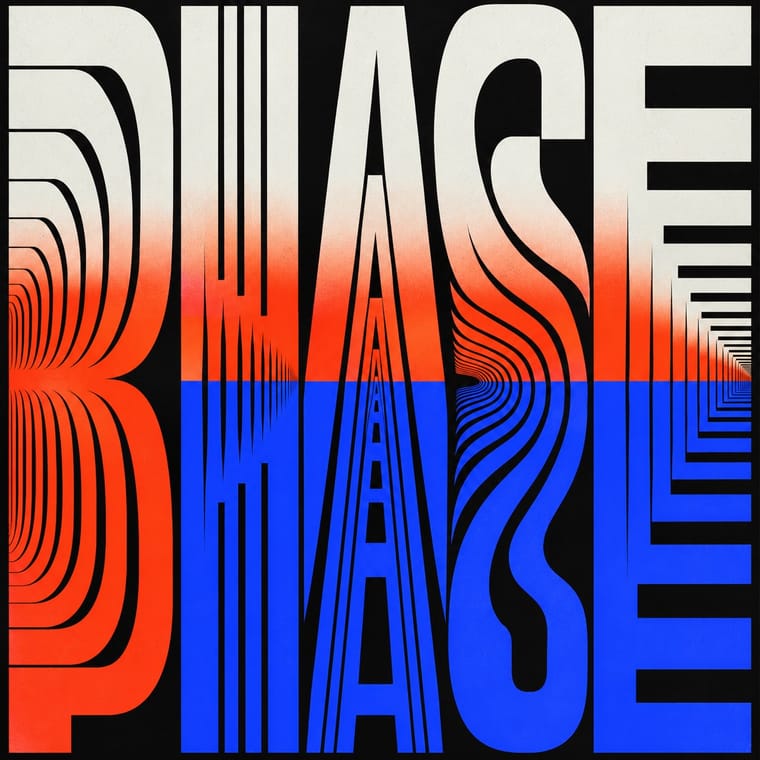
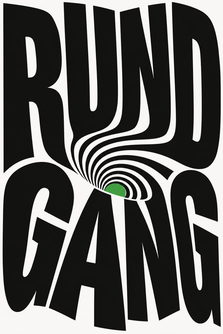
Lucerne's twisted and warped letters are already halfway to motion (The Notwist also ran as an animated poster); animate the construction for screens while keeping the printed F4 as the still.
Mix them and make something Kinetic Typography Lucerne Poster Scene
01
What each style brings
Each part of the design comes from the style with the stronger say in it, and each style gives at least two.
Kinetic Typography & Variable Type Lucerne Poster Scene (Neubad & Südpol Posters)
- Type from Kinetic Typography
- Colour from Kinetic Typography
- Form from Lucerne Poster Scene
- Composition from Lucerne Poster Scene
- Surface from Lucerne Poster Scene
02
The type
Open fonts standing in for each style’s own type, which is often hand-drawn or commercial.
Display · Kinetic Typography
Hello
Inter Tight, standing in for Variable grotesques with weight and width axes (e.g. Roboto Flex)
Text · Lucerne Poster Scene
Lucerne's poster culture for small non-commercial venues (Südpol, Neubad, Treibhaus) and the Weltformat festival. Each event gets a one-off poster, most often with the title as the picture: letters built, twisted or warped into one optical motif. Neubad's posters are black and white only; Felix Pfäffli's Südpol series (2010–2015) added Risograph colour. The scene rests on local designers' exchange, fostered by Brechbühl through Weltformat (co-founded 2009) and the Show & Tell meetings (2012); in 2015, 26 of the 100 best posters from Germany, Austria and Switzerland came from the Lucerne area.
Space Grotesk; Lucerne Poster Scene used Letters constructed or distorted for each poster and The Südpol typeface drawn by Erich Brechbühl in 2008 from the letterforms of the signage of the old slaughterhouse, used for the SÜDPOL wordmark that recurs, in varying positions, on the Südpol posters
03
The colours
The ground and leading colours come from Kinetic Typography, with a counter-accent from Lucerne Poster Scene. The ink reads on the ground at 4.5:1 or more.
Kinetic Typography & Variable Type Lucerne Poster Scene (Neubad & Südpol Posters)
-
#0b0b0bground · 36% -
#f3f3efink · 14% -
#ff3d1faccent · 18% -
#f0e111accent · 14% -
#2b3dffaccent · 10% -
#ff415baccent · 8%
As CSS
:root {
  --ground: #0b0b0b;
  --ink: #f3f3ef;
  --accent-1: #ff3d1f;
  --accent-2: #f0e111;
  --accent-3: #2b3dff;
  --accent-4: #ff415b;
  --font-display: "Inter Tight", sans-serif;
  --font-text: "Space Grotesk", sans-serif;
}
04
The two styles
05
More combinations
With Kinetic Typography
- Generative & Dynamic Identities Pairs well · Drive the variable axes with data or sound so the type responds to input rather than merely looping.
- Renaissance Book Typography Contrasts · The still, centuries-old reading page is the opposite pole; keep long text static and reserve motion for display.
- Neo-Swiss Revival Pairs well · Animate a Swiss-revival grid of tight grotesque headlines and you have most of a kinetic identity; the grid keeps the motion legible.
- Czech Poetist Book Design (Devětsil) Pairs well · Teige's Abeceda posed a dancer as each letter; borrow its body-as-glyph idea to give motion type a human performer.
- Demoscene Graphics (Cracktros, Demos & Text-Mode Art) Pairs well · The sine scroller is an early kinetic type system; set greetings or credits as a waving bitmap scroller over raster bars for event openers and title sequences.
- Danmaku Bullet-Comment Overlay Contrasts · Kinetic type is one designer's choreographed letters; danmaku is hundreds of identical-default lines from strangers. Decide whether motion type should feel authored or crowd-made before borrowing either.
- Korean Variety-Show Captions (Yeneung Jamak) Contrasts · Borrow a brief scale change for one emphatic caption, but keep live-action performers as the subject: the atlas's kinetic identity style makes moving letters the picture, whereas variety captions comment on footage and often simply cut in and out.
With Lucerne Poster Scene
- Neo-Swiss Revival Contrasts · Neo-Swiss keeps the grotesque intact on a modular grid for identities and the web; Lucerne keeps the grotesque only for the small print and distorts the title itself, poster by poster. Choose neo-Swiss for a system, Lucerne for a one-off event.
- Polish Poster School Contrasts · Another cultural-venue poster culture of one idea per sheet, but painted and hand-lettered as a metaphor; Lucerne builds the idea from the letters and optical effects on the computer. Borrow the Polish wit, not the brush.
- Op Art Graphics Pairs well · The Neubad's black-and-white rule led Brechbühl straight to Op Art for The Notwist; take Op's vibrating line fields and checks, but bend them into the letters of the title instead of filling the sheet with pattern alone.
- Di Tella Graphic Design (Instituto Torcuato Di Tella) Pairs well · Both make the event title an optical picture for a small cultural institution under tight means; add the Di Tella's one or two flat inks and blunt grotesque to a Lucerne letter construction for a sterner, more 1960s sheet.
- Screenprinted Gig & Alt-Movie Poster Contrasts · Gig posters are illustrated editions made for collectors; Lucerne's concert posters are mostly typographic, made for the city's walls and small venue runs. Use the contrast to decide between picture and title.