Style combination · Pairs well
Generative × Kinetic Typography
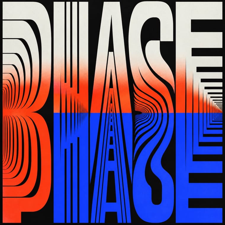
Drive the variable axes with data or sound so the type responds to input rather than merely looping.
01
What each style brings
Each part of the design comes from the style with the stronger say in it, and each style gives at least two.
Generative & Dynamic Identities Kinetic Typography & Variable Type
- Type from Kinetic Typography
- Colour from Generative
- Form from Generative
- Composition from Generative
- Surface from Kinetic Typography
02
The type
Open fonts standing in for each style’s own type, which is often hand-drawn or commercial.
Display · Kinetic Typography
Circuit
Inter Tight, standing in for Variable grotesques with weight and width axes (e.g. Roboto Flex)
Text · Generative
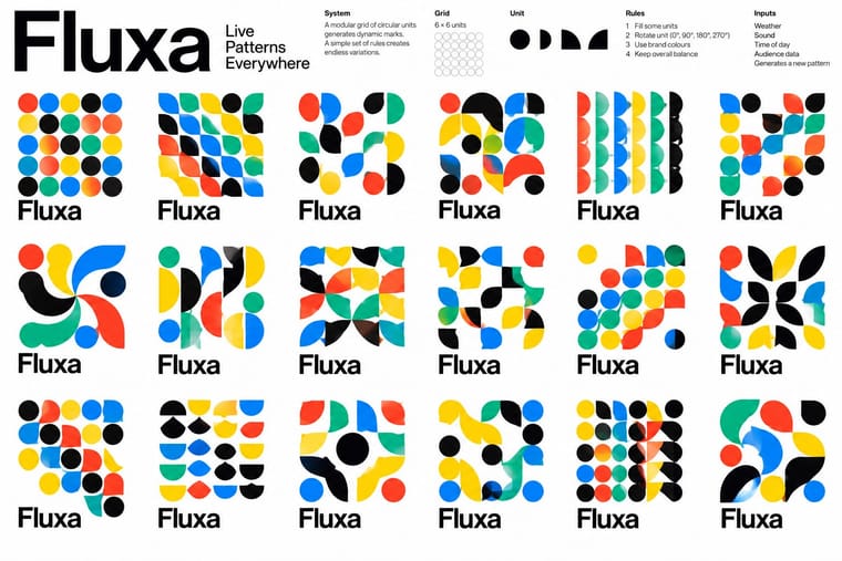
Identity systems designed as rules rather than fixed marks: logos and graphics generated by code, data or parameters so that they vary endlessly while staying recognisable. Anticipated by Karl Gerstner's Designing Programmes (1964) and launched by projects such as Sagmeister's Casa da Música (2007) and TheGreenEyl's MIT Media Lab identity (2011), the approach now spans responsive, data-driven and AI-assisted brands.
Inter; Generative used Neue Haas Grotesk and Variable fonts
03
The colours
The ground and leading colours come from Generative, with a counter-accent from Kinetic Typography. The ink reads on the ground at 4.5:1 or more.
Generative & Dynamic Identities Kinetic Typography & Variable Type
-
#ffffffground · 36% -
#111111ink · 14% -
#0091ffaccent · 18% -
#ff3d1faccent · 14% -
#ffd400accent · 10% -
#2b3dffaccent · 8%
As CSS
:root {
  --ground: #ffffff;
  --ink: #111111;
  --accent-1: #0091ff;
  --accent-2: #ff3d1f;
  --accent-3: #ffd400;
  --accent-4: #2b3dff;
  --font-display: "Inter Tight", sans-serif;
  --font-text: "Inter", sans-serif;
}
04
The two styles
05
More combinations
With Generative
- Hand-Painted Signage & Vernacular Lettering Contrasts · Hand-painted lettering's one-off irregularity is the human counterpart to algorithmic variation; mix the two only with clear intent.
- Op Art Graphics Pairs well · Op Art's line modulation and moiré are ready-made rules for patterns that respond to data or motion.
- Corporate Identity Modernism Pairs well · Keep one invariant element from corporate modernism, such as a fixed wordmark or colour, so the variable identity stays recognisable.
- International Typographic Style Pairs well · Use a Swiss modular grid as the fixed frame so generated variants stay coherent across the whole system.
- Dark Tech Minimalism Pairs well · Run a generative shader or particle field behind the hero to replace stock imagery with live, on-brand texture.
- Generative-AI Image Aesthetic Contrasts · Rule-based generative identity designs the system and accepts abstract variation; AI imagery averages toward realism, so decide which kind of 'generative' a brief needs.
- Milanese Industrial Modernism (Olivetti, Pirelli, Studio Boggeri) Pairs well · Pintori's cascades of numerals and dots are proto-generative; code them as rules to drive a contemporary variable identity.
- Data Humanism Pairs well · Let a generative system draw personal data portraits from people's own answers, as What Counts did, but give the code a hand-drawn grammar and a legend so the output reads as made by people.
With Kinetic Typography
- Renaissance Book Typography Contrasts · The still, centuries-old reading page is the opposite pole; keep long text static and reserve motion for display.
- Neo-Swiss Revival Pairs well · Animate a Swiss-revival grid of tight grotesque headlines and you have most of a kinetic identity; the grid keeps the motion legible.
- Czech Poetist Book Design (Devětsil) Pairs well · Teige's Abeceda posed a dancer as each letter; borrow its body-as-glyph idea to give motion type a human performer.
- Demoscene Graphics (Cracktros, Demos & Text-Mode Art) Pairs well · The sine scroller is an early kinetic type system; set greetings or credits as a waving bitmap scroller over raster bars for event openers and title sequences.
- Danmaku Bullet-Comment Overlay Contrasts · Kinetic type is one designer's choreographed letters; danmaku is hundreds of identical-default lines from strangers. Decide whether motion type should feel authored or crowd-made before borrowing either.
- Korean Variety-Show Captions (Yeneung Jamak) Contrasts · Borrow a brief scale change for one emphatic caption, but keep live-action performers as the subject: the atlas's kinetic identity style makes moving letters the picture, whereas variety captions comment on footage and often simply cut in and out.
- Lucerne Poster Scene (Neubad & Südpol Posters) Pairs well · Lucerne's twisted and warped letters are already halfway to motion (The Notwist also ran as an animated poster); animate the construction for screens while keeping the printed F4 as the still.