Style combination · Pairs well
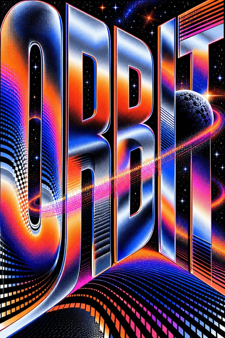
Demoscene Graphics × Kinetic Typography
The sine scroller is an early kinetic type system; set greetings or credits as a waving bitmap scroller over raster bars for event openers and title sequences.
Mix them and make something Demoscene Graphics Kinetic Typography
01
What each style brings
Each part of the design comes from the style with the stronger say in it, and each style gives at least two.
Demoscene Graphics (Cracktros, Demos & Text-Mode Art) Kinetic Typography & Variable Type
- Type from Kinetic Typography
- Colour from Demoscene Graphics
- Form from Demoscene Graphics
- Composition from Kinetic Typography
- Surface from Demoscene Graphics
02
The type
Open fonts standing in for each style’s own type, which is often hand-drawn or commercial.
Display · Kinetic Typography
Circuit
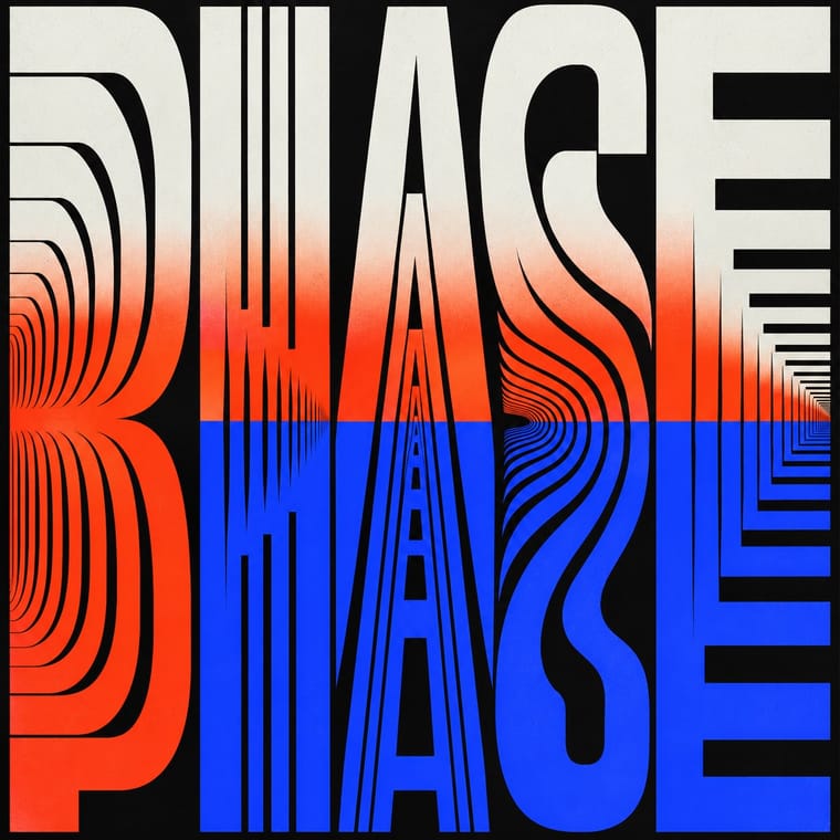
Inter Tight, standing in for Variable grotesques with weight and width axes (e.g. Roboto Flex)
Text · Demoscene Graphics
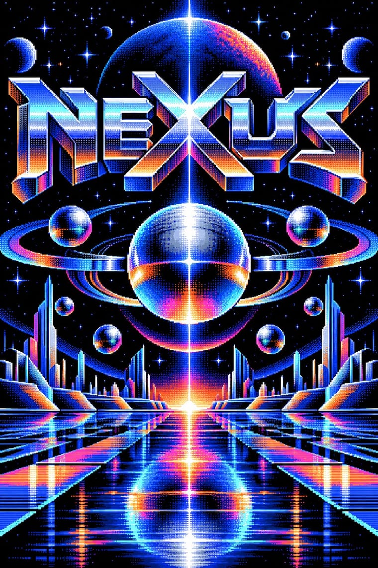
The graphics of the demoscene, a mainly European community of coders, graphicians and musicians that grew from the intros software crackers added to pirated Commodore 64 and Amiga games in the mid-1980s. On a black screen a hand-pixelled group logo in chrome, metal or stone shading hangs over raster (on the Amiga, "copper") bars, sine scrollers, starfields and real-time 3D cut to tracker music; still pictures push tiny palettes through dithering, and a text-mode branch from North American bulletin boards draws ANSI art from IBM PC characters.
VT323; Demoscene Graphics used Hand-pixelled group logos with chrome, metal or stone shading, bevels and highlights, drawn dot by dot in paint programs such as Deluxe Paint (Dan Silva, Electronic Arts, 1985) on the Amiga and Bitmap scroller fonts, from 8×8 character sets to large multicolour alphabets, bent into sine-wave and DYCP (different Y character position) scrollers
03
The colours
The ground and leading colours come from Demoscene Graphics, with a counter-accent from Kinetic Typography. The ink reads on the ground at 4.5:1 or more.
Demoscene Graphics (Cracktros, Demos & Text-Mode Art) Kinetic Typography & Variable Type
-
#000000ground · 36% -
#e8f0ffink · 14% -
#ff7a1aaccent · 18% -
#ff3d1faccent · 14% -
#ff3fa4accent · 10% -
#2b3dffaccent · 8%
As CSS
:root {
  --ground: #000000;
  --ink: #e8f0ff;
  --accent-1: #ff7a1a;
  --accent-2: #ff3d1f;
  --accent-3: #ff3fa4;
  --accent-4: #2b3dff;
  --font-display: "Inter Tight", sans-serif;
  --font-text: "VT323", monospace;
}
Use it with care
Demoscene Graphics (Cracktros, Demos & Text-Mode Art): The demoscene is a living, non-commercial community whose practice is on the national inventories of intangible heritage of Finland (2020), Germany and Poland (2021), Switzerland and the Netherlands (2023), Sweden and France (2025) and Norway (2026), and its pictures are signed work: party rules throw out ripped entries, ban AI-generated or AI-inspired graphics and ask for working stages as proof of hand work. Never copy a group's logo or an artist's pixels, do not pass a generated chrome-logo-and-copper-bar pastiche off as scene work, and credit or commission scene graphicians when a project borrows the look; the crack-intro roots lie in software piracy, which the scene has long distanced itself from, so do not borrow real cracking-group names for new work or glamourise warez. Keep flashing raster and strobe effects to three flashes or fewer per second when the look moves into interfaces, broadcast or public screens.
04
The two styles
05
More combinations
With Demoscene Graphics
- Rave & Acid House Graphics Pairs well · Rave flyers and scene logos share chrome lettering on black and the same 1990s tracker-and-techno culture; animate a flyer's line-up as a demo-style scroller for party visuals.
- Bitmap & Pixel Graphics Contrasts · Bitmap graphics is the legible, flat pixel of icons, sprites and system fonts; scene graphics spend the same pixels on chrome, gradients and motion for show. Pick the icon grid for an interface and the scene logo for a title screen.
- Glitch Art & Datamosh Graphics Contrasts · Glitch art lets the machine fail and keeps the damage; the demoscene makes it do the impossible without a dropped frame. Decide whether a piece about technology should show breakdown or mastery.
- Generative & Dynamic Identities Pairs well · Both make the picture from code; borrow the scene's size-coding and real-time plasma, tunnel and particle effects to drive a dynamic identity live instead of from rendered video.
- Synthwave / Outrun Contrasts · Synthwave paints chrome logos and neon grids as 1980s nostalgia; scene graphics are the working practice that never stopped. For credibility with a technical audience, build the effect in code rather than painting its look.
- Analog Horror Graphics Contrasts · Both put bitmap type on black screens, but the demoscene shows a machine running flawlessly at its limit and analog horror shows one failing. Pick mastery or breakdown.
- PS1 / Lo-Fi 3D Revival (PSX Aesthetic) Contrasts · The demoscene shows a machine performing flawlessly at its limit in chrome and gradients; the PSX revival fakes old hardware's flaws on a modern engine and keeps them murky. Pick mastery or imitation of limits.
- Forum Signature Art (Sig & C4D Render Graphics) Pairs well · Another amateur scene of competitions and handles; its pixelled logos give a sig a crafted name plate.
With Kinetic Typography
- Generative & Dynamic Identities Pairs well · Drive the variable axes with data or sound so the type responds to input rather than merely looping.
- Renaissance Book Typography Contrasts · The still, centuries-old reading page is the opposite pole; keep long text static and reserve motion for display.
- Neo-Swiss Revival Pairs well · Animate a Swiss-revival grid of tight grotesque headlines and you have most of a kinetic identity; the grid keeps the motion legible.
- Czech Poetist Book Design (Devětsil) Pairs well · Teige's Abeceda posed a dancer as each letter; borrow its body-as-glyph idea to give motion type a human performer.
- Danmaku Bullet-Comment Overlay Contrasts · Kinetic type is one designer's choreographed letters; danmaku is hundreds of identical-default lines from strangers. Decide whether motion type should feel authored or crowd-made before borrowing either.
- Korean Variety-Show Captions (Yeneung Jamak) Contrasts · Borrow a brief scale change for one emphatic caption, but keep live-action performers as the subject: the atlas's kinetic identity style makes moving letters the picture, whereas variety captions comment on footage and often simply cut in and out.
- Lucerne Poster Scene (Neubad & Südpol Posters) Pairs well · Lucerne's twisted and warped letters are already halfway to motion (The Notwist also ran as an animated poster); animate the construction for screens while keeping the printed F4 as the still.