Style combination · Pairs well
Islamic Geometric × Renaissance Book Typography
Use arabesque or moresque fleurons, as Venetian and Lyon printers did, to frame a classical text block.
Mix them and make something Islamic Geometric Renaissance Book Typography
01
What each style brings
Each part of the design comes from the style with the stronger say in it, and each style gives at least two.
Islamic Geometric & Calligraphic Tradition Renaissance Book Typography
- Type from Renaissance Book Typography
- Colour from Islamic Geometric
-
Renaissance Book Typography avoids full polychrome: this is where the two pull against each other.
- Form from Islamic Geometric
- Composition from Islamic Geometric
- Surface from Renaissance Book Typography
02
The type
Open fonts standing in for each style’s own type, which is often hand-drawn or commercial.
Display · Renaissance Book Typography
Quiet
EB Garamond; Renaissance Book Typography used Jenson's roman and Griffo's roman
Text · Islamic Geometric
A visual system shared across the Islamic world in which proportioned calligraphy, compass-and-straightedge geometry and the vegetal arabesque carry meaning and beauty in place of figurative imagery. Star-and-polygon tilings repeat across whole surfaces as if continuing beyond the frame, while Kufic, Thuluth and Naskh inscriptions give hierarchy to buildings, manuscripts and objects.
Reem Kufi; Islamic Geometric used Kufic and Thuluth
03
The colours
The ground and leading colours come from Islamic Geometric, with a counter-accent from Renaissance Book Typography. The ink reads on the ground at 4.5:1 or more.
Islamic Geometric & Calligraphic Tradition Renaissance Book Typography
-
#f2e9d8ground · 36% -
#1b1b1bink · 14% -
#c8a046accent · 18% -
#b23a2baccent · 14% -
#2a9d9baccent · 10% -
#1d3f8aaccent · 8%
As CSS
:root {
  --ground: #f2e9d8;
  --ink: #1b1b1b;
  --accent-1: #c8a046;
  --accent-2: #b23a2b;
  --accent-3: #2a9d9b;
  --accent-4: #1d3f8a;
  --font-display: "EB Garamond", serif;
  --font-text: "Reem Kufi", cursive;
}
Use it with care
Islamic Geometric & Calligraphic Tradition: Qur'anic verses, the names of God and the Prophet and other sacred phrases must not be cropped, distorted, mirrored, used as texture or printed on floors, footwear or throwaway packaging; have any Arabic-script text read and approved by a fluent reader or calligrapher. Abstract geometric pattern is far less sensitive than script, but credit the traditions and makers it comes from.
04
The two styles
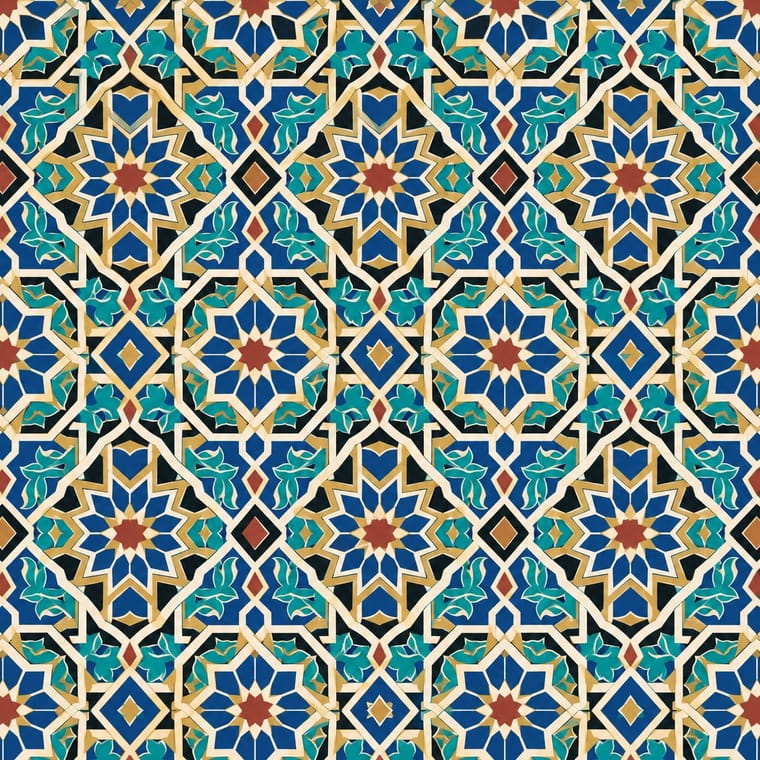
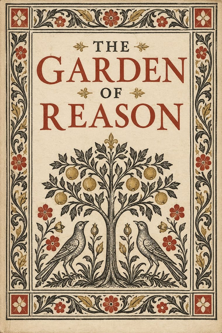
05
More combinations
With Islamic Geometric
- International Typographic Style Contrasts · Drop one tessellated panel into an asymmetric Swiss grid to make the tension between infinite pattern and white space the subject.
- Art Deco Pairs well · Borrow star polygons and stepped borders for Deco-style framing; both depend on strict symmetry and metallic accents.
- Iranian Modernist Graphic Design Pairs well · Set one calligraphic word or a fragment of girih against flat colour and a modernist grid instead of reproducing whole tile panels.
- Armenian Manuscript Illumination Contrasts · Horseshoe arches and vegetal and geometric ornament are shared, but the Islamic geometric tradition keeps its arches and fields aniconic, while Armenian books fill the same arches with birds, beasts and painted saints; choose whether a frame should carry figures or only pattern.
- Kamon (Japanese Family Crests) Contrasts · Both are built with compass and straight edge, but girih tiles the whole surface without end while a mon closes one motif inside a ring; borrow the tessellation for a ground and the crest for the single sign on it.
- Baghdad School of Arab Book Painting (Maqamat Illustration) Contrasts · Non-figural Islamic art is the contrast: this style puts people and satire where geometry would be. No descent is implied.
- Ethiopian Ge'ez Manuscript & Haräg Illumination Pairs well · Haräg interlace and Islamic strapwork share frame-and-band logic; compare them for headpieces, but keep the Ethiopian bands varied rather than strictly tiled.
- Andean Woven Graphic Systems Contrasts · Islamic pattern interlaces stars around radial centres while Andean geometry is orthogonal, stepped and deliberately irregular; choose one as the structural logic rather than blending them.
With Renaissance Book Typography
- Minimalist Graphic Design Pairs well · Keep classical page proportions and a humanist serif but strip the ornament to give minimal layouts warmth and authority.
- Arts & Crafts Movement Pairs well · Morris's Kelmscott Press revived Jenson's roman; pair a Renaissance text block with dense Arts & Crafts borders for a private-press feel.
- Gothic Blackletter & Fraktur Tradition Contrasts · The humanist roman was drawn against the gothic textura it replaced in Italy: open, round and light where blackletter is dense, broken and dark.
- International Typographic Style Contrasts · Centred, justified and serifed versus asymmetric, ragged and sans: the clearest foil for deciding which order a page should follow.
- Ethiopian Ge'ez Manuscript & Haräg Illumination Pairs well · Ge'ez manuscripts share the logic of black text with red rubrics; borrow the principle of red for names and headings, not the sacred imagery.
- Gothic Book of Hours (Illuminated Devotional Book) Contrasts · Compare a hand-painted devotional opening with a printed humanist text page: the former gives pictures and illuminated margins a larger organising role, while the latter centres roman type and measured margins.
- Emblem Book (Motto, Picture & Epigram) Contrasts · Its parent shares the humanist roman and italic, the paper and the woodcut, but lets text carry the page with ornament at its edges; the emblem book puts a framed picture at the centre of every page and makes it part of the argument.
- Cranbrook & Deconstructivist Typography Contrasts · The single justified book block is what deconstruction questions; quoting it inside a layered layout makes the critique explicit.