Style combination · Pairs well
Arts × Renaissance Book Typography
Morris's Kelmscott Press revived Jenson's roman; pair a Renaissance text block with dense Arts & Crafts borders for a private-press feel.
Mix them and make something Arts Renaissance Book Typography
01
What each style brings
Each part of the design comes from the style with the stronger say in it, and each style gives at least two.
Arts & Crafts Movement Renaissance Book Typography
- Type from Renaissance Book Typography
- Colour from Arts
- Form from Arts
- Composition from Renaissance Book Typography
- Surface from Arts
02
The type
Open fonts standing in for each style’s own type, which is often hand-drawn or commercial.
Display · Renaissance Book Typography
Public
EB Garamond; Renaissance Book Typography used Jenson's roman and Griffo's roman
Text · Renaissance Book Typography
The printed book as shaped by humanist Italy and France: roman and italic types modelled on humanist handwriting, a single justified text block set in harmonious proportions within generous margins, and woodcut initials, borders and printer's devices as the only ornament. Its page became the default model of the Western book for the next five centuries.
EB Garamond; Renaissance Book Typography used Jenson's roman and Griffo's roman
03
The colours
The ground and leading colours come from Arts, with a counter-accent from Renaissance Book Typography. The ink reads on the ground at 4.5:1 or more.
Arts & Crafts Movement Renaissance Book Typography
-
#efe6d2ground · 36% -
#1c1a17ink · 14% -
#a33224accent · 18% -
#c39a4aaccent · 14% -
#2e4a6aaccent · 10% -
#5f7140accent · 8%
As CSS
:root {
  --ground: #efe6d2;
  --ink: #1c1a17;
  --accent-1: #a33224;
  --accent-2: #c39a4a;
  --accent-3: #2e4a6a;
  --accent-4: #5f7140;
  --font-display: "EB Garamond", serif;
  --font-text: "EB Garamond", serif;
}
04
The two styles
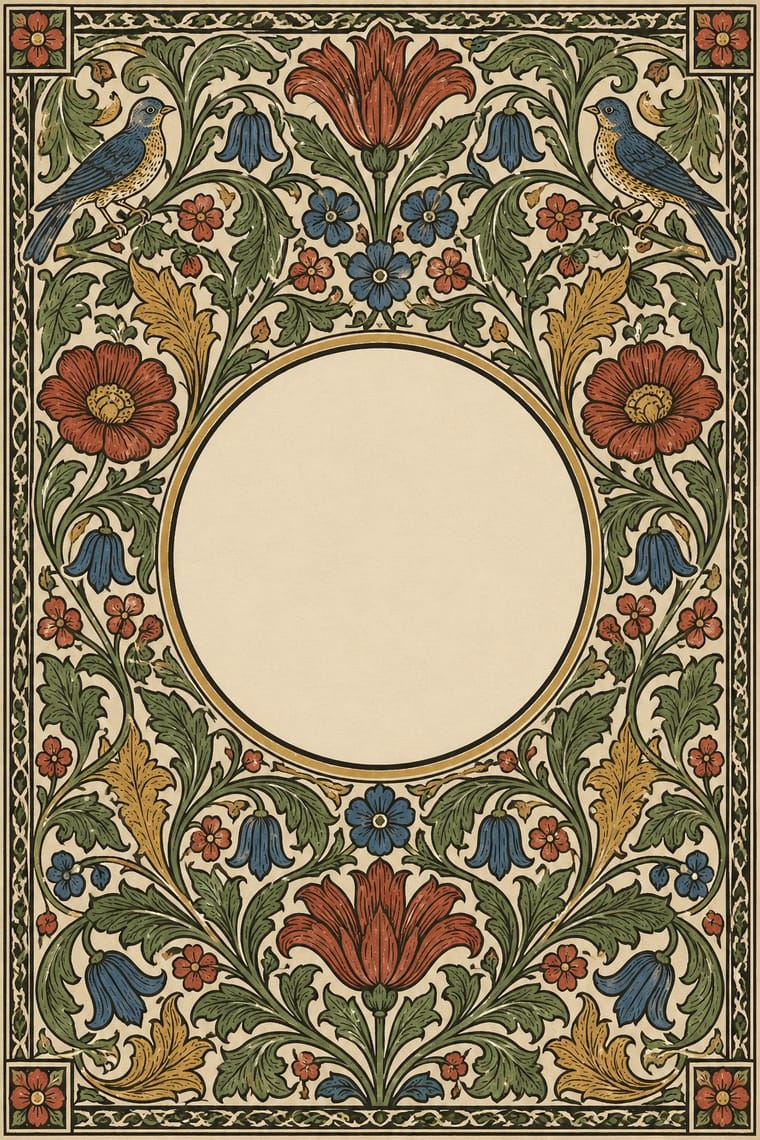
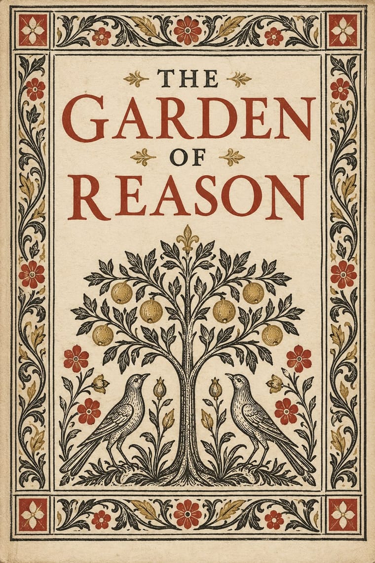
05
More combinations
With Arts
- Flat Design Contrasts · Borrow one engraved border or initial to give a flat interface a crafted, editorial moment against its vector minimalism.
- Scandinavian Functionalism Pairs well · Keep the craft ethic and natural palette but reduce Morris's foliage to a single repeating motif for warmth without clutter.
- Risograph & Indie Print Culture Pairs well · Frame a two-ink riso print with a Morris-style vine border to give indie publishing an heirloom, hand-made gravity.
- Die Neue Typographie Contrasts · Tschichold's asymmetric, unornamented page was built against this centred, bordered book; set them side by side to argue tradition versus machine age.
- Gothic Blackletter & Fraktur Tradition Pairs well · Morris's Kelmscott Press revived gothic type (Troy and Chaucer) inside dense woodcut borders; join the broken letter to foliate frames and handmade paper for a medieval, hand-made book.
- Josef Frank and Svenskt Tenn Botanical Prints Pairs well · The parent tradition: both fill a repeat with plants on linen, but Morris is symmetrical, earthy and dense with dark grounds, Frank is looser, brighter and mostly light. Pair a Morris-style framed book page with Frank-style endpapers.
- Italian Futurism Contrasts · Arts & Crafts handwork is everything Futurism wanted to burn; juxtapose them to stage machine against hand.
- Vorticism & BLAST Typography Contrasts · BLAST refused 'a revival of lost folk art' and blasted the 'years 1837 to 1900'; set its hard black shards against a hand-printed floral page to stage machine against handicraft.
With Renaissance Book Typography
- Minimalist Graphic Design Pairs well · Keep classical page proportions and a humanist serif but strip the ornament to give minimal layouts warmth and authority.
- Gothic Blackletter & Fraktur Tradition Contrasts · The humanist roman was drawn against the gothic textura it replaced in Italy: open, round and light where blackletter is dense, broken and dark.
- Islamic Geometric & Calligraphic Tradition Pairs well · Use arabesque or moresque fleurons, as Venetian and Lyon printers did, to frame a classical text block.
- International Typographic Style Contrasts · Centred, justified and serifed versus asymmetric, ragged and sans: the clearest foil for deciding which order a page should follow.
- Ethiopian Ge'ez Manuscript & Haräg Illumination Pairs well · Ge'ez manuscripts share the logic of black text with red rubrics; borrow the principle of red for names and headings, not the sacred imagery.
- Gothic Book of Hours (Illuminated Devotional Book) Contrasts · Compare a hand-painted devotional opening with a printed humanist text page: the former gives pictures and illuminated margins a larger organising role, while the latter centres roman type and measured margins.
- Emblem Book (Motto, Picture & Epigram) Contrasts · Its parent shares the humanist roman and italic, the paper and the woodcut, but lets text carry the page with ornament at its edges; the emblem book puts a framed picture at the centre of every page and makes it part of the argument.
- Cranbrook & Deconstructivist Typography Contrasts · The single justified book block is what deconstruction questions; quoting it inside a layered layout makes the critique explicit.