Style combination · Contrasts
Newtro × Out-of-Square Hangul Typography
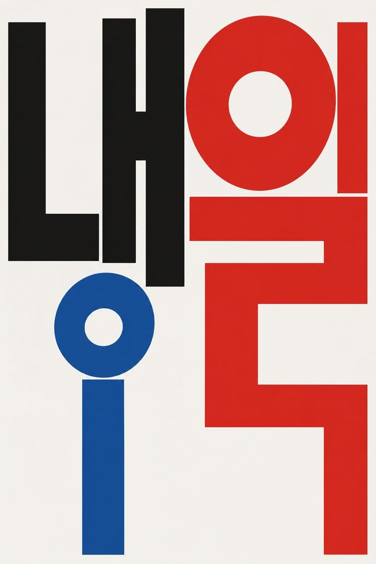
Set the modernist, geometric de-squared Hangul of Ahn Sang-soo against newtro's revived brush and cursive label lettering to show two ideas of fashionable Hangul.
Mix them and make something Newtro Out-of-Square Hangul Typography
01
What each style brings
Each part of the design comes from the style with the stronger say in it, and each style gives at least two.
Newtro (Korean New-Retro) Out-of-Square Hangul Typography
- Type from Out-of-Square Hangul Typography
-
Newtro avoids experimental & distorted: this is where the two pull against each other, which is the point of the contrast.
- Colour from Newtro
- Form from Newtro
- Composition from Newtro
- Surface from Out-of-Square Hangul Typography
02
The type
Open fonts standing in for each style’s own type, which is often hand-drawn or commercial.
Display · Out-of-Square Hangul Typography
Pop
Syne; Out-of-Square Hangul Typography used Ahn Sang-soo typeface and Isang-che, Mir-che and Mano-che
Text · Newtro
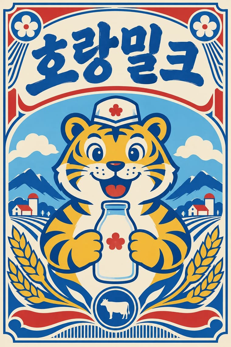
A South Korean branding trend, named 'Going New-tro' in Seoul National University's Trend Korea 2019 (October 2018), in which heritage firms reissue their own postwar to 1990s labels, trademarks and mascots, polished for young buyers. Jinro's sky-blue bottle and toad label (2019) and Gompyo flour's white bear on beer cans (2020) set the look: centred labels and badges, two or three flat colours on pale grounds, brush, cursive or hand-drawn logotypes, often Hanja with Hangul beside them, and a cartoon mascot as hero. Its source is the recent consumer past, reinterpreted, not reproduced.
Zen Maru Gothic; Newtro used Revived label logotypes in Hanja with Hangul beside them, such as Jinro's Hanja name from its 1970s–80s labels and Daesun soju's cursive lettering from its 1965 launch and Thick brush and hand-drawn Hangul display lettering of postwar Korean packaging and shop signboards
03
The colours
The ground and leading colours come from Newtro, with a counter-accent from Out-of-Square Hangul Typography. The ink reads on the ground at 4.5:1 or more.
Newtro (Korean New-Retro) Out-of-Square Hangul Typography
-
#f4ecd8ground · 36% -
#1c1c1cink · 14% -
#f0b929accent · 18% -
#d7322baccent · 14% -
#1f58a8accent · 10% -
#7cc3e3accent · 8%
As CSS
:root {
  --ground: #f4ecd8;
  --ink: #1c1c1c;
  --accent-1: #f0b929;
  --accent-2: #d7322b;
  --accent-3: #1f58a8;
  --accent-4: #7cc3e3;
  --font-display: "Syne", sans-serif;
  --font-text: "Zen Maru Gothic", sans-serif;
}
Use it with care
Newtro (Korean New-Retro): Newtro revives a firm's own archive: for any other client draw on that client's history, not Jinro's toad or Gompyo's bear, which their owners guard. In 2023 the first cans of 7Bräu's Daepyo Wheat Beer, which kept Gompyo's colour scheme and a bear, drew Daehan Flour Mills' warning that copying the brand's design could be unfair competition, and 7Bräu promised a redesign with a tiger. Keep Hangul and Hanja correct and legible, and do not swap in Japanese Shōwa-retro or colonial-era 'Gyeongseong' imagery: a 2018 JoongAng Ilbo column called restaurants that mix Japanese food with Gyeongseong nostalgia 'tasteless', since those who lived through the occupation remember it as 'shameful and painful'.
04
The two styles
05
More combinations
With Newtro
- Hipster Artisanal Revival Contrasts · Both dress a product in the past, but hipster badges invent a Victorian heritage for a new firm while newtro reissues a real firm's own recent archive.
- Synthwave / Outrun Contrasts · Synthwave imagines an eighties that never shipped, in neon gradients; newtro reprints packaging that actually sat on Korean shelves, in flat spot colours.
- Guochao (China-Chic National Trend) Contrasts · China's contemporary heritage trend draws on imperial and folk motifs in red and gold; newtro draws on late-twentieth-century consumer packaging and its mascots.
- Hand-Painted Signage & Vernacular Lettering Pairs well · Newtro's lettering is borrowed from Korean signboards; pair a revived label with real sign-painted shopfronts, as Euljiro's cafés keep their old hardware-store signs.
- Kawaii Design Pairs well · Revived trademarks become cute merchandise and emoticons; push the toad or bear toward kawaii roundness for spin-offs while keeping the label's period lettering.
- Showa and Heisei Retro Revival (Japanese Packaging and Kissaten Graphics) Contrasts · Both revive old everyday graphics, but newtro is Korean heritage-brand reissue with badge-led logic, while this is Japanese katakana-led kissaten and dagashi graphics in pastel spot colour.
- Taiwan Floral Cloth (Huabu) Pairs well · Both turn a postwar household look into nostalgia for young buyers; pair a reissued retro label or mascot with a floral-cloth band for packaging that recalls a grandmother's home.
- Korean Commercial Calligraphy (Kaelligeurapi) Contrasts · Both meet on Korean soju shelves: newtro redraws a firm's old label lettering and mascot in flat spot colours, while commercial calligraphy writes a new brushed name in black on a pale label.
With Out-of-Square Hangul Typography
- International Typographic Style Pairs well · Place a modular out-of-square headline on a strict Swiss grid so the hanging, irregular syllables read as deliberate against an ordered page.
- Emigre & Early Digital Type Pairs well · Both turned a constructed alphabet into a magazine laboratory in the 1980s; set an Emigre-era Latin face beside an out-of-square Hangul face for a bilingual experimental spread.
- Chaekgeori & Minhwa Screen Painting Pairs well · Munjado builds a character from pictures and out-of-square Hangul builds pictures from letters; combine them for a Korean identity that spans folk painting and modern type.
- Hong Kong Neon & Beiwei Shop-Sign Lettering Contrasts · Beiwei's chisel-edged, stele-derived brush script is the opposite of monoline geometric jamo; set the two side by side to show calligraphic against constructed East Asian lettering.
- Roman-like Thai Typography (modern loopless Thai) Pairs well · Both modernise an Asian script by dropping a defining convention, the square cell in Hangul and the head loop in Thai; set them together for a pan-Asian modern type specimen or festival identity.
- Seoul Independent Graphic Design (Small-Studio Scene) Pairs well · Ahn Sang-soo freed Hangul from the square in 1985, and Sulki & Min have gone further back, to Cho Young-jae's 1976 proposal to restructure Hangul for typewriters, a study they say has rarely been discussed with the depth it deserves, and to the origins of unsquared Hangul; set a hanging, de-squared headline in a centred one-colour poster to join the generations.
- Korean Commercial Calligraphy (Kaelligeurapi) Contrasts · Both free Hangul from the equal square, but Ahn Sang-soo constructs monoline jamo as a reusable typeface while kaelligeurapi writes each word once with the brush; choose between a system and a signature.
- Song–Ming Woodblock Book Typography (Songti / Mincho) Contrasts · Ahn Sang-soo's typeface broke exactly the equal square that Myeongjo keeps; run Myeongjo body text under out-of-square headings to stage tradition against experiment.