Style combination · Pairs well
Chaekgeori × Out-of-Square Hangul Typography
Set a munjado-style pictorial character beside modular out-of-square Hangul to bridge Joseon folk painting and contemporary Korean type.
Munjado builds a character from pictures and out-of-square Hangul builds pictures from letters; combine them for a Korean identity that spans folk painting and modern type.
Mix them and make something Chaekgeori Out-of-Square Hangul Typography
01
What each style brings
Each part of the design comes from the style with the stronger say in it, and each style gives at least two.
Chaekgeori & Minhwa Screen Painting Out-of-Square Hangul Typography
- Type from Out-of-Square Hangul Typography
- Colour from Out-of-Square Hangul Typography
- Form from Chaekgeori
- Composition from Chaekgeori
- Surface from Chaekgeori
-
02
The type
Open fonts standing in for each style’s own type, which is often hand-drawn or commercial.
Display · Out-of-Square Hangul Typography
Wow
Syne; Out-of-Square Hangul Typography used Ahn Sang-soo typeface and Isang-che, Mir-che and Mano-che
Text · Chaekgeori
Korean painted folding screens of the late Joseon period. Chaekgeori ('books and things') stack books, bronzes, ceramics and scholar's tools, often in a grid of bookcase compartments drawn with Western-derived shading and several viewpoints at once. Promoted at court by King Jeongjo, the genre passed to anonymous folk painters (minhwa), who also made munjado screens in which one Confucian-virtue character is built from emblematic pictures.
Shippori Mincho; Chaekgeori used Haeseo (regular script) brush characters and Munjado pictorial ideographs built from emblematic motifs
03
The colours
The ground and leading colours come from Out-of-Square Hangul Typography, with a counter-accent from Chaekgeori. The ink reads on the ground at 4.5:1 or more.
Chaekgeori & Minhwa Screen Painting Out-of-Square Hangul Typography
-
#f5f3eeground · 36% -
#111111ink · 14% -
#f2c12eaccent · 18% -
#d7261eaccent · 14% -
#1f4fa0accent · 10% -
#2e7d6baccent · 8%
As CSS
:root {
  --ground: #f5f3ee;
  --ink: #111111;
  --accent-1: #f2c12e;
  --accent-2: #d7261e;
  --accent-3: #1f4fa0;
  --accent-4: #2e7d6b;
  --font-display: "Syne", sans-serif;
  --font-text: "Shippori Mincho", serif;
}
04
The two styles
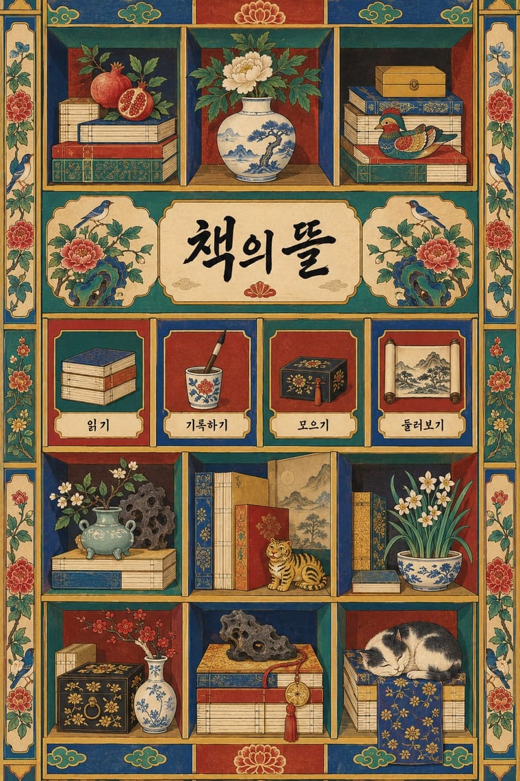
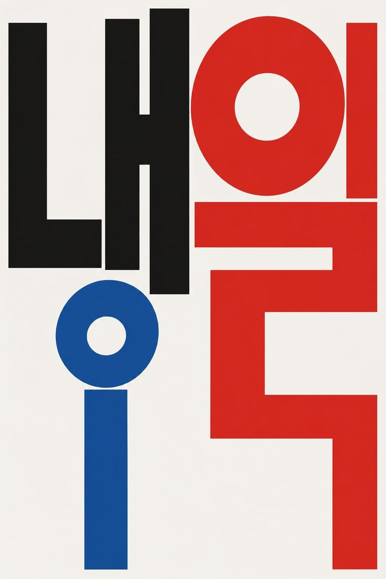
05
More combinations
With Chaekgeori
- Skeuomorphic UI Pairs well · A wooden bookshelf interface is a digital chaekgado; use its compartment grid and trompe-l'oeil objects for a playful library or catalogue UI.
- Nianhua & Chinese Folk Print Pairs well · Both are auspicious household pictures; drop nianhua rebuses (a fish for surplus, a bat for fortune) into the compartments of a chaekgado grid for festive packaging.
- Cubist Pictorial Space Pairs well · Chaekgeori already shows objects from several viewpoints at once; borrow Cubist faceting to push its tilted shelves further, or cite chaekgeori as an East Asian precedent for multi-view still life.
- Ma & Wabi-sabi Aesthetics Contrasts · Chaekgeori fills the screen with prized possessions where ma leaves it empty; isolate one shelf object on a blank ground to move between display and restraint.
- Song–Ming Woodblock Book Typography (Songti / Mincho) Pairs well · Chaekgeori screens paint stacks of the scholar's books; pair a painted bookcase grid with real ruled, framed Myeongjo text pages for a Korean scholarly identity.
- Burmese Parabaik Painting (Konbaung Folding Books) Pairs well · Both are court paintings on a folding support that took Western-derived shading and recession into a local convention; set a parabaik procession beside a chaekgado shelf to compare how each folds depth into panels.
- Korean Commercial Calligraphy (Kaelligeurapi) Pairs well · Munjado paints a character full of pictures and commercial calligraphy bends a brushed word into a picture of its meaning; pair them for a Korean identity in which writing and image are the same mark.
- Minjung Woodcut Graphics (Korean People's Art) Pairs well · Minjung artists studied folk painting; borrow minhwa's flat colour and folk motifs to warm a black-and-white print.
With Out-of-Square Hangul Typography
- International Typographic Style Pairs well · Place a modular out-of-square headline on a strict Swiss grid so the hanging, irregular syllables read as deliberate against an ordered page.
- Emigre & Early Digital Type Pairs well · Both turned a constructed alphabet into a magazine laboratory in the 1980s; set an Emigre-era Latin face beside an out-of-square Hangul face for a bilingual experimental spread.
- Hong Kong Neon & Beiwei Shop-Sign Lettering Contrasts · Beiwei's chisel-edged, stele-derived brush script is the opposite of monoline geometric jamo; set the two side by side to show calligraphic against constructed East Asian lettering.
- Roman-like Thai Typography (modern loopless Thai) Pairs well · Both modernise an Asian script by dropping a defining convention, the square cell in Hangul and the head loop in Thai; set them together for a pan-Asian modern type specimen or festival identity.
- Seoul Independent Graphic Design (Small-Studio Scene) Pairs well · Ahn Sang-soo freed Hangul from the square in 1985, and Sulki & Min have gone further back, to Cho Young-jae's 1976 proposal to restructure Hangul for typewriters, a study they say has rarely been discussed with the depth it deserves, and to the origins of unsquared Hangul; set a hanging, de-squared headline in a centred one-colour poster to join the generations.
- Korean Commercial Calligraphy (Kaelligeurapi) Contrasts · Both free Hangul from the equal square, but Ahn Sang-soo constructs monoline jamo as a reusable typeface while kaelligeurapi writes each word once with the brush; choose between a system and a signature.
- Newtro (Korean New-Retro) Contrasts · Set the modernist, geometric de-squared Hangul of Ahn Sang-soo against newtro's revived brush and cursive label lettering to show two ideas of fashionable Hangul.
- Song–Ming Woodblock Book Typography (Songti / Mincho) Contrasts · Ahn Sang-soo's typeface broke exactly the equal square that Myeongjo keeps; run Myeongjo body text under out-of-square headings to stage tradition against experiment.