Style combination · Contrasts
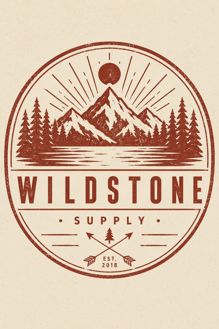
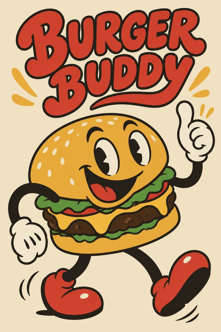
Hipster Artisanal Revival × Rubber-Hose Revival
The independent food brand's previous look: a cartoon protagonist replaces the monochrome badge and Victorian craft cues.
Mix them and make something Hipster Artisanal Revival Rubber-Hose Revival
01
What each style brings
Each part of the design comes from the style with the stronger say in it, and each style gives at least two.
Hipster Artisanal Revival Rubber-Hose Revival (Cartoon Mascot Graphics)
- Type from Hipster Artisanal Revival
- Colour from Hipster Artisanal Revival
- Form from Rubber-Hose Revival
- Composition from Rubber-Hose Revival
- Surface from Hipster Artisanal Revival
02
The type
Open fonts standing in for each style’s own type, which is often hand-drawn or commercial.
Display · Hipster Artisanal Revival
Memory
Jost, standing in for Futura (Paul Renner, Bauer, 1927), as on the Field Notes cover
Text · Rubber-Hose Revival
A present-day revival of 1920s and 1930s American cartoon drawing: characters with bendy, jointless 'rubber hose' limbs, round bodies, big white eyes and gloved hands, drawn in a confident black outline and filled with a few flat colours. Studio MDHR's hand-animated Cuphead (2017) made it a contemporary look; from there it moved into games, motion graphics and, by the mid-2020s, food brands whose mascot is a burger, coffee cup or devil with springy arms beside soft, bouncy lettering.
Zen Maru Gothic; Rubber-Hose Revival used Hand-lettered titles in the manner of early-1930s cartoon title cards and Soft, heavy round-serif display faces such as Cooper Black for the 'soft typography' the mascot brands pair with their characters
03
The colours
The ground and leading colours come from Hipster Artisanal Revival, with a counter-accent from Rubber-Hose Revival. The ink reads on the ground at 4.5:1 or more.
Hipster Artisanal Revival Rubber-Hose Revival (Cartoon Mascot Graphics)
-
#f1e8d6ground · 36% -
#1e1c1aink · 14% -
#8e2f25accent · 18% -
#d7352baccent · 14% -
#c4a27aaccent · 10% -
#e9b73faccent · 8%
As CSS
:root {
  --ground: #f1e8d6;
  --ink: #1e1c1a;
  --accent-1: #8e2f25;
  --accent-2: #d7352b;
  --accent-3: #c4a27a;
  --accent-4: #e9b73f;
  --font-display: "Jost", sans-serif;
  --font-text: "Zen Maru Gothic", sans-serif;
}
Use it with care
Hipster Artisanal Revival: The hipster fashion and branding of the same years also borrowed pseudo-Native 'tribal' dress: Adrienne Keene's Native Appropriations (2010) answered the fashion for 'hipster headdresses' by noting that eagle feathers 'have to be earned', and in 2012 the Navajo Nation sued Urban Outfitters over goods sold under the 'Navajo' name. Keep to arrows, triangles and trade-mark devices; do not add feathered headdresses, war bonnets or 'tribal' and 'Navajo' patterns as a heritage shorthand.
Rubber-Hose Revival (Cartoon Mascot Graphics): The early cartoon look this revives is entangled with blackface minstrelsy: several sources trace the black bodies, white gloves and large white eyes of Mickey Mouse and his peers to minstrel caricature, and many 1930s shorts carried explicit racial caricature. Borrow the elastic limbs, round construction and outline, not the minstrel face; never give a character exaggerated lips, dialect or skin colour as an ethnic marker. The characters themselves (Cuphead, Bendy, Mickey, Felix, Oswald, Betty Boop) are still trademarked or copyrighted: invent your own mascot and never ask an image model for a named character or studio hand.
04
The two styles
05
More combinations
With Hipster Artisanal Revival
- DTC 'Blanding' / Millennial Minimalism Contrasts · Where this dressed new firms as old ones, blanding dressed them as frictionless and new, with lowercase geometric sans, pastels and white space; set the two side by side to place a brand between heritage and novelty.
- Victorian Letterpress & Wood Type Pairs well · Go back to the source: swap the stock badge parts for real jobbing type, printers' rules and stock borders to turn pastiche into the trade print it quotes.
- Risograph & Indie Print Culture Pairs well · The same small-batch maker economy; print the badge in one riso ink on uncoated stock to get real ink grain instead of a distress overlay.
- Flat Design Contrasts · Its contemporary on screen was textureless and many-coloured where this was single-ink and worn; one stamped badge inside a flat interface marks a product as hand-made.
- Hand-Painted Signage & Vernacular Lettering Pairs well · Sign painting revived alongside it; paint the badge on the shop window or chalkboard so the lettering is made by hand instead of aged with a texture filter.
- Phototype Expressive Typography (Lubalin & U&lc) Contrasts · Both pair a script with a geometric sans, but the craft badge tracks its capitals wide in a centred one-ink frame, while Lubalin kerns the same pairing until the letters touch and join. Set one against the other to decide whether the letters should breathe or fuse.
- Cottagecore Contrasts · Shares handmade, small-batch values, but swap its black-and-white urban badges for soft colour and florals to get cottagecore.
- European Heraldry Contrasts · The craft badge borrows heraldry's air of lineage with an 'Est.' date and crossed arrows on kraft paper, while a real coat of arms is a granted or inherited, blazoned identity in strong tinctures; set the two side by side to show the difference between quoting heritage and holding it.
With Rubber-Hose Revival
- Corporate Memphis Contrasts · Both draw stretched figures in flat colour, but the revival gives each brand its own outlined, nostalgic mascot where Corporate Memphis uses interchangeable faceless people.
- UPA & Cartoon Modern Contrasts · UPA rejected exactly this: it traded rubbery full movement and round bodies for angular caricature, flat modernist sets and limited animation.
- Yuru-chara (Japanese Local Mascot Design) Pairs well · Both build a mascot from the thing it promotes; borrow the yuru-chara's costume-ready frontal figure and licensing for a rubber-hose brand character.
- Underground Comix Pairs well · Add its hatching, crowding and adult edge for a darker take on the hose-limbed character, as Bendy turned the cartoon sinister.
- Push Pin Style Contrasts · Push Pin also revived old cartoon and Victorian graphics with playful lettering, but as eclectic editorial illustration; the rubber-hose revival commits to one animation convention and a recurring brand character.
- Risograph & Indie Print Culture Pairs well · Print the mascot's stickers and zines in two riso inks for grain and misregistration that suit its period feel.
- Newtro (Korean New-Retro) Contrasts · Both are post-2017 nostalgic branding in flat spot colour; newtro quotes Korean 1970s–80s packaging and emblems, the revival quotes 1920s–30s American animation.
- CalArts Style (Rounded Cartoon Character Design) Contrasts · Inkier, pie-eyed, nostalgic 1930s mascot drawing against thin-limbed, flat-coloured, contemporary character design.