Style combination · Contrasts
Newtro × Rubber-Hose Revival
Both are post-2017 nostalgic branding in flat spot colour; newtro quotes Korean 1970s–80s packaging and emblems, the revival quotes 1920s–30s American animation.
01
What each style brings
Each part of the design comes from the style with the stronger say in it, and each style gives at least two.
Newtro (Korean New-Retro) Rubber-Hose Revival (Cartoon Mascot Graphics)
- Type from Newtro
- Colour from Newtro
- Form from Rubber-Hose Revival
- Composition from Rubber-Hose Revival
- Surface from Newtro
02
The type
Open fonts standing in for each style’s own type, which is often hand-drawn or commercial.
Display · Newtro
Memory
Kaushan Script, standing in for Woowa Brothers' Euljiro (2019) and Euljiro 10 Years Later (2020), free Hangul fonts drawn from Euljiro signboard brush lettering
Text · Rubber-Hose Revival
A present-day revival of 1920s and 1930s American cartoon drawing: characters with bendy, jointless 'rubber hose' limbs, round bodies, big white eyes and gloved hands, drawn in a confident black outline and filled with a few flat colours. Studio MDHR's hand-animated Cuphead (2017) made it a contemporary look; from there it moved into games, motion graphics and, by the mid-2020s, food brands whose mascot is a burger, coffee cup or devil with springy arms beside soft, bouncy lettering.
Zen Maru Gothic; Rubber-Hose Revival used Hand-lettered titles in the manner of early-1930s cartoon title cards and Soft, heavy round-serif display faces such as Cooper Black for the 'soft typography' the mascot brands pair with their characters
03
The colours
The ground and leading colours come from Newtro, with a counter-accent from Rubber-Hose Revival. The ink reads on the ground at 4.5:1 or more.
Newtro (Korean New-Retro) Rubber-Hose Revival (Cartoon Mascot Graphics)
-
#f4ecd8ground · 36% -
#1c1c1cink · 14% -
#f0b929accent · 18% -
#d7352baccent · 14% -
#1f58a8accent · 10% -
#7cc3e3accent · 8%
As CSS
:root {
  --ground: #f4ecd8;
  --ink: #1c1c1c;
  --accent-1: #f0b929;
  --accent-2: #d7352b;
  --accent-3: #1f58a8;
  --accent-4: #7cc3e3;
  --font-display: "Kaushan Script", cursive;
  --font-text: "Zen Maru Gothic", sans-serif;
}
Use it with care
Newtro (Korean New-Retro): Newtro revives a firm's own archive: for any other client draw on that client's history, not Jinro's toad or Gompyo's bear, which their owners guard. In 2023 the first cans of 7Bräu's Daepyo Wheat Beer, which kept Gompyo's colour scheme and a bear, drew Daehan Flour Mills' warning that copying the brand's design could be unfair competition, and 7Bräu promised a redesign with a tiger. Keep Hangul and Hanja correct and legible, and do not swap in Japanese Shōwa-retro or colonial-era 'Gyeongseong' imagery: a 2018 JoongAng Ilbo column called restaurants that mix Japanese food with Gyeongseong nostalgia 'tasteless', since those who lived through the occupation remember it as 'shameful and painful'.
Rubber-Hose Revival (Cartoon Mascot Graphics): The early cartoon look this revives is entangled with blackface minstrelsy: several sources trace the black bodies, white gloves and large white eyes of Mickey Mouse and his peers to minstrel caricature, and many 1930s shorts carried explicit racial caricature. Borrow the elastic limbs, round construction and outline, not the minstrel face; never give a character exaggerated lips, dialect or skin colour as an ethnic marker. The characters themselves (Cuphead, Bendy, Mickey, Felix, Oswald, Betty Boop) are still trademarked or copyrighted: invent your own mascot and never ask an image model for a named character or studio hand.
04
The two styles
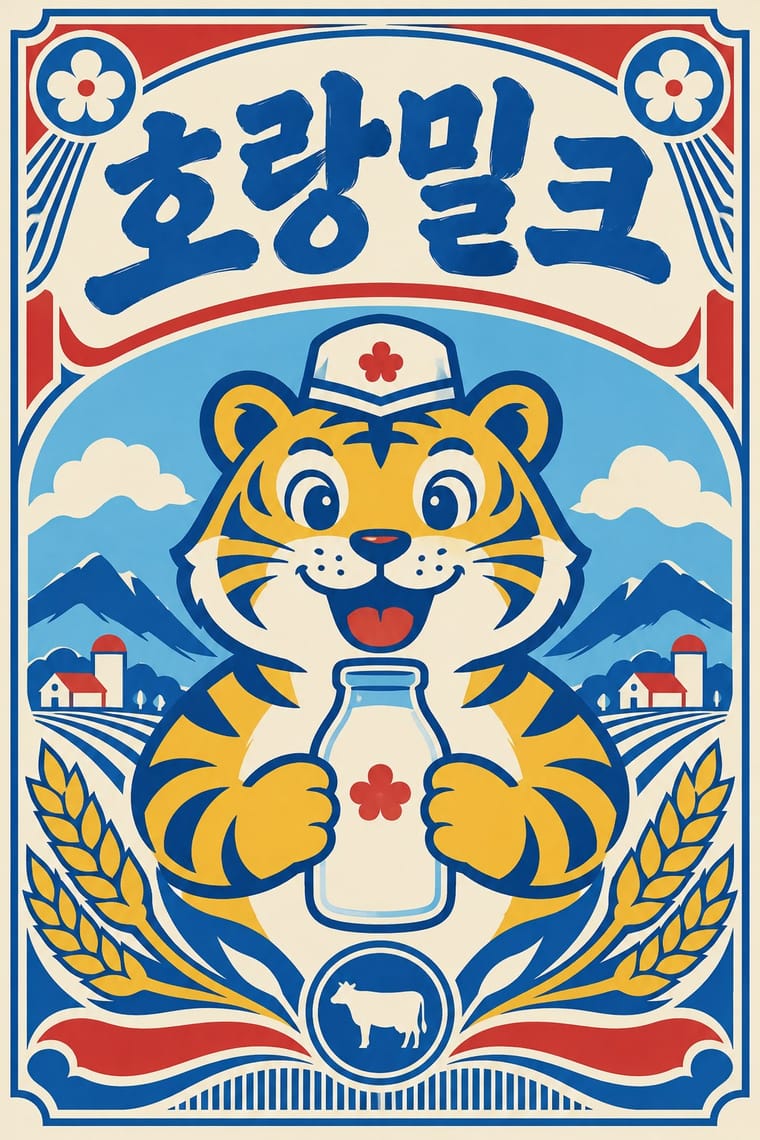
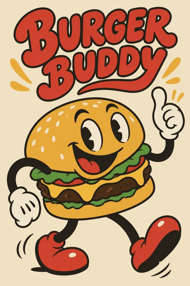
05
More combinations
With Newtro
- Out-of-Square Hangul Typography Contrasts · Set the modernist, geometric de-squared Hangul of Ahn Sang-soo against newtro's revived brush and cursive label lettering to show two ideas of fashionable Hangul.
- Hipster Artisanal Revival Contrasts · Both dress a product in the past, but hipster badges invent a Victorian heritage for a new firm while newtro reissues a real firm's own recent archive.
- Synthwave / Outrun Contrasts · Synthwave imagines an eighties that never shipped, in neon gradients; newtro reprints packaging that actually sat on Korean shelves, in flat spot colours.
- Guochao (China-Chic National Trend) Contrasts · China's contemporary heritage trend draws on imperial and folk motifs in red and gold; newtro draws on late-twentieth-century consumer packaging and its mascots.
- Hand-Painted Signage & Vernacular Lettering Pairs well · Newtro's lettering is borrowed from Korean signboards; pair a revived label with real sign-painted shopfronts, as Euljiro's cafés keep their old hardware-store signs.
- Kawaii Design Pairs well · Revived trademarks become cute merchandise and emoticons; push the toad or bear toward kawaii roundness for spin-offs while keeping the label's period lettering.
- Showa and Heisei Retro Revival (Japanese Packaging and Kissaten Graphics) Contrasts · Both revive old everyday graphics, but newtro is Korean heritage-brand reissue with badge-led logic, while this is Japanese katakana-led kissaten and dagashi graphics in pastel spot colour.
- Taiwan Floral Cloth (Huabu) Pairs well · Both turn a postwar household look into nostalgia for young buyers; pair a reissued retro label or mascot with a floral-cloth band for packaging that recalls a grandmother's home.
With Rubber-Hose Revival
- Corporate Memphis Contrasts · Both draw stretched figures in flat colour, but the revival gives each brand its own outlined, nostalgic mascot where Corporate Memphis uses interchangeable faceless people.
- UPA & Cartoon Modern Contrasts · UPA rejected exactly this: it traded rubbery full movement and round bodies for angular caricature, flat modernist sets and limited animation.
- Yuru-chara (Japanese Local Mascot Design) Pairs well · Both build a mascot from the thing it promotes; borrow the yuru-chara's costume-ready frontal figure and licensing for a rubber-hose brand character.
- Underground Comix Pairs well · Add its hatching, crowding and adult edge for a darker take on the hose-limbed character, as Bendy turned the cartoon sinister.
- Push Pin Style Contrasts · Push Pin also revived old cartoon and Victorian graphics with playful lettering, but as eclectic editorial illustration; the rubber-hose revival commits to one animation convention and a recurring brand character.
- Risograph & Indie Print Culture Pairs well · Print the mascot's stickers and zines in two riso inks for grain and misregistration that suit its period feel.
- Hipster Artisanal Revival Contrasts · The independent food brand's previous look: a cartoon protagonist replaces the monochrome badge and Victorian craft cues.
- CalArts Style (Rounded Cartoon Character Design) Contrasts · Inkier, pie-eyed, nostalgic 1930s mascot drawing against thin-limbed, flat-coloured, contemporary character design.