Style combination · Pairs well
Rubber-Hose Revival × Underground Comix
Add its hatching, crowding and adult edge for a darker take on the hose-limbed character, as Bendy turned the cartoon sinister.
Mix them and make something Rubber-Hose Revival Underground Comix
01
What each style brings
Each part of the design comes from the style with the stronger say in it, and each style gives at least two.
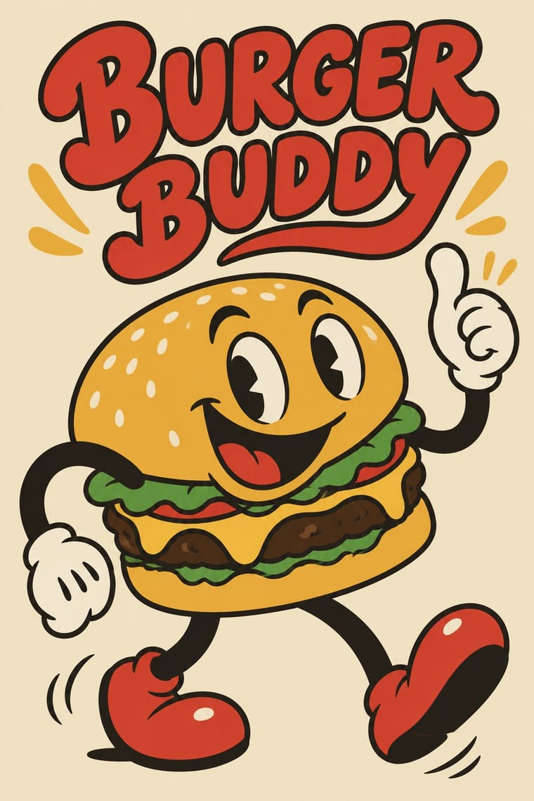
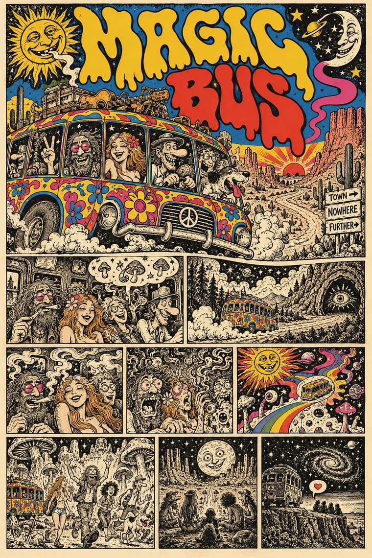
Rubber-Hose Revival (Cartoon Mascot Graphics) Underground Comix
- Type from Underground Comix
- Colour from Rubber-Hose Revival
- Form from Rubber-Hose Revival
- Composition from Underground Comix
- Surface from Rubber-Hose Revival
-
Underground Comix avoids flat: this is where the two pull against each other.
02
The type
Open fonts standing in for each style’s own type, which is often hand-drawn or commercial.
Display · Underground Comix
Hello
Bangers, standing in for Pen-drawn balloon capitals (each cartoonist's own hand on the page, in the same pen as the drawing)
Text · Rubber-Hose Revival
A present-day revival of 1920s and 1930s American cartoon drawing: characters with bendy, jointless 'rubber hose' limbs, round bodies, big white eyes and gloved hands, drawn in a confident black outline and filled with a few flat colours. Studio MDHR's hand-animated Cuphead (2017) made it a contemporary look; from there it moved into games, motion graphics and, by the mid-2020s, food brands whose mascot is a burger, coffee cup or devil with springy arms beside soft, bouncy lettering.
Zen Maru Gothic; Rubber-Hose Revival used Hand-lettered titles in the manner of early-1930s cartoon title cards and Soft, heavy round-serif display faces such as Cooper Black for the 'soft typography' the mascot brands pair with their characters
03
The colours
The ground and leading colours come from Rubber-Hose Revival, with a counter-accent from Underground Comix. The ink reads on the ground at 4.5:1 or more.
Rubber-Hose Revival (Cartoon Mascot Graphics) Underground Comix
-
#f2e6c9ground · 36% -
#1b1612ink · 14% -
#d7352baccent · 18% -
#f2c12eaccent · 14% -
#5a9bd0accent · 10% -
#c9307aaccent · 8%
As CSS
:root {
  --ground: #f2e6c9;
  --ink: #1b1612;
  --accent-1: #d7352b;
  --accent-2: #f2c12e;
  --accent-3: #5a9bd0;
  --accent-4: #c9307a;
  --font-display: "Bangers", sans-serif;
  --font-text: "Zen Maru Gothic", sans-serif;
}
Use it with care
Rubber-Hose Revival (Cartoon Mascot Graphics): The early cartoon look this revives is entangled with blackface minstrelsy: several sources trace the black bodies, white gloves and large white eyes of Mickey Mouse and his peers to minstrel caricature, and many 1930s shorts carried explicit racial caricature. Borrow the elastic limbs, round construction and outline, not the minstrel face; never give a character exaggerated lips, dialect or skin colour as an ethnic marker. The characters themselves (Cuphead, Bendy, Mickey, Felix, Oswald, Betty Boop) are still trademarked or copyrighted: invent your own mascot and never ask an image model for a named character or studio hand.
Underground Comix: Much of the canon trades in racial caricature, such as a Black woman drawn as an 'African native' caricature, and in graphic sexual violence against women and casual misogyny, which the women's comics of 1970 and 1972 answered in their own books: borrow the hatched line, the crowded panel and the candour, not the stereotypes, and give every character the same anatomy and drawing care. The characters and mastheads (Mr. Natural, Fritz the Cat, the Freak Brothers, the Checkered Demon, the Zap logo) still belong to their makers and estates: draw your own, never ask an image model for a named cartoonist's hand, living or dead, and never present a generated page as a vintage comic.
04
The two styles
05
More combinations
With Rubber-Hose Revival
- Corporate Memphis Contrasts · Both draw stretched figures in flat colour, but the revival gives each brand its own outlined, nostalgic mascot where Corporate Memphis uses interchangeable faceless people.
- UPA & Cartoon Modern Contrasts · UPA rejected exactly this: it traded rubbery full movement and round bodies for angular caricature, flat modernist sets and limited animation.
- Yuru-chara (Japanese Local Mascot Design) Pairs well · Both build a mascot from the thing it promotes; borrow the yuru-chara's costume-ready frontal figure and licensing for a rubber-hose brand character.
- Push Pin Style Contrasts · Push Pin also revived old cartoon and Victorian graphics with playful lettering, but as eclectic editorial illustration; the rubber-hose revival commits to one animation convention and a recurring brand character.
- Risograph & Indie Print Culture Pairs well · Print the mascot's stickers and zines in two riso inks for grain and misregistration that suit its period feel.
- Hipster Artisanal Revival Contrasts · The independent food brand's previous look: a cartoon protagonist replaces the monochrome badge and Victorian craft cues.
- Newtro (Korean New-Retro) Contrasts · Both are post-2017 nostalgic branding in flat spot colour; newtro quotes Korean 1970s–80s packaging and emblems, the revival quotes 1920s–30s American animation.
- CalArts Style (Rounded Cartoon Character Design) Contrasts · Inkier, pie-eyed, nostalgic 1930s mascot drawing against thin-limbed, flat-coloured, contemporary character design.
With Underground Comix
- Filipino Komiks Contrasts · Both put black-and-white hatched interiors behind colour covers, but komiks drew naturalistic folk heroes and romances for the country's most widely read periodicals, while comix push big-footed caricature into adult taboo for a head-shop audience.
- Psychedelic Poster Pairs well · Take the cover from the ballroom poster, with its clashing flat inks and melting letters, and keep the hatched black-and-white panels inside, as Zap did with Moscoso and Griffin.
- Escuela Bruguera (Spanish Humour Comics) Contrasts · Both draw rubbery big-footed caricatures, but Bruguera's are coloured, family-friendly gags; the undergrounds use the same cartoon body for adult taboo.
- Turkish Weekly Humour Magazines (Gırgır to Uykusuz) Contrasts · Both learned from Mad and crowd hand-lettered caricature into the panel, but the Istanbul weeklies are mass-circulation collective magazines whose cover lampoons the week's politics, while comix are self-published books whose shock is sex, drugs and taboo.
- L'Association and French Alternative Comics Pairs well · A later French-language small-press scene, one of whose founders turned to psychedelic and autobiographical comics after discovering Crumb and Shelton, keeps the black ink and the single author's hand but clears the crowding and the shock; borrow its book design to give a comix page a calmer format.
- Métal hurlant Science-Fiction Comics (Mœbius, Druillet & Les Humanoïdes Associés) Contrasts · Adult comics of the 1970s in two opposite registers: painted, luminous science-fiction vistas against cheap, crowded black-and-white satire.
- American Four-Colour Comic Book (Golden to Bronze Age) Contrasts · Same format, everything else reversed: set a four-colour, Code-approved house-style page beside a hatched black-and-white page by a single author to show what the undergrounds rejected.
- Punk & DIY Zine Pairs well · Both are cheap, self-published print made outside the mainstream; add cut-and-paste collage and Xerox grit to a hand-drawn comix page for the later punk-zine voice.