Style combination · Contrasts
Hand-Painted Signage × Roman-like Thai Typography
A hand-painted shopfront sign, in looped letters or broad-nib Naris, beside a flat loopless headline shows the shift from the letterer's hand to dry transfer and digital type that Manop Srisomporn himself made.
Mix them and make something Hand-Painted Signage Roman-like Thai Typography
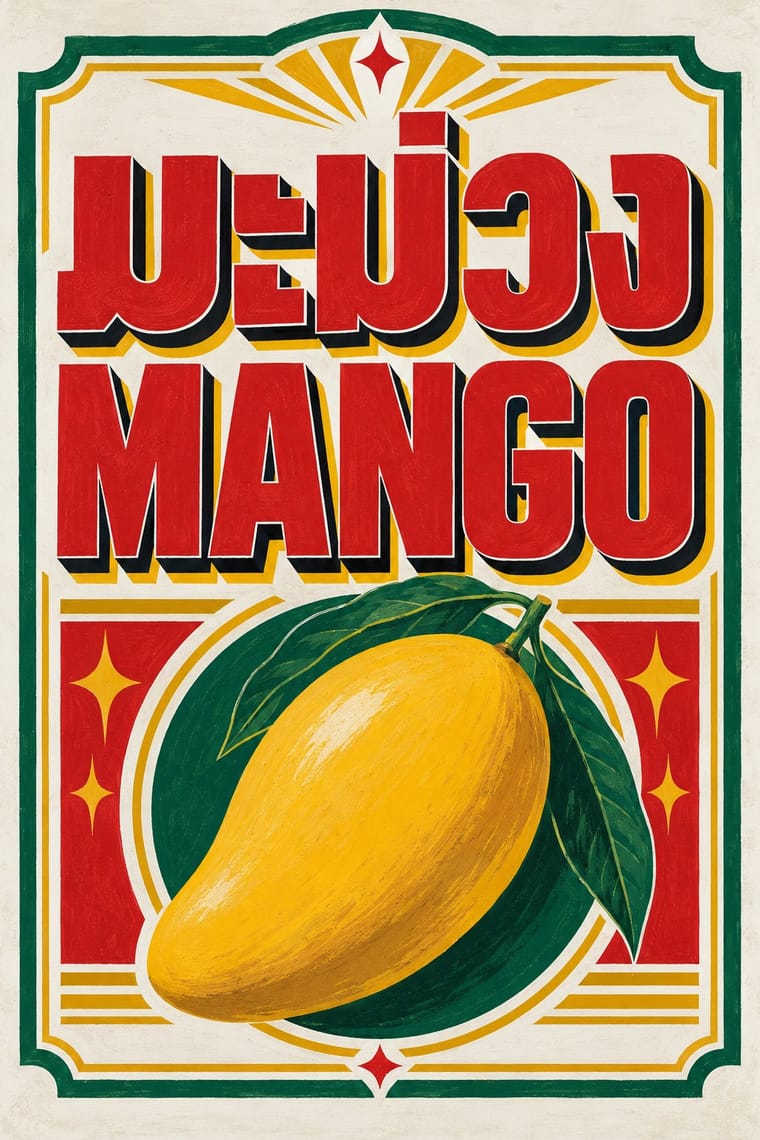
01
What each style brings
Each part of the design comes from the style with the stronger say in it, and each style gives at least two.
Hand-Painted Signage & Vernacular Lettering Roman-like Thai Typography (modern loopless Thai)
- Type from Roman-like Thai Typography
- Colour from Roman-like Thai Typography
- Form from Hand-Painted Signage
- Composition from Hand-Painted Signage
- Surface from Hand-Painted Signage
-
Roman-like Thai Typography avoids painterly brushwork: this is where the two pull against each other, which is the point of the contrast.
02
The type
Open fonts standing in for each style’s own type, which is often hand-drawn or commercial.
Display · Roman-like Thai Typography
Kin
Inter Tight, standing in for Helvetica, the Latin model for Manoptica
Text · Hand-Painted Signage
Letters painted by trained sign writers on fascias, windows, walls, vehicles and showcards, from Victorian gold leaf on glass to Mexican rótulos, Indian bazaar boards and Ghanaian barbershop signs. Brush-built letters with shading, drop shadows and outlines are fitted to the panel and mixed in a few styles for hierarchy, valuing legibility at a distance and the painter's flourish; vinyl displaced the craft in the 1980s and it has revived since the 2010s.
Oswald; Hand-Painted Signage used One-stroke casual (showcard) alphabet and Block and Egyptian sign writers' letters
03
The colours
The ground and leading colours come from Roman-like Thai Typography, with a counter-accent from Hand-Painted Signage. The ink reads on the ground at 4.5:1 or more.
Hand-Painted Signage & Vernacular Lettering Roman-like Thai Typography (modern loopless Thai)
-
#f6f5f1ground · 36% -
#141414ink · 14% -
#f5b800accent · 18% -
#c99a2eaccent · 14% -
#d6242aaccent · 10% -
#0a7a4faccent · 8%
As CSS
:root {
  --ground: #f6f5f1;
  --ink: #141414;
  --accent-1: #f5b800;
  --accent-2: #c99a2e;
  --accent-3: #d6242a;
  --accent-4: #0a7a4f;
  --font-display: "Inter Tight", sans-serif;
  --font-text: "Oswald", sans-serif;
}
Use it with care
Roman-like Thai Typography (modern loopless Thai): Loopless Thai is contested inside Thailand. Researchers such as Rachapoom Punsongserm find it harder to read in small, bold or justified body text and less legible across viewing distances than a Thai universal-design face, with letters that can be taken for Latin (พ.ร.บ. can read as W.S.U.), so keep it mostly to display sizes and set body, legal and small interface text in a looped face. Critics also see it as eroding the looped forms that mark Thai identity, and Cadson Demak, which popularised it, has since turned back towards looped faces. Have every Thai word checked by a fluent reader, since image models invent or garble Thai letters, and never pass shaped Latin letters off as Thai.
04
The two styles
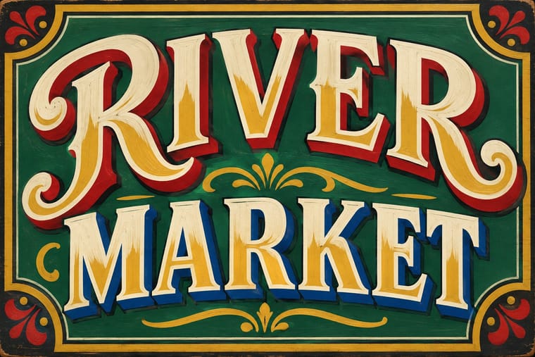
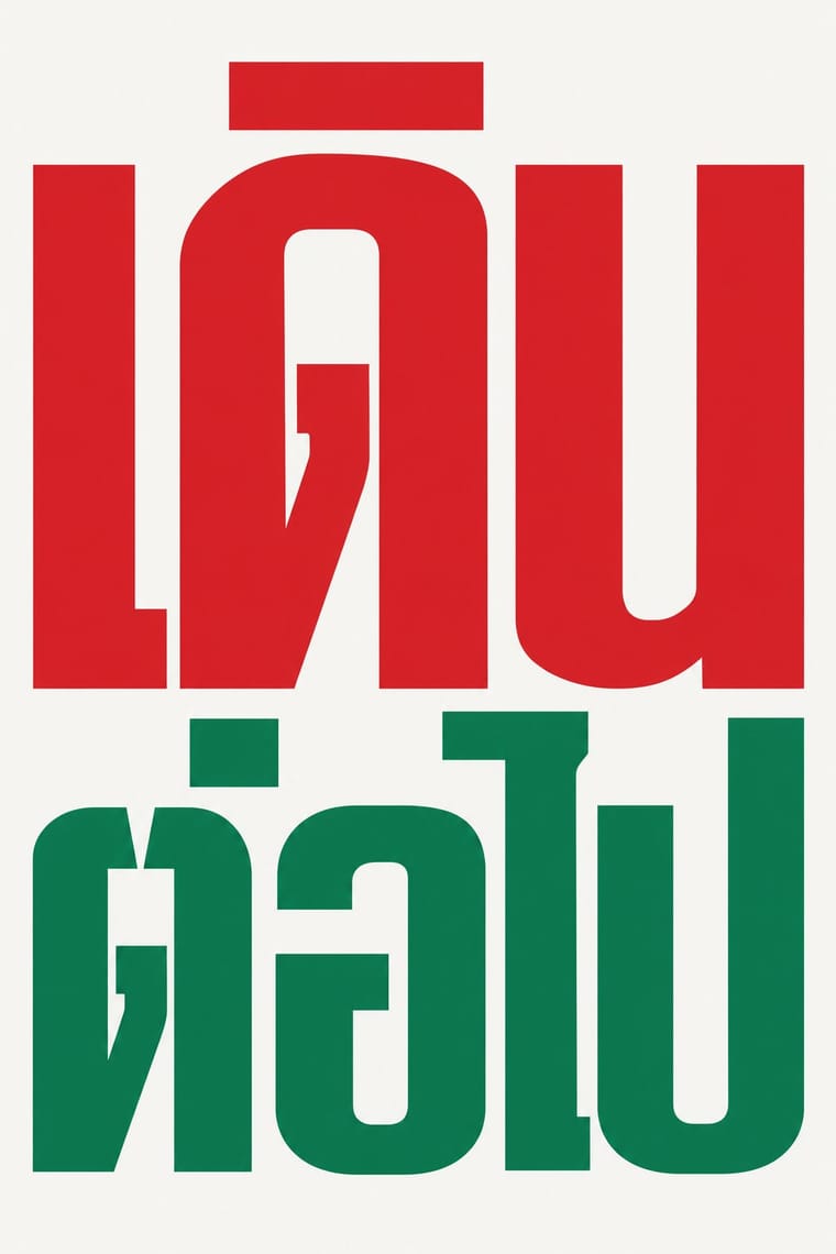
05
More combinations
With Hand-Painted Signage
- Victorian Letterpress & Wood Type Pairs well · Sign writers and type founders traded letterforms; set a wood-type headline and finish it with painted shadows and outlines.
- West African Barbershop & Hair Salon Signs Pairs well · West African barbershop boards are the sign writer's catalogue genre; pair a painted name panel with a grid of numbered hairstyle portraits for a shop menu that reads from the street.
- Graffiti & Hip-Hop Graphics Pairs well · Graffiti writers inherited the sign painter's outlines and drop shadows; pair a disciplined sign alphabet with a wildstyle tag for contrast of control.
- Flat Design Contrasts · Against flat, machine-perfect UI, one hand-painted wordmark signals human craft; keep everything else flat so it stands out.
- Fileteado Porteño Pairs well · Add filete scrolls and bevelled shading to plain painted lettering for a richer, Buenos Aires-style sign.
- Generative & Dynamic Identities Contrasts · Hand-painted lettering's one-off irregularity is the human counterpart to algorithmic variation; mix the two only with clear intent.
- Italian Painted Film Poster (Rome Studios) Pairs well · Shares the painted-on-site lettering craft; borrow its bold hand-lettering for the title block.
- City Pop Illustration Pairs well · Suzuki fills his streets with painted shop names; real sign-writers' letterforms make the fascias in a city pop scene read as made rather than typeset.
With Roman-like Thai Typography
- Out-of-Square Hangul Typography Pairs well · Both modernise an Asian script by dropping a defining convention, the square cell in Hangul and the head loop in Thai; set them together for a pan-Asian modern type specimen or festival identity.
- Thai Yantra (Yant) Diagrams Contrasts · Yantras keep hand-drawn Khom letters in sacred, protective diagrams; loopless Thai is secular, standardised and commercial, so never use a yantra as a decorative foil for it.
- Contemporary Arabic & Dual-Script Type Design Pairs well · Both redraw a non-Latin script to sit beside a Latin sans as an equal; dual-script Arabic keeps its calligraphic structure, while loopless Thai changes the letter itself, so pair them in a multiscript identity only with native readers for each script.
- Machine-Age Simplified Arabic Type Pairs well · A parallel machine-age simplification of another script; both strip traditional details to an even, rational line, and both stayed contested for long reading.