Style combination · Pairs well
Fileteado Porteño × Hand-Painted Signage
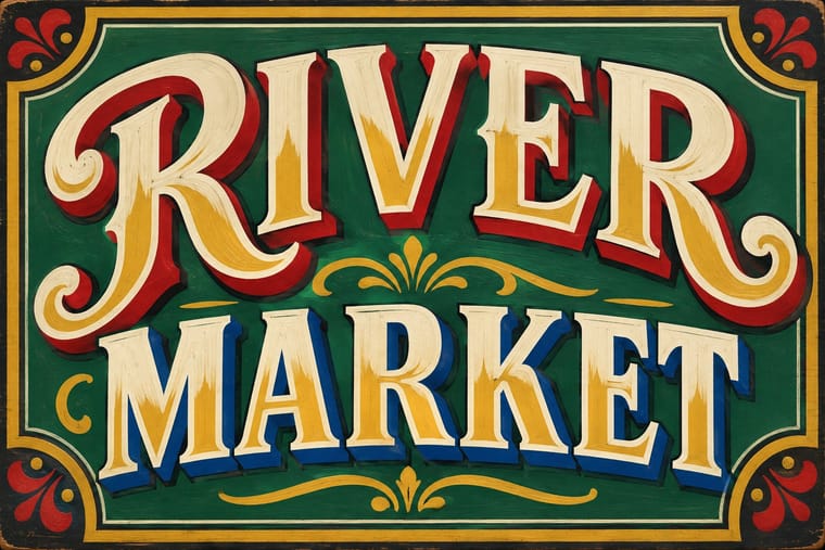
Add filete scrolls and bevelled shading to plain painted lettering for a richer, Buenos Aires-style sign.
Mix them and make something Fileteado Porteño Hand-Painted Signage
01
What each style brings
Each part of the design comes from the style with the stronger say in it, and each style gives at least two.
Fileteado Porteño Hand-Painted Signage & Vernacular Lettering
- Type from Hand-Painted Signage
- Colour from Fileteado Porteño
- Form from Fileteado Porteño
- Composition from Fileteado Porteño
- Surface from Hand-Painted Signage
02
The type
Open fonts standing in for each style’s own type, which is often hand-drawn or commercial.
Text · Fileteado Porteño
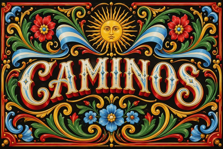
A Buenos Aires tradition of ornamental brush painting that began around 1900 on the grey-painted trade carts of Italian immigrant coachbuilders and spread to trucks, colectivo buses, shop signs and gallery panels. Mirror-symmetric spirals of acanthus, ribbons in the national colours, birds, dragons and flowers are modelled with layered highlights and shadows on dark grounds, framing a lettered name, initials or a witty refrán.
Libre Caslon Text; Fileteado Porteño used Letra gótica and Shaded Roman capitals with drop shadows
03
The colours
The ground and leading colours come from Fileteado Porteño, with a counter-accent from Hand-Painted Signage. The ink reads on the ground at 4.5:1 or more.
Fileteado Porteño Hand-Painted Signage & Vernacular Lettering
-
#141414ground · 36% -
#f3ead3ink · 14% -
#f2b705accent · 18% -
#c99a2eaccent · 14% -
#c8102eaccent · 10% -
#6cace4accent · 8%
As CSS
:root {
  --ground: #141414;
  --ink: #f3ead3;
  --accent-1: #f2b705;
  --accent-2: #c99a2e;
  --accent-3: #c8102e;
  --accent-4: #6cace4;
  --font-display: "Yellowtail", cursive;
  --font-text: "Libre Caslon Text", serif;
}
Use it with care
Fileteado Porteño: Filete porteño is UNESCO-listed intangible heritage (2015) and a living trade: commission or credit fileteadores rather than tracing their published panels, and keep its Argentine emblems and devotional images, such as the Virgin of Luján, in a respectful context.
04
The two styles
05
More combinations
With Fileteado Porteño
- Art Nouveau Pairs well · Use Art Nouveau's flatter whiplash line to tame filete's modelled acanthus for print and repeat patterns while keeping its curvilinear energy.
- Victorian Letterpress & Wood Type Pairs well · Wrap shaded wood-type capitals in a filete ribbon and corner scrolls for labels and menus that read porteño without a full painted panel.
- International Typographic Style Contrasts · Set one painted filete scroll against a strict grid and neutral sans so the ornament reads as a deliberate, celebratory interruption.
- Minimalist Graphic Design Contrasts · Its horror of empty panels is the opposite of minimalist restraint; isolate a single small filete motif on a large quiet field to stage the clash.
- Di Tella Graphic Design (Instituto Torcuato Di Tella) Contrasts · Same city, opposite choice: Buenos Aires' ornamental filete against the Di Tella's ornament-free flat-ink modernism; set side by side they show the porteño vernacular and the porteño avant-garde.
- Argentine Adventure Historieta (Oesterheld–Breccia) Contrasts · Two Buenos Aires vernaculars that both work on dark grounds: fileteado frames a lettered name with polychrome, highlighted acanthus and ribbons, while the historieta rejects ornament and lets bare black ink and side light carry a story.
With Hand-Painted Signage
- Victorian Letterpress & Wood Type Pairs well · Sign writers and type founders traded letterforms; set a wood-type headline and finish it with painted shadows and outlines.
- West African Barbershop & Hair Salon Signs Pairs well · West African barbershop boards are the sign writer's catalogue genre; pair a painted name panel with a grid of numbered hairstyle portraits for a shop menu that reads from the street.
- Graffiti & Hip-Hop Graphics Pairs well · Graffiti writers inherited the sign painter's outlines and drop shadows; pair a disciplined sign alphabet with a wildstyle tag for contrast of control.
- Flat Design Contrasts · Against flat, machine-perfect UI, one hand-painted wordmark signals human craft; keep everything else flat so it stands out.
- Roman-like Thai Typography (modern loopless Thai) Contrasts · A hand-painted shopfront sign, in looped letters or broad-nib Naris, beside a flat loopless headline shows the shift from the letterer's hand to dry transfer and digital type that Manop Srisomporn himself made.
- Generative & Dynamic Identities Contrasts · Hand-painted lettering's one-off irregularity is the human counterpart to algorithmic variation; mix the two only with clear intent.
- Italian Painted Film Poster (Rome Studios) Pairs well · Shares the painted-on-site lettering craft; borrow its bold hand-lettering for the title block.
- City Pop Illustration Pairs well · Suzuki fills his streets with painted shop names; real sign-writers' letterforms make the fascias in a city pop scene read as made rather than typeset.