Style combination · Contrasts
Grunge Typography × International Typographic Style
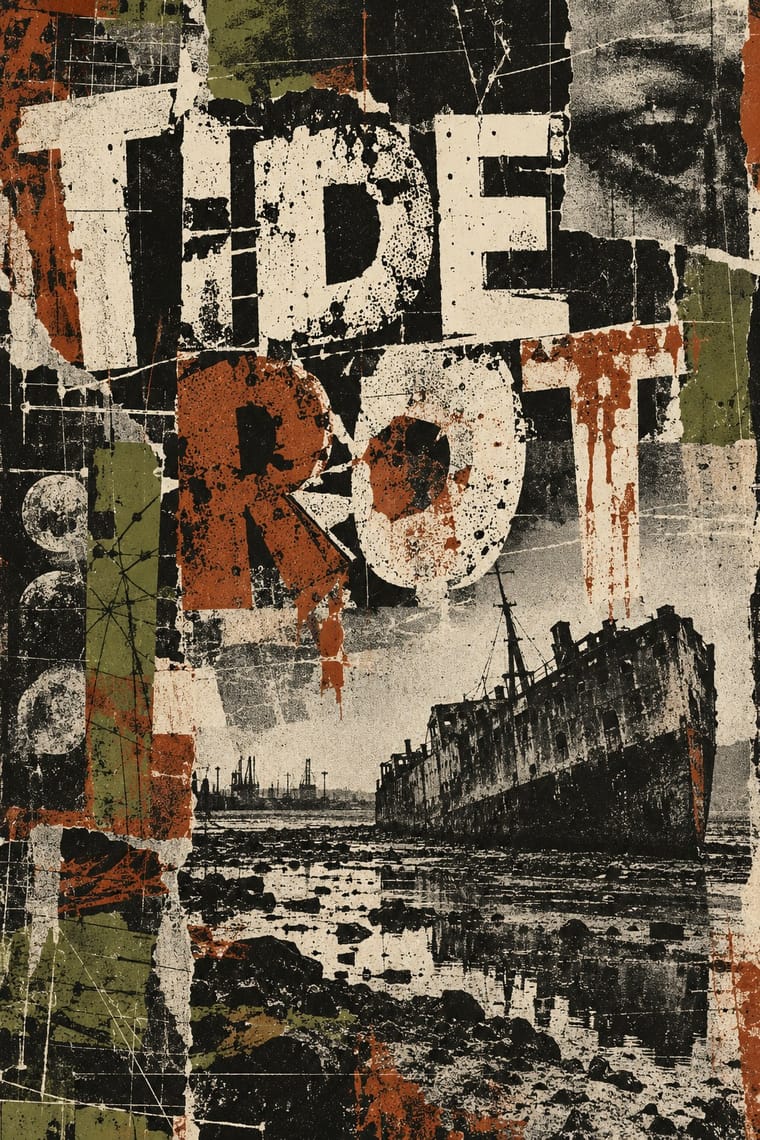
Run a single eroded headline through an otherwise clean grid to signal attitude without sacrificing legibility.
Mix them and make something Grunge Typography International Typographic Style
01
What each style brings
Each part of the design comes from the style with the stronger say in it, and each style gives at least two.
Grunge Typography International Typographic Style
- Type from Grunge Typography
-
International Typographic Style avoids eclectic mixing: this is where the two pull against each other, which is the point of the contrast.
- Colour from International Typographic Style
- Form from International Typographic Style
- Composition from International Typographic Style
-
Grunge Typography avoids modular grid: this is where the two pull against each other, which is the point of the contrast.
- Surface from Grunge Typography
02
The type
Open fonts standing in for each style’s own type, which is often hand-drawn or commercial.
Text · International Typographic Style
A post-war refinement of the New Typography in which the mathematical grid, objective photography and neo-grotesque sans-serifs were used to communicate with clarity and neutrality. Taught at the Basel and Zurich schools, it became the default language of international corporate and institutional communication.
Inter; International Typographic Style used Akzidenz-Grotesk and Helvetica
03
The colours
The ground and leading colours come from International Typographic Style, with a counter-accent from Grunge Typography. The ink reads on the ground at 4.5:1 or more.
Grunge Typography International Typographic Style
-
#f2f0e9ground · 36% -
#111111ink · 14% -
#e1251baccent · 18% -
#a8322daccent · 14% -
#1f4e9caccent · 10% -
#7a7a7aaccent · 8%
As CSS
:root {
  --ground: #f2f0e9;
  --ink: #111111;
  --accent-1: #e1251b;
  --accent-2: #a8322d;
  --accent-3: #1f4e9c;
  --accent-4: #7a7a7a;
  --font-display: "Rock Salt", cursive;
  --font-text: "Inter", sans-serif;
}
04
The two styles

05
More combinations
With Grunge Typography
- Acid Graphics / New Ugly Pairs well · Grunge's layered, distressed type is a direct ancestor of acid graphics; add chrome and neon to update it for today.
- Brutalist Web Design Pairs well · Raw web layouts absorb grunge's broken grids naturally; add one scanned texture for an analogue edge.
- Frutiger Aero Contrasts · Clean glossy optimism is grunge's opposite; juxtapose them only when you want the clash itself to be the message.
- Glitch Art & Datamosh Graphics Contrasts · Grunge scanned in photocopier grain and dirt and layered type on the Mac; glitch art breaks the file and lets the codec make the damage. Pick analogue distress or digital failure deliberately rather than stacking both.
- Kawaii Design Contrasts · Grunge's dirt and illegibility is kawaii's opposite; one cute character on a distressed texture creates knowing dissonance.
- British Style Press (The Face, i-D and Arena) Contrasts · Both broke magazine conventions, but grunge eroded and blurred letters while Brody's stay hard-edged and constructed; choose between decay and construction.
- Indie Sleaze Pairs well · Wikipedia describes the look as combining 1970s and 1980s fashion with grunge fashion, 'grubby' and 'performatively vintage'.
- Black Metal Graphics Contrasts · Both made legibility negotiable in the 1990s, but grunge layered and eroded digital type across a broken grid, while black metal draws one logo by hand and centres it in emptiness; pick analogue symmetry or digital disorder.
With International Typographic Style
- Art Nouveau Contrasts · Ornamental curves against an orthogonal grid make a strong deliberate tension.
- Brutalist Web Design Pairs well · Strip the grid to raw HTML defaults to get a rawer, contemporary take on Swiss honesty.
- Psychedelic Poster Contrasts · Its exact opposite on legibility; borrow one swirling element to break a too-cold Swiss layout.
- Japanese Postwar Modernism Pairs well · Add Japanese restraint and emblematic colour fields to the grid for warmth without losing order.
- American Traditional Tattoo Flash Contrasts · Rational grid and sans-serif against sentimental, hand-lettered emblems: one flash motif on a Swiss layout makes a sharp contrast.
- Graffiti & Hip-Hop Graphics Contrasts · Put a single tag or throw-up over a strict Swiss grid to stage the clash between institutional order and a street voice.
- Pop Art Graphics Contrasts · Set one loud appropriated Pop image inside a strict grid with a neutral grotesque so the irony reads as deliberate rather than chaotic.
- Italian Painted Film Poster (Rome Studios) Contrasts · Grid, restraint and photographic objectivity are the opposite of a crowded painted montage.