Style combination · Contrasts
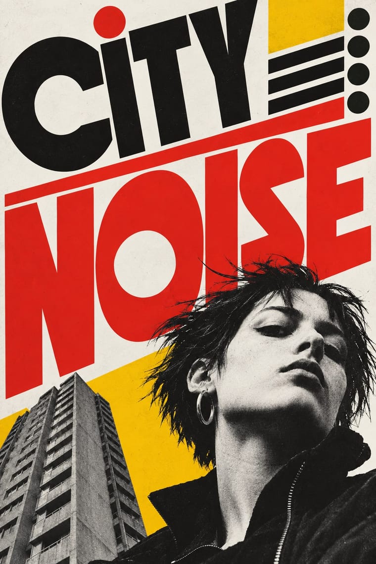
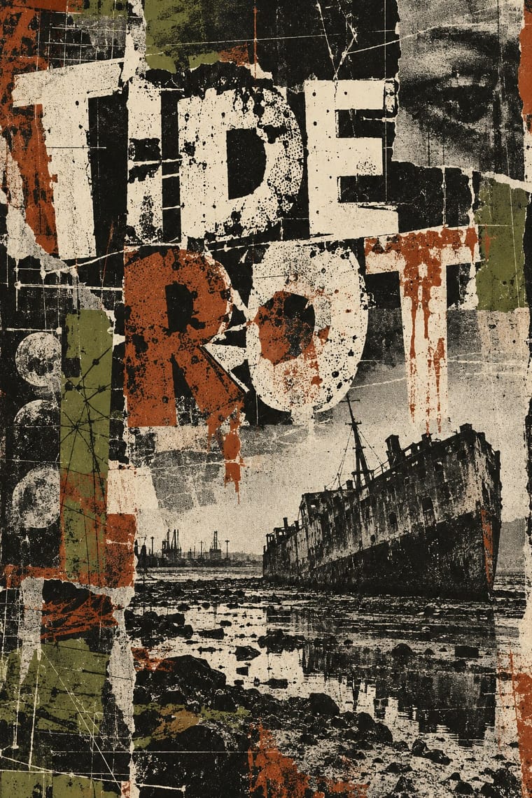
British Style Press × Grunge Typography
Both broke magazine conventions, but grunge eroded and blurred letters while Brody's stay hard-edged and constructed; choose between decay and construction.
Mix them and make something British Style Press Grunge Typography
01
What each style brings
Each part of the design comes from the style with the stronger say in it, and each style gives at least two.
British Style Press (The Face, i-D and Arena) Grunge Typography
- Type from British Style Press
- Colour from Grunge Typography
- Form from British Style Press
- Composition from British Style Press
- Surface from Grunge Typography
02
The type
Open fonts standing in for each style’s own type, which is often hand-drawn or commercial.
Display · British Style Press
No!
Anton, standing in for Industria (Neville Brody), a geometric, condensed sans-serif drawn for The Face's headlines (1984)
Text · Grunge Typography
The 1990s magazine and music-industry style in which type was layered, eroded, overlapped and cropped until legibility became negotiable. Made on the Macintosh but deliberately dirty, it combined distressed digital fonts, scanned textures and blurred, cropped photography with layouts that broke the grid on every spread, treating the page as an expressive surface rather than a neutral container for text.
Special Elite; Grunge Typography used Template Gothic and FF Trixie
03
The colours
The ground and leading colours come from Grunge Typography, with a counter-accent from British Style Press. The ink reads on the ground at 4.5:1 or more.
British Style Press (The Face, i-D and Arena) Grunge Typography
-
#1b1a17ground · 36% -
#e8e2d0ink · 14% -
#a8322daccent · 18% -
#f5c400accent · 14% -
#e2231aaccent · 10% -
#6b6b3aaccent · 8%
As CSS
:root {
  --ground: #1b1a17;
  --ink: #e8e2d0;
  --accent-1: #a8322d;
  --accent-2: #f5c400;
  --accent-3: #e2231a;
  --accent-4: #6b6b3a;
  --font-display: "Anton", sans-serif;
  --font-text: "Special Elite", monospace;
}
Use it with care
British Style Press (The Face, i-D and Arena): The Face, i-D and Arena mastheads, i-D's winking cover device and Brody's typefaces are trademarks or licensed fonts, and the street portraits show real, identifiable people: draw your own alphabet and symbols in the idiom rather than copying a Brody face or a masthead, and do not present a generated spread as a page from these magazines.
04
The two styles
05
More combinations
With British Style Press
- Swiss Punk / New Wave Typography Pairs well · Both took modernism apart in the 1980s: add Weingart's layered, tracked grotesques to a Brody spread for a more Swiss, less drawn result.
- Russian Constructivism Pairs well · Brody's source: take Rodchenko's diagonals, heavy bars and huge constructed letters, swap agitprop for fashion and club culture, and you get a Face spread.
- Post-Punk Record Sleeve (Stiff, Factory, 4AD) Contrasts · Same years and city: Saville kept type sparse or left it off and quoted one image on a single square. Brody's own Fetish and Cabaret Voltaire sleeves belong to that genre; this entry is the editorial system he built alongside them, with oversized drawn headlines across a whole magazine.
- Punk & DIY Zine Contrasts · Its parent: punk pasted ransom-note chaos onto photocopies, while the style press drew its own ordered alphabets and printed them offset; i-D sits between the two.
With Grunge Typography
- International Typographic Style Contrasts · Run a single eroded headline through an otherwise clean grid to signal attitude without sacrificing legibility.
- Acid Graphics / New Ugly Pairs well · Grunge's layered, distressed type is a direct ancestor of acid graphics; add chrome and neon to update it for today.
- Brutalist Web Design Pairs well · Raw web layouts absorb grunge's broken grids naturally; add one scanned texture for an analogue edge.
- Frutiger Aero Contrasts · Clean glossy optimism is grunge's opposite; juxtapose them only when you want the clash itself to be the message.
- Glitch Art & Datamosh Graphics Contrasts · Grunge scanned in photocopier grain and dirt and layered type on the Mac; glitch art breaks the file and lets the codec make the damage. Pick analogue distress or digital failure deliberately rather than stacking both.
- Kawaii Design Contrasts · Grunge's dirt and illegibility is kawaii's opposite; one cute character on a distressed texture creates knowing dissonance.
- Indie Sleaze Pairs well · Wikipedia describes the look as combining 1970s and 1980s fashion with grunge fashion, 'grubby' and 'performatively vintage'.
- Black Metal Graphics Contrasts · Both made legibility negotiable in the 1990s, but grunge layered and eroded digital type across a broken grid, while black metal draws one logo by hand and centres it in emptiness; pick analogue symmetry or digital disorder.