Style combination · Contrasts
Glitch Art × Grunge Typography
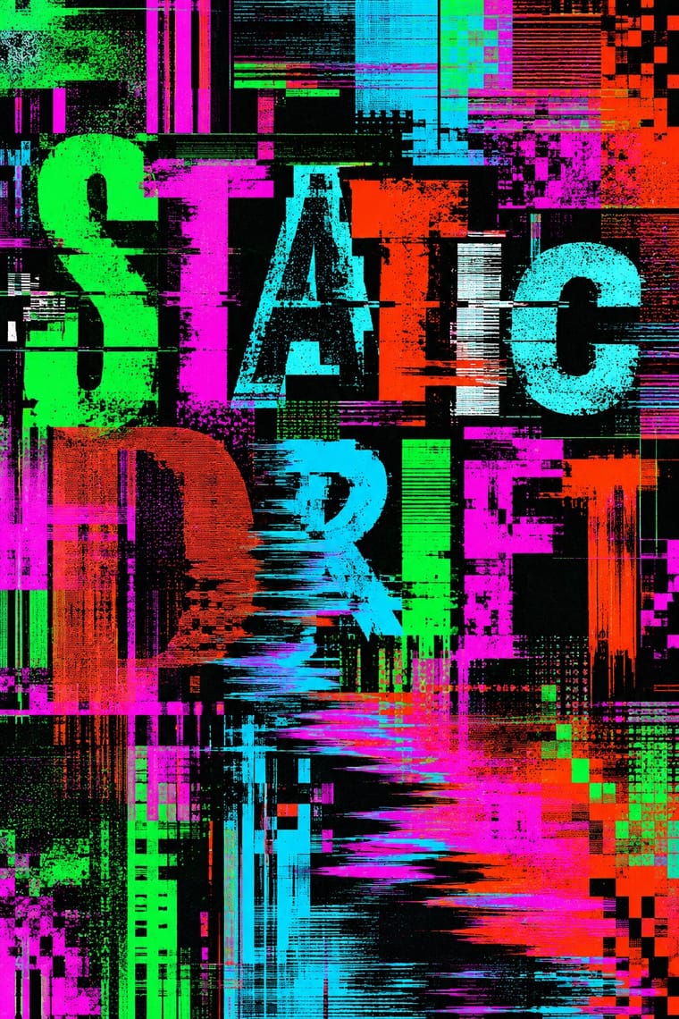
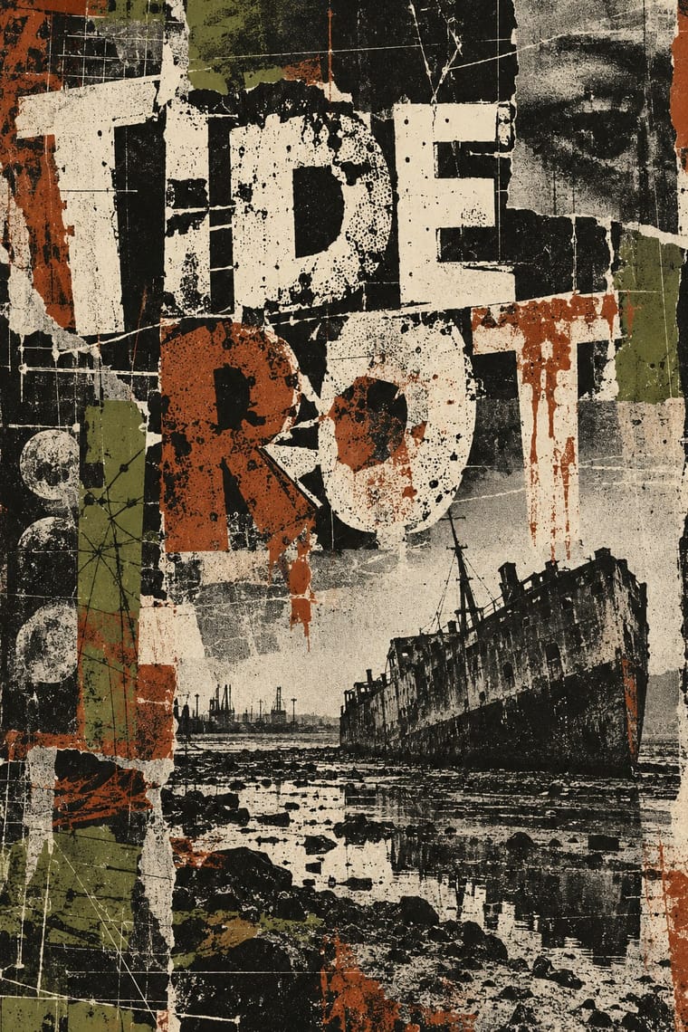
Grunge scanned in photocopier grain and dirt and layered type on the Mac; glitch art breaks the file and lets the codec make the damage. Pick analogue distress or digital failure deliberately rather than stacking both.
01
What each style brings
Each part of the design comes from the style with the stronger say in it, and each style gives at least two.
Glitch Art & Datamosh Graphics Grunge Typography
- Type from Grunge Typography
- Colour from Glitch Art
- Form from Glitch Art
- Composition from Grunge Typography
- Surface from Glitch Art
02
The type
Open fonts standing in for each style’s own type, which is often hand-drawn or commercial.
Text · Glitch Art
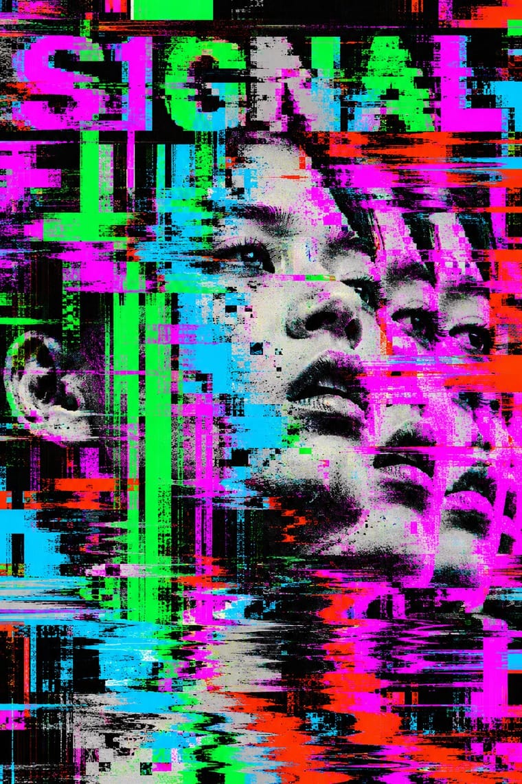
An art and design practice that makes digital failure the picture. Artists deliberately corrupt image and video files or short-circuit hardware: they edit a JPEG's bytes (databending), delete a video's keyframes so one shot smears into the next (datamoshing) or sort pixels into streaks. Compression blocks, torn scanlines, shifted colour channels and raw code replace drawing, and the colour comes from the fault. Rosa Menkman and GLI.TC/H framed it as a critique of seamless technology; designers took it onto record sleeves and fonts, music videos onto MTV in 2009, and it became a stock filter.
Space Mono; Glitch Art used Raw file bytes opened as text (databending in a text editor) and Operating-system interface fonts caught in error messages and cascading windows, as in JODI's My%Desktop
03
The colours
The ground and leading colours come from Glitch Art, with a counter-accent from Grunge Typography. The ink reads on the ground at 4.5:1 or more.
Glitch Art & Datamosh Graphics Grunge Typography
-
#0a0a0aground · 36% -
#00ff41ink · 14% -
#ff00ffaccent · 18% -
#a8322daccent · 14% -
#00e5ffaccent · 10% -
#ff2a00accent · 8%
As CSS
:root {
  --ground: #0a0a0a;
  --ink: #00ff41;
  --accent-1: #ff00ff;
  --accent-2: #a8322d;
  --accent-3: #00e5ff;
  --accent-4: #ff2a00;
  --font-display: "Rock Salt", cursive;
  --font-text: "Space Mono", monospace;
}
Use it with care
Glitch Art & Datamosh Graphics: Glitch video and animated glitch effects often flicker: keep flashes to three or fewer in any one second, and be stricter with saturated red, to meet WCAG 2.3.1 and protect people with photosensitive epilepsy. Datamoshing and databending usually start from someone else's footage or photographs, so clear the rights before corrupting them for commercial work. When a datamosh or pixel-sort look follows a particular artist's process, credit it; the 2009 music videos overtook the artists who developed the technique.
04
The two styles
05
More combinations
With Glitch Art
- Vaporwave Pairs well · Vaporwave uses glitch as one surface among busts, grids and pastel 3D; give a vaporwave video a real datamosh between its found clips so the smear comes from the file rather than a plug-in.
- Brutalist Web Design Pairs well · Both put the machinery on show; set corrupted images on a raw-HTML page of default fonts so the code and the broken pictures make one argument about the medium.
- Internet Ugly & Meme Vernacular Contrasts · Deep-fried memes also pile up JPEG damage, but as a joke for a crowd to copy; glitch art makes the damage its subject. Borrow the re-saving, not the punchline.
- Acid Graphics / New Ugly Contrasts · Acid graphics renders polished chrome and adds glitch as a finish; glitch art breaks the file and keeps what comes out. Decide whether a brief wants spectacle or exposure.
- Frutiger Aero Contrasts · Aero's glossy, seamless interface is the frictionless technology glitch art questions; corrupt one Aero-style screen to show what the gloss hides.
- International Typographic Style Contrasts · A clean Swiss grid is the perfect signal to break: tear one band of a strict layout sideways and let the rest stay legible as the reference.
- Witch House Graphics (Symbol Names and Haunted Web Imagery) Pairs well · Use channel displacement or compression damage to estrange a recognisable scene, but retain the symbol-name as the identity; the image need not become an abstract demonstration of file failure.
- Cyberpunk Visual Style Pairs well · Add signal tearing and scan-line breakup to suggest a failing, overloaded network.
With Grunge Typography
- International Typographic Style Contrasts · Run a single eroded headline through an otherwise clean grid to signal attitude without sacrificing legibility.
- Acid Graphics / New Ugly Pairs well · Grunge's layered, distressed type is a direct ancestor of acid graphics; add chrome and neon to update it for today.
- Brutalist Web Design Pairs well · Raw web layouts absorb grunge's broken grids naturally; add one scanned texture for an analogue edge.
- Frutiger Aero Contrasts · Clean glossy optimism is grunge's opposite; juxtapose them only when you want the clash itself to be the message.
- Kawaii Design Contrasts · Grunge's dirt and illegibility is kawaii's opposite; one cute character on a distressed texture creates knowing dissonance.
- British Style Press (The Face, i-D and Arena) Contrasts · Both broke magazine conventions, but grunge eroded and blurred letters while Brody's stay hard-edged and constructed; choose between decay and construction.
- Indie Sleaze Pairs well · Wikipedia describes the look as combining 1970s and 1980s fashion with grunge fashion, 'grubby' and 'performatively vintage'.
- Black Metal Graphics Contrasts · Both made legibility negotiable in the 1990s, but grunge layered and eroded digital type across a broken grid, while black metal draws one logo by hand and centres it in emptiness; pick analogue symmetry or digital disorder.