Style combination · Pairs well
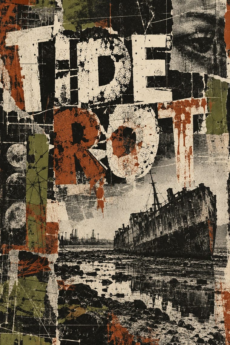
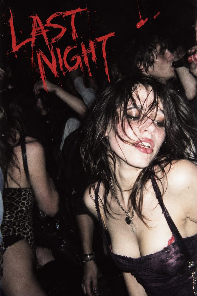
Grunge Typography × Indie Sleaze
Wikipedia describes the look as combining 1970s and 1980s fashion with grunge fashion, 'grubby' and 'performatively vintage'.
01
What each style brings
Each part of the design comes from the style with the stronger say in it, and each style gives at least two.
Grunge Typography Indie Sleaze
- Type from Grunge Typography
- Colour from Indie Sleaze
- Form from Indie Sleaze
- Composition from Grunge Typography
- Surface from Grunge Typography
02
The type
Open fonts standing in for each style’s own type, which is often hand-drawn or commercial.
Text · Indie Sleaze
Mainly a fashion and music-scene label applied in retrospect to the late-2000s indie and blog-rock crowd (skinny jeans, band tees, smudged eyeliner). Its graphic expression is mostly photographic and platform-based, not a designed system: amateur direct-flash party snapshots posted as an unedited stream to MySpace and early Tumblr, overexposed, noisy and dark-roomed. Its distinctness lies in that pairing of flash snapshot and blog stream.
Space Grotesk; Indie Sleaze used Default blog and profile-page sans-serif captions and The MySpace and Tumblr interface type around the photographs
03
The colours
The ground and leading colours come from Indie Sleaze, with a counter-accent from Grunge Typography. The ink reads on the ground at 4.5:1 or more.
Grunge Typography Indie Sleaze
-
#0d0b0eground · 36% -
#e6e1eaink · 14% -
#c8322daccent · 18% -
#5a3a63accent · 14% -
#8b3a1aaccent · 10% -
#6b6b3aaccent · 8%
As CSS
:root {
  --ground: #0d0b0e;
  --ink: #e6e1ea;
  --accent-1: #c8322d;
  --accent-2: #5a3a63;
  --accent-3: #8b3a1a;
  --accent-4: #6b6b3a;
  --font-display: "Rock Salt", cursive;
  --font-text: "Space Grotesk", sans-serif;
}
Use it with care
Indie Sleaze: The look was built on photographing real people, often drunk or intoxicated, in nightlife, and posting the pictures publicly without their ongoing consent; the Cobrasnake archive and the Tumblr and MySpace posts are of identifiable individuals. Terry Richardson, whom Wikipedia lists among the mid-2000s photographers who embraced the style, has been accused by multiple models of sexual misconduct and exploitation (he says the allegations are false) and Condé Nast stopped commissioning him in 2017; he is deliberately left out of the exemplars and his work is not a model to follow. The revival raises the same consent and privacy questions: get consent from anyone identifiable, and do not reuse old nightlife photographs of real people as stock for a retro look.
04
The two styles
05
More combinations
With Grunge Typography
- International Typographic Style Contrasts · Run a single eroded headline through an otherwise clean grid to signal attitude without sacrificing legibility.
- Acid Graphics / New Ugly Pairs well · Grunge's layered, distressed type is a direct ancestor of acid graphics; add chrome and neon to update it for today.
- Brutalist Web Design Pairs well · Raw web layouts absorb grunge's broken grids naturally; add one scanned texture for an analogue edge.
- Frutiger Aero Contrasts · Clean glossy optimism is grunge's opposite; juxtapose them only when you want the clash itself to be the message.
- Glitch Art & Datamosh Graphics Contrasts · Grunge scanned in photocopier grain and dirt and layered type on the Mac; glitch art breaks the file and lets the codec make the damage. Pick analogue distress or digital failure deliberately rather than stacking both.
- Kawaii Design Contrasts · Grunge's dirt and illegibility is kawaii's opposite; one cute character on a distressed texture creates knowing dissonance.
- British Style Press (The Face, i-D and Arena) Contrasts · Both broke magazine conventions, but grunge eroded and blurred letters while Brody's stay hard-edged and constructed; choose between decay and construction.
- Black Metal Graphics Contrasts · Both made legibility negotiable in the 1990s, but grunge layered and eroded digital type across a broken grid, while black metal draws one logo by hand and centres it in emptiness; pick analogue symmetry or digital disorder.
With Indie Sleaze
- Internet Ugly & Meme Vernacular Pairs well · Both live on casual web platforms and refuse polish; Indie Sleaze takes the music-scene snapshot where Internet Ugly takes meme vernacular.
- Hipster Artisanal Revival Contrasts · Near relative (the look was itself called hipster style in the 2000s), but craft, heritage badges and warm vintage stand against dirty, nocturnal flash photography.
- Brutalist Web Design Contrasts · Deliberate raw web structure against an unplanned blog stream of photographs.