Style combination · Contrasts
Frutiger Aero × Grunge Typography
Clean glossy optimism is grunge's opposite; juxtapose them only when you want the clash itself to be the message.
01
What each style brings
Each part of the design comes from the style with the stronger say in it, and each style gives at least two.
Frutiger Aero Grunge Typography
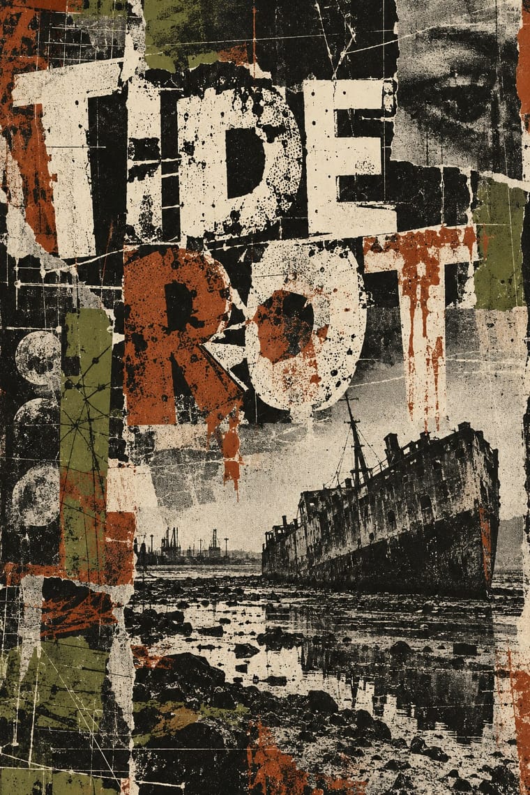
- Type from Grunge Typography
- Colour from Frutiger Aero
- Form from Frutiger Aero
- Composition from Grunge Typography
- Surface from Frutiger Aero
-
Grunge Typography avoids gloss & highlights: this is where the two pull against each other, which is the point of the contrast.
02
The type
Open fonts standing in for each style’s own type, which is often hand-drawn or commercial.
Text · Frutiger Aero
The glossy, optimistic look of consumer technology from the mid-2000s to the early 2010s, retrospectively named in 2017 by the Consumer Aesthetics Research Institute after Windows Vista's Aero interface and Adrian Frutiger's humanist sans. Translucent glass panels, glossy orbs and buttons, water droplets, bubbles, auroras, green fields and blue skies fused technology with clean nature, set in airy humanist sans-serifs.
Fira Sans; Frutiger Aero used Frutiger and Segoe UI
03
The colours
The ground and leading colours come from Frutiger Aero, with a counter-accent from Grunge Typography. The ink reads on the ground at 4.5:1 or more.
Frutiger Aero Grunge Typography
-
#f5fbffground · 36% -
#0b5fa5ink · 14% -
#22c3c9accent · 18% -
#a8322daccent · 14% -
#4fb3e8accent · 10% -
#b8e04aaccent · 8%
As CSS
:root {
  --ground: #f5fbff;
  --ink: #0b5fa5;
  --accent-1: #22c3c9;
  --accent-2: #a8322d;
  --accent-3: #4fb3e8;
  --accent-4: #b8e04a;
  --font-display: "Rock Salt", cursive;
  --font-text: "Fira Sans", sans-serif;
}
04
The two styles
05
More combinations
With Frutiger Aero
- Vaporwave Pairs well · Both trade on mid-2000s tech nostalgia; mix Aero bubbles and skies with vaporwave's pastel 3D for retro-internet campaigns.
- Brutalist Web Design Contrasts · Raw HTML against bubbly gloss is a sharp foil for ironic or nostalgic web projects.
- Glassmorphism Pairs well · Glassmorphism is its flatter heir; reintroduce a touch of Aero gloss and nature photography to warm up frosted-glass UI.
- Flat Design Contrasts · Flat design was the reaction that ended it; toggle gloss against flat to signal ‘then and now’ in retro tech work.
- Forum Signature Art (Sig & C4D Render Graphics) Contrasts · The same years' glossy, light and airy interface look against the sig's dark, smudged depth.
- Skeuomorphic UI Pairs well · Share gloss and depth; combine Aero's glass and nature with skeuomorphic objects for convincing 2000s-nostalgia interfaces.
- Punk & DIY Zine Contrasts · Glossy optimism is everything punk rejects; one torn xerox fragment on an aero gradient reads as instant sabotage.
- Solarpunk Contrasts · Both pair green nature with optimistic technology, but Aero renders it as glossy stock photography, bubbles and glass for a product; choose solarpunk for painted, handmade, lived-in places and shared infrastructure.
With Grunge Typography
- International Typographic Style Contrasts · Run a single eroded headline through an otherwise clean grid to signal attitude without sacrificing legibility.
- Acid Graphics / New Ugly Pairs well · Grunge's layered, distressed type is a direct ancestor of acid graphics; add chrome and neon to update it for today.
- Brutalist Web Design Pairs well · Raw web layouts absorb grunge's broken grids naturally; add one scanned texture for an analogue edge.
- Glitch Art & Datamosh Graphics Contrasts · Grunge scanned in photocopier grain and dirt and layered type on the Mac; glitch art breaks the file and lets the codec make the damage. Pick analogue distress or digital failure deliberately rather than stacking both.
- Kawaii Design Contrasts · Grunge's dirt and illegibility is kawaii's opposite; one cute character on a distressed texture creates knowing dissonance.
- British Style Press (The Face, i-D and Arena) Contrasts · Both broke magazine conventions, but grunge eroded and blurred letters while Brody's stay hard-edged and constructed; choose between decay and construction.
- Indie Sleaze Pairs well · Wikipedia describes the look as combining 1970s and 1980s fashion with grunge fashion, 'grubby' and 'performatively vintage'.
- Black Metal Graphics Contrasts · Both made legibility negotiable in the 1990s, but grunge layered and eroded digital type across a broken grid, while black metal draws one logo by hand and centres it in emptiness; pick analogue symmetry or digital disorder.