Style combination · Contrasts
Googie × Tiki Pop
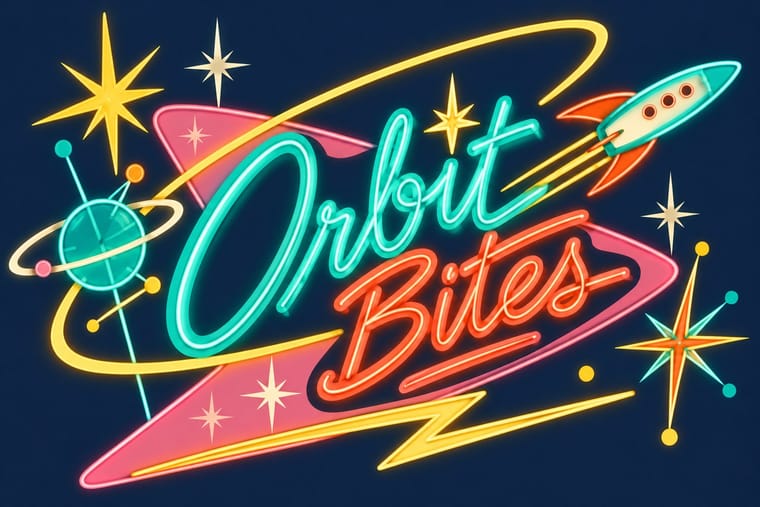
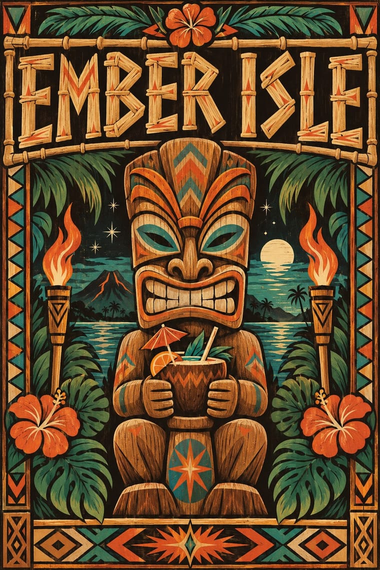
The same post-war roadside America built both, but Googie looks forward with boomerangs, starbursts and pastel space-age optimism while tiki looks back to a pseudo-primitive island in carved wood and torchlight; choose Googie to promise the future and tiki to offer an escape from it.
01
What each style brings
Each part of the design comes from the style with the stronger say in it, and each style gives at least two.
Googie & Atomic Age Tiki Pop (Polynesian Pop)
- Type from Tiki Pop
- Colour from Tiki Pop
-
Googie avoids earth & mineral: this is where the two pull against each other, which is the point of the contrast.
- Form from Googie
- Composition from Googie
- Surface from Tiki Pop
02
The type
Open fonts standing in for each style’s own type, which is often hand-drawn or commercial.
Display · Tiki Pop
Pop
Yellowtail, standing in for Casual brush script for venue names, as on the Waikiki Room menu at the Pick-Nicollet Hotel
Text · Googie
The exuberant commercial modernism of post-war American roadside culture (coffee shops, motels, car washes, bowling alleys and neon signs), named in 1952 by critic Douglas Haskell after John Lautner's Googie's coffee shop in Los Angeles (1949). Upswept roofs, boomerangs, starbursts, atoms and parabolic arches worked as giant signs for passing drivers, with casual scripts and neon promising a Space Age future.
Jost; Googie used Neon-tube script lettering and Dom Casual
03
The colours
The ground and leading colours come from Tiki Pop, with a counter-accent from Googie. The ink reads on the ground at 4.5:1 or more.
Googie & Atomic Age Tiki Pop (Polynesian Pop)
-
#1a1612ground · 36% -
#f0e2c3ink · 14% -
#d9622baccent · 18% -
#2a9d8faccent · 14% -
#f6cf3faccent · 10% -
#6b4423accent · 8%
As CSS
:root {
  --ground: #1a1612;
  --ink: #f0e2c3;
  --accent-1: #d9622b;
  --accent-2: #2a9d8f;
  --accent-3: #f6cf3f;
  --accent-4: #6b4423;
  --font-display: "Yellowtail", cursive;
  --font-text: "Jost", sans-serif;
}
Use it with care
Tiki Pop (Polynesian Pop): Tiki Pop is an outsider's pastiche built from sacred things: Polynesian wood images such as a Mangarevan tiki were carved to hold the mana of deities and stood on marae, and Hawaiian ki'i, Māori and Marquesan tiki belong to particular peoples, yet the style fused them into one grinning bar mascot and paired it with topless 'wahine' and 'savage' jokes, which Pacific artists such as Dan Taulapapa McMullin ('Tiki Manifesto') describe as erasure. Quote it as mid-century American commercial design, not as Polynesian art: invent your own non-sacred mascot rather than copying a named deity or museum carving, drop the sexualised island women and 'cannibal' caricature, do not use tā moko or Hawaiian words as decoration, and commission Pacific Islander artists when the subject is the Pacific itself.
04
The two styles
05
More combinations
With Googie
- Y2K Futurism Pairs well · Both sell a glossy future; add Googie starbursts and orbit lines to Y2K chrome for retro-futurism that spans both millennia.
- HfG Ulm Systematic Design Contrasts · Ulm's anti-styling functionalism is its sober opposite; use the contrast to calibrate how much showmanship a brand can bear.
- Hand-Painted Signage & Vernacular Lettering Pairs well · Pair Googie forms with sign-painter scripts and shaded lettering for convincing diner, motel and bowling-alley signage.
- Memphis Design Pairs well · Memphis revived its boomerangs and squiggles; mix the two for a playful atomic-meets-postmodern pattern system.
- City Pop Illustration Pairs well · Googie's motels, diners and boomerang roadside signs are the American architecture these painters idealised; borrow its signage and script for the fascias in a city pop street scene.
- Polish Cold War Neon (PRL Neonisation) Contrasts · Googie sold motels and coffee shops to passing drivers with starbursts, boomerangs and swept-back sign panels; the Polish signs answered to state planners rather than to passing trade and kept to a script name and a line figure on a modernist block. Borrow googie's bounce when a Polish-style sign feels too polite.
- Art Deco Pairs well · Googie's atomic starbursts extend Deco's celestial ornament; mix them for retro hospitality and signage.
- Streamline Moderne Pairs well · Googie is Streamline's post-war heir; combine their curves and speed lines for retro diner, travel or automotive branding.
With Tiki Pop
- Japonisme Contrasts · Both are Western absorptions of another culture's art, but Japonisme learned formal lessons (flat colour, cropping, asymmetry) while tiki took the sacred figures themselves as mascots; borrow a way of composing, not a god.
- Pacific Barkcloth (Tapa) Design Contrasts · Tiki menus borrowed tapa-like zigzag bands as mere borders; real ngatu, siapo and kapa are women's ceremonial wealth with named motifs, so set the two side by side to see what was flattened, and commission tapa makers rather than copying their patterns.
- Hand-Painted Signage & Vernacular Lettering Pairs well · Have a sign writer paint the bar's name in brush script and shaded bamboo capitals on weathered boards, so the lettering is made by hand rather than taken from a tiki font.
- Screenprinted Gig & Alt-Movie Poster Pairs well · For a tiki night or rum festival, hand-pull a flat, hand-lettered screenprint around one invented carved mascot in torch orange and lagoon teal, keeping the date and venue line legible.
- Kōwhaiwhai & Toi Māori Design Contrasts · Polynesian Pop folded Māori carving into one generic 'Tiki'; Toi Māori is taonga tied to particular iwi, so keep it out of tiki pastiche and work with Māori designers when the subject is Aotearoa.