Style combination · Pairs well
Hand-Painted Signage × Tiki Pop
Have a sign writer paint the bar's name in brush script and shaded bamboo capitals on weathered boards, so the lettering is made by hand rather than taken from a tiki font.
01
What each style brings
Each part of the design comes from the style with the stronger say in it, and each style gives at least two.
Hand-Painted Signage & Vernacular Lettering Tiki Pop (Polynesian Pop)
- Type from Tiki Pop
- Colour from Tiki Pop
- Form from Tiki Pop
- Composition from Hand-Painted Signage
- Surface from Hand-Painted Signage
02
The type
Open fonts standing in for each style’s own type, which is often hand-drawn or commercial.
Display · Tiki Pop
Wow
Yellowtail, standing in for Casual brush script for venue names, as on the Waikiki Room menu at the Pick-Nicollet Hotel
Text · Hand-Painted Signage
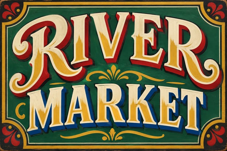
Letters painted by trained sign writers on fascias, windows, walls, vehicles and showcards, from Victorian gold leaf on glass to Mexican rótulos, Indian bazaar boards and Ghanaian barbershop signs. Brush-built letters with shading, drop shadows and outlines are fitted to the panel and mixed in a few styles for hierarchy, valuing legibility at a distance and the painter's flourish; vinyl displaced the craft in the 1980s and it has revived since the 2010s.
Oswald; Hand-Painted Signage used One-stroke casual (showcard) alphabet and Block and Egyptian sign writers' letters
03
The colours
The ground and leading colours come from Tiki Pop, with a counter-accent from Hand-Painted Signage. The ink reads on the ground at 4.5:1 or more.
Hand-Painted Signage & Vernacular Lettering Tiki Pop (Polynesian Pop)
-
#1a1612ground · 36% -
#f0e2c3ink · 14% -
#d9622baccent · 18% -
#c99a2eaccent · 14% -
#2a9d8faccent · 10% -
#b8262baccent · 8%
As CSS
:root {
  --ground: #1a1612;
  --ink: #f0e2c3;
  --accent-1: #d9622b;
  --accent-2: #c99a2e;
  --accent-3: #2a9d8f;
  --accent-4: #b8262b;
  --font-display: "Yellowtail", cursive;
  --font-text: "Oswald", sans-serif;
}
Use it with care
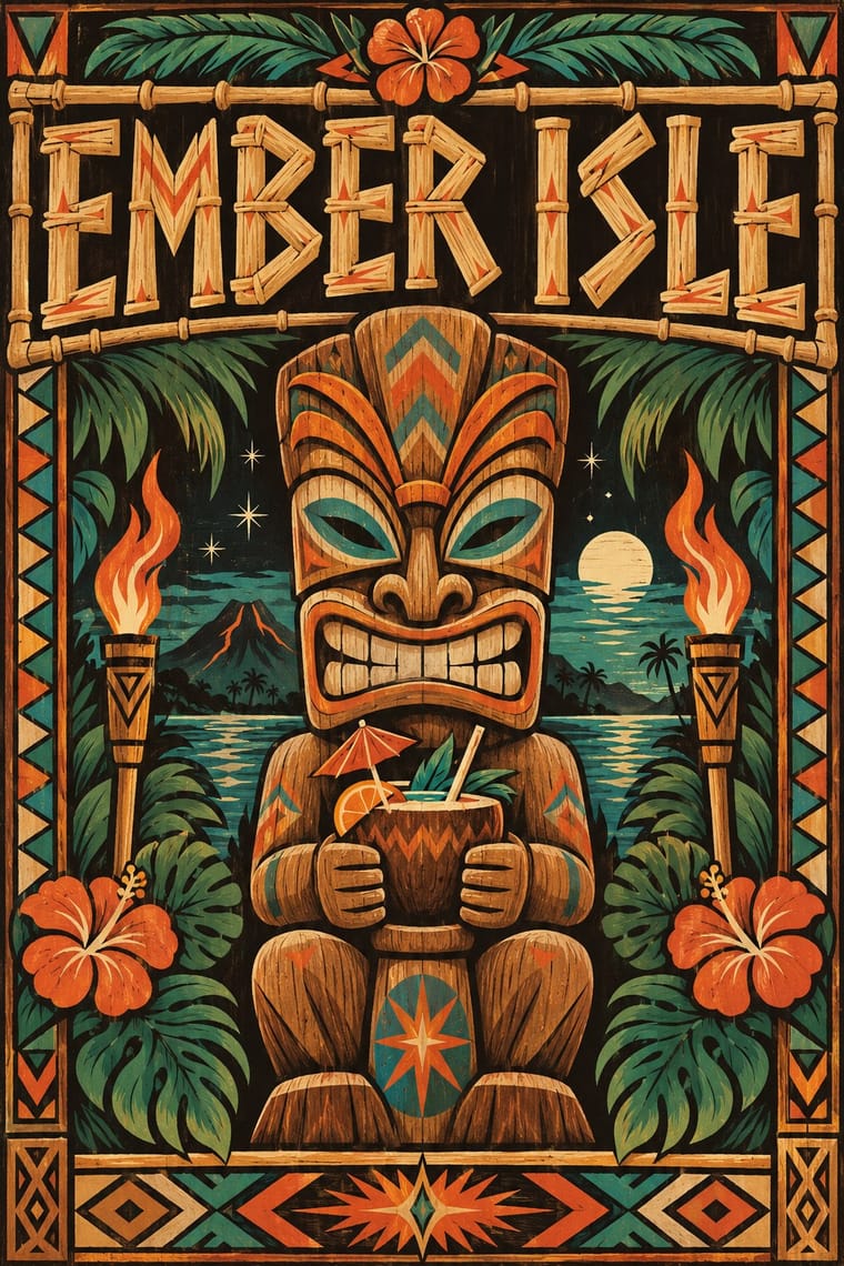
Tiki Pop (Polynesian Pop): Tiki Pop is an outsider's pastiche built from sacred things: Polynesian wood images such as a Mangarevan tiki were carved to hold the mana of deities and stood on marae, and Hawaiian ki'i, Māori and Marquesan tiki belong to particular peoples, yet the style fused them into one grinning bar mascot and paired it with topless 'wahine' and 'savage' jokes, which Pacific artists such as Dan Taulapapa McMullin ('Tiki Manifesto') describe as erasure. Quote it as mid-century American commercial design, not as Polynesian art: invent your own non-sacred mascot rather than copying a named deity or museum carving, drop the sexualised island women and 'cannibal' caricature, do not use tā moko or Hawaiian words as decoration, and commission Pacific Islander artists when the subject is the Pacific itself.
04
The two styles
05
More combinations
With Hand-Painted Signage
- Victorian Letterpress & Wood Type Pairs well · Sign writers and type founders traded letterforms; set a wood-type headline and finish it with painted shadows and outlines.
- West African Barbershop & Hair Salon Signs Pairs well · West African barbershop boards are the sign writer's catalogue genre; pair a painted name panel with a grid of numbered hairstyle portraits for a shop menu that reads from the street.
- Graffiti & Hip-Hop Graphics Pairs well · Graffiti writers inherited the sign painter's outlines and drop shadows; pair a disciplined sign alphabet with a wildstyle tag for contrast of control.
- Flat Design Contrasts · Against flat, machine-perfect UI, one hand-painted wordmark signals human craft; keep everything else flat so it stands out.
- Fileteado Porteño Pairs well · Add filete scrolls and bevelled shading to plain painted lettering for a richer, Buenos Aires-style sign.
- Roman-like Thai Typography (modern loopless Thai) Contrasts · A hand-painted shopfront sign, in looped letters or broad-nib Naris, beside a flat loopless headline shows the shift from the letterer's hand to dry transfer and digital type that Manop Srisomporn himself made.
- Generative & Dynamic Identities Contrasts · Hand-painted lettering's one-off irregularity is the human counterpart to algorithmic variation; mix the two only with clear intent.
- Italian Painted Film Poster (Rome Studios) Pairs well · Shares the painted-on-site lettering craft; borrow its bold hand-lettering for the title block.
With Tiki Pop
- Japonisme Contrasts · Both are Western absorptions of another culture's art, but Japonisme learned formal lessons (flat colour, cropping, asymmetry) while tiki took the sacred figures themselves as mascots; borrow a way of composing, not a god.
- Googie & Atomic Age Contrasts · The same post-war roadside America built both, but Googie looks forward with boomerangs, starbursts and pastel space-age optimism while tiki looks back to a pseudo-primitive island in carved wood and torchlight; choose Googie to promise the future and tiki to offer an escape from it.
- Pacific Barkcloth (Tapa) Design Contrasts · Tiki menus borrowed tapa-like zigzag bands as mere borders; real ngatu, siapo and kapa are women's ceremonial wealth with named motifs, so set the two side by side to see what was flattened, and commission tapa makers rather than copying their patterns.
- Screenprinted Gig & Alt-Movie Poster Pairs well · For a tiki night or rum festival, hand-pull a flat, hand-lettered screenprint around one invented carved mascot in torch orange and lagoon teal, keeping the date and venue line legible.
- Kōwhaiwhai & Toi Māori Design Contrasts · Polynesian Pop folded Māori carving into one generic 'Tiki'; Toi Māori is taonga tied to particular iwi, so keep it out of tiki pastiche and work with Māori designers when the subject is Aotearoa.