Style combination · Pairs well
Googie × Hand-Painted Signage
Pair Googie forms with sign-painter scripts and shaded lettering for convincing diner, motel and bowling-alley signage.
01
What each style brings
Each part of the design comes from the style with the stronger say in it, and each style gives at least two.
Googie & Atomic Age Hand-Painted Signage & Vernacular Lettering
- Type from Hand-Painted Signage
- Colour from Googie
- Form from Googie
- Composition from Googie
- Surface from Hand-Painted Signage
02
The type
Open fonts standing in for each style’s own type, which is often hand-drawn or commercial.
Text · Googie
The exuberant commercial modernism of post-war American roadside culture (coffee shops, motels, car washes, bowling alleys and neon signs), named in 1952 by critic Douglas Haskell after John Lautner's Googie's coffee shop in Los Angeles (1949). Upswept roofs, boomerangs, starbursts, atoms and parabolic arches worked as giant signs for passing drivers, with casual scripts and neon promising a Space Age future.
Jost; Googie used Neon-tube script lettering and Dom Casual
03
The colours
The ground and leading colours come from Googie, with a counter-accent from Hand-Painted Signage. The ink reads on the ground at 4.5:1 or more.
Googie & Atomic Age Hand-Painted Signage & Vernacular Lettering
-
#1e2b4aground · 36% -
#f3ead6ink · 14% -
#f2673aaccent · 18% -
#c99a2eaccent · 14% -
#f6cf3faccent · 10% -
#b8262baccent · 8%
As CSS
:root {
  --ground: #1e2b4a;
  --ink: #f3ead6;
  --accent-1: #f2673a;
  --accent-2: #c99a2e;
  --accent-3: #f6cf3f;
  --accent-4: #b8262b;
  --font-display: "Yellowtail", cursive;
  --font-text: "Jost", sans-serif;
}
04
The two styles
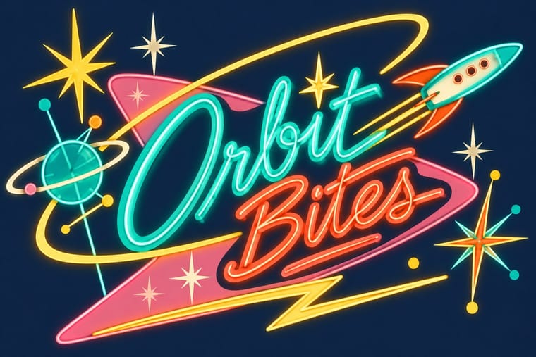
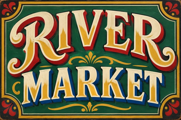
05
More combinations
With Googie
- Y2K Futurism Pairs well · Both sell a glossy future; add Googie starbursts and orbit lines to Y2K chrome for retro-futurism that spans both millennia.
- HfG Ulm Systematic Design Contrasts · Ulm's anti-styling functionalism is its sober opposite; use the contrast to calibrate how much showmanship a brand can bear.
- Memphis Design Pairs well · Memphis revived its boomerangs and squiggles; mix the two for a playful atomic-meets-postmodern pattern system.
- City Pop Illustration Pairs well · Googie's motels, diners and boomerang roadside signs are the American architecture these painters idealised; borrow its signage and script for the fascias in a city pop street scene.
- Polish Cold War Neon (PRL Neonisation) Contrasts · Googie sold motels and coffee shops to passing drivers with starbursts, boomerangs and swept-back sign panels; the Polish signs answered to state planners rather than to passing trade and kept to a script name and a line figure on a modernist block. Borrow googie's bounce when a Polish-style sign feels too polite.
- Art Deco Pairs well · Googie's atomic starbursts extend Deco's celestial ornament; mix them for retro hospitality and signage.
- Streamline Moderne Pairs well · Googie is Streamline's post-war heir; combine their curves and speed lines for retro diner, travel or automotive branding.
- Tiki Pop (Polynesian Pop) Contrasts · The same post-war roadside America built both, but Googie looks forward with boomerangs, starbursts and pastel space-age optimism while tiki looks back to a pseudo-primitive island in carved wood and torchlight; choose Googie to promise the future and tiki to offer an escape from it.
With Hand-Painted Signage
- Victorian Letterpress & Wood Type Pairs well · Sign writers and type founders traded letterforms; set a wood-type headline and finish it with painted shadows and outlines.
- West African Barbershop & Hair Salon Signs Pairs well · West African barbershop boards are the sign writer's catalogue genre; pair a painted name panel with a grid of numbered hairstyle portraits for a shop menu that reads from the street.
- Graffiti & Hip-Hop Graphics Pairs well · Graffiti writers inherited the sign painter's outlines and drop shadows; pair a disciplined sign alphabet with a wildstyle tag for contrast of control.
- Flat Design Contrasts · Against flat, machine-perfect UI, one hand-painted wordmark signals human craft; keep everything else flat so it stands out.
- Fileteado Porteño Pairs well · Add filete scrolls and bevelled shading to plain painted lettering for a richer, Buenos Aires-style sign.
- Roman-like Thai Typography (modern loopless Thai) Contrasts · A hand-painted shopfront sign, in looped letters or broad-nib Naris, beside a flat loopless headline shows the shift from the letterer's hand to dry transfer and digital type that Manop Srisomporn himself made.
- Generative & Dynamic Identities Contrasts · Hand-painted lettering's one-off irregularity is the human counterpart to algorithmic variation; mix the two only with clear intent.
- Italian Painted Film Poster (Rome Studios) Pairs well · Shares the painted-on-site lettering craft; borrow its bold hand-lettering for the title block.