Style combination · Pairs well
Screenprinted Gig × Tiki Pop
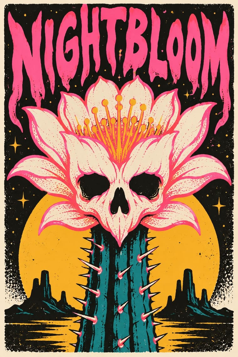
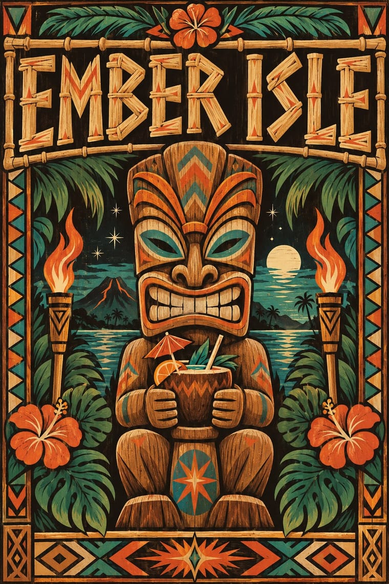
For a tiki night or rum festival, hand-pull a flat, hand-lettered screenprint around one invented carved mascot in torch orange and lagoon teal, keeping the date and venue line legible.
01
What each style brings
Each part of the design comes from the style with the stronger say in it, and each style gives at least two.
Screenprinted Gig & Alt-Movie Poster Tiki Pop (Polynesian Pop)
- Type from Tiki Pop
- Colour from Screenprinted Gig
- Form from Tiki Pop
- Composition from Screenprinted Gig
- Surface from Tiki Pop
02
The type
Open fonts standing in for each style’s own type, which is often hand-drawn or commercial.
Display · Tiki Pop
Hello
Yellowtail, standing in for Casual brush script for venue names, as on the Waikiki Room menu at the Pick-Nicollet Hotel
Text · Screenprinted Gig
Hand-pulled, numbered screenprints that revived the rock poster in Austin from 1991, led by Frank Kozik, and spread via Flatstock fairs and, from 2004, Mondo to 'alternative' film posters, for collectors as much as the show. The gig posters lean to fluorescent inks, innocent cartoons in bizarre scenes and dense psychedelic layers; the film posters, often by the same artists, to Bass-like silhouettes or a whole cast on one sheet. A few flat inks, opaque or overprinting, sometimes metallic, carry hand-drawn lettering and usually one witty idea, sweet and sinister, nostalgic and knowing.
Oswald; Screenprinted Gig used Hand-drawn display lettering by the poster artist, drawn into the image and Condensed sans-serif and wood-type-style capitals for the band, venue and date line
03
The colours
The ground and leading colours come from Screenprinted Gig, with a counter-accent from Tiki Pop. The ink reads on the ground at 4.5:1 or more.
Screenprinted Gig & Alt-Movie Poster Tiki Pop (Polynesian Pop)
-
#1d1c1aground · 36% -
#f1ead8ink · 14% -
#f2b134accent · 18% -
#d9622baccent · 14% -
#2a9d8faccent · 10% -
#ff4f9aaccent · 8%
As CSS
:root {
  --ground: #1d1c1a;
  --ink: #f1ead8;
  --accent-1: #f2b134;
  --accent-2: #d9622b;
  --accent-3: #2a9d8f;
  --accent-4: #ff4f9a;
  --font-display: "Yellowtail", cursive;
  --font-text: "Oswald", sans-serif;
}
Use it with care
Screenprinted Gig & Alt-Movie Poster: Film characters, logos and band names belong to their owners: Mondo's Star Wars and Marvel posters were made under licence from Lucasfilm and Disney, so clear the rights before printing a fan 'alt poster'; gig posters are the living trade of named independent printmakers, so commission or credit them rather than generating look-alikes of a recognisable artist's hand; and when you borrow the scene's sweet-and-sinister mix, keep the sinister half to monsters, skulls and noir rather than hate symbols or real atrocities: Kozik's own art drew on the iconography of Franco's fascist regime, under which he spent his earliest years in Spain, and that is not a costume to reuse.
Tiki Pop (Polynesian Pop): Tiki Pop is an outsider's pastiche built from sacred things: Polynesian wood images such as a Mangarevan tiki were carved to hold the mana of deities and stood on marae, and Hawaiian ki'i, Māori and Marquesan tiki belong to particular peoples, yet the style fused them into one grinning bar mascot and paired it with topless 'wahine' and 'savage' jokes, which Pacific artists such as Dan Taulapapa McMullin ('Tiki Manifesto') describe as erasure. Quote it as mid-century American commercial design, not as Polynesian art: invent your own non-sacred mascot rather than copying a named deity or museum carving, drop the sexualised island women and 'cannibal' caricature, do not use tā moko or Hawaiian words as decoration, and commission Pacific Islander artists when the subject is the Pacific itself.
04
The two styles
05
More combinations
With Screenprinted Gig
- Pop Art Graphics Pairs well · Shepard Fairey called Kozik 'the punk rock Warhol'; take Pop's appropriated cartoons and halftones and give them a gig poster's single idea and hand-lettered title.
- Psychedelic Poster Pairs well · The 1960s Fillmore and Avalon posters are its ancestor; borrow one swelling, shape-filling title from them, but keep the band, date and venue line readable.
- Polish Poster School Pairs well · Both swap the star's photograph for one idea; add the Polish school's painted ambiguity to a flat screenprint when a film poster needs to unsettle rather than wink.
- Australian Poster Collective Screenprints Contrasts · Both hand-pull flat, hand-lettered screenprints from the same psychedelic root and both reach for fluoro inks; the Australian collectives printed for unions, marches and community causes (and some bands), often from photo stencils, and pasted them up at night, while the gig and alt-movie poster prints for one show, one film and a collector's wall, trading agitation for wit and nostalgia.
- American Mid-Century Modernism Pairs well · Saul Bass's film posters are a favourite model of the alternative movie poster (Film Comment found the Bass homages 'far too plentiful' in 2014); borrow his one cut-paper symbol that holds the whole story.
- WPA Silkscreen Posters Pairs well · Firewatch, the game Olly Moss art-directed, takes its look from National Park posters, and Killscreen (2014) likened its trailer to the Federal Art Project's 1930s national-park posters; give a fannish subject that calm public-service look and the wit shows.
- Risograph & Indie Print Culture Contrasts · Riso gives translucent soy inks and grain on small sheets; choose the screenprint for heavier ink, opaque where it must cover, on a large sheet that collectors frame, and riso for cheap, quick runs.
- Bandung Distro Graphics Pairs well · Both screenprint scene-made graphics for bands; distro moves the print from paper onto cloth.
With Tiki Pop
- Japonisme Contrasts · Both are Western absorptions of another culture's art, but Japonisme learned formal lessons (flat colour, cropping, asymmetry) while tiki took the sacred figures themselves as mascots; borrow a way of composing, not a god.
- Googie & Atomic Age Contrasts · The same post-war roadside America built both, but Googie looks forward with boomerangs, starbursts and pastel space-age optimism while tiki looks back to a pseudo-primitive island in carved wood and torchlight; choose Googie to promise the future and tiki to offer an escape from it.
- Pacific Barkcloth (Tapa) Design Contrasts · Tiki menus borrowed tapa-like zigzag bands as mere borders; real ngatu, siapo and kapa are women's ceremonial wealth with named motifs, so set the two side by side to see what was flattened, and commission tapa makers rather than copying their patterns.
- Hand-Painted Signage & Vernacular Lettering Pairs well · Have a sign writer paint the bar's name in brush script and shaded bamboo capitals on weathered boards, so the lettering is made by hand rather than taken from a tiki font.
- Kōwhaiwhai & Toi Māori Design Contrasts · Polynesian Pop folded Māori carving into one generic 'Tiki'; Toi Māori is taonga tied to particular iwi, so keep it out of tiki pastiche and work with Māori designers when the subject is Aotearoa.