Style combination · Contrasts
Googie × Polish Cold War Neon
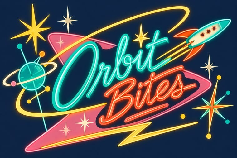
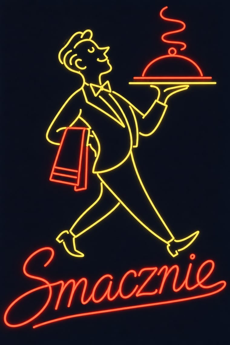
Googie sold motels and coffee shops to passing drivers with starbursts, boomerangs and swept-back sign panels; the Polish signs answered to state planners rather than to passing trade and kept to a script name and a line figure on a modernist block. Borrow googie's bounce when a Polish-style sign feels too polite.
01
What each style brings
Each part of the design comes from the style with the stronger say in it, and each style gives at least two.
Googie & Atomic Age Polish Cold War Neon (PRL Neonisation)
- Type from Polish Cold War Neon
- Colour from Polish Cold War Neon
- Form from Googie
- Composition from Polish Cold War Neon
- Surface from Googie
02
The type
Open fonts standing in for each style’s own type, which is often hand-drawn or commercial.
Display · Polish Cold War Neon
Signal
Yellowtail; Polish Cold War Neon used Artist-drawn script bent from thin glass tube, often a letterform invented for the one sign and composed so finely that it read more as ornament than as ordinary writing (Zieliński and Tarwacka) and Block capitals for rooftop signs, and in the 1970s heavy block letters filled or backlit with tube
Text · Googie
The exuberant commercial modernism of post-war American roadside culture (coffee shops, motels, car washes, bowling alleys and neon signs), named in 1952 by critic Douglas Haskell after John Lautner's Googie's coffee shop in Los Angeles (1949). Upswept roofs, boomerangs, starbursts, atoms and parabolic arches worked as giant signs for passing drivers, with casual scripts and neon promising a Space Age future.
Jost; Googie used Neon-tube script lettering and Dom Casual
03
The colours
The ground and leading colours come from Polish Cold War Neon, with a counter-accent from Googie. The ink reads on the ground at 4.5:1 or more.
Googie & Atomic Age Polish Cold War Neon (PRL Neonisation)
-
#0d1120ground · 36% -
#f6f1e4ink · 14% -
#ff3b30accent · 18% -
#ffc83daccent · 14% -
#5b9dffaccent · 10% -
#3ee08faccent · 8%
As CSS
:root {
  --ground: #0d1120;
  --ink: #f6f1e4;
  --accent-1: #ff3b30;
  --accent-2: #ffc83d;
  --accent-3: #5b9dff;
  --accent-4: #3ee08f;
  --font-display: "Yellowtail", cursive;
  --font-text: "Jost", sans-serif;
}
Use it with care
Polish Cold War Neon (PRL Neonisation): Draw new names and figures rather than copying surviving signs: Siatkarka is a registered monument by a named designer, the Neon Muzeum restores and relights others in situ, and wordmarks such as Społem, Cepelia and Jubiler are still in use; and remember that these lights advertised the modern city for a one-party state, often over shops whose shelves were empty.
04
The two styles
05
More combinations
With Googie
- Y2K Futurism Pairs well · Both sell a glossy future; add Googie starbursts and orbit lines to Y2K chrome for retro-futurism that spans both millennia.
- HfG Ulm Systematic Design Contrasts · Ulm's anti-styling functionalism is its sober opposite; use the contrast to calibrate how much showmanship a brand can bear.
- Hand-Painted Signage & Vernacular Lettering Pairs well · Pair Googie forms with sign-painter scripts and shaded lettering for convincing diner, motel and bowling-alley signage.
- Memphis Design Pairs well · Memphis revived its boomerangs and squiggles; mix the two for a playful atomic-meets-postmodern pattern system.
- City Pop Illustration Pairs well · Googie's motels, diners and boomerang roadside signs are the American architecture these painters idealised; borrow its signage and script for the fascias in a city pop street scene.
- Art Deco Pairs well · Googie's atomic starbursts extend Deco's celestial ornament; mix them for retro hospitality and signage.
- Streamline Moderne Pairs well · Googie is Streamline's post-war heir; combine their curves and speed lines for retro diner, travel or automotive branding.
- Tiki Pop (Polynesian Pop) Contrasts · The same post-war roadside America built both, but Googie looks forward with boomerangs, starbursts and pastel space-age optimism while tiki looks back to a pseudo-primitive island in carved wood and torchlight; choose Googie to promise the future and tiki to offer an escape from it.
With Polish Cold War Neon
- Polish Poster School Pairs well · Some of the same artists drew posters and neons; take the poster's single witty idea and hand-drawn title and translate it into one line of light for a night version of a campaign.
- Thaw Modernism (Soviet and Czechoslovak) Pairs well · The thaw's laconic figures, few flat colours and civic optimism are the daytime print counterpart of these signs; pair them for a cinema, café or festival identity that has to work on paper and on a facade.
- Synthwave / Outrun Contrasts · Synthwave remembers neon as a glowing grid, chrome and sunset gradients on a screen; the Polish signs were real tubes in one or two colours with no gradients. Use the contrast to keep a neon revival honest to the single line.
- Hong Kong Neon & Beiwei Shop-Sign Lettering Contrasts · Both bend shop names into glass tube against the night, but Kowloon's calligraphers stacked heavy Beiwei characters on signs projecting over a crowded commercial street, while Poland's planners placed one light openwork sign per roof or facade in one or two trade colours; compare them to choose between a canyon of competing signs and a single emblem on the skyline.
- Socialist Realist Propaganda Poster Contrasts · Siatkarka plays on the roof of a socialist-realist house at MDM: a light, playful line figure over a heavy, monumental facade. Set the two side by side to show what the thaw changed.