Style combination · Contrasts
Kōwhaiwhai × Tiki Pop
Polynesian Pop folded Māori carving into one generic 'Tiki'; Toi Māori is taonga tied to particular iwi, so keep it out of tiki pastiche and work with Māori designers when the subject is Aotearoa.
01
What each style brings
Each part of the design comes from the style with the stronger say in it, and each style gives at least two.
Kōwhaiwhai & Toi Māori Design Tiki Pop (Polynesian Pop)
- Type from Tiki Pop
- Colour from Kōwhaiwhai
- Form from Kōwhaiwhai
- Composition from Kōwhaiwhai
- Surface from Tiki Pop
02
The type
Open fonts standing in for each style’s own type, which is often hand-drawn or commercial.
Display · Tiki Pop
Hello
Yellowtail, standing in for Casual brush script for venue names, as on the Waikiki Room menu at the Pick-Nicollet Hotel
Text · Kōwhaiwhai
Toi Māori, the visual arts of the tangata whenua of Aotearoa, of which kōwhaiwhai, the painted scroll patterns of paddles and meeting-house rafters, is the most graphic strand. Patterns are built from the koru (unfurling frond) and crescent forms in red ochre (kōkōwai), black and white, balancing positive and negative shapes in long mirrored bands, alongside carving (whakairo), tukutuku lattice panels and woven tāniko.
Archivo; Kōwhaiwhai used Whakarare and Painted and carved lettering in 19th-century meeting houses
03
The colours
The ground and leading colours come from Kōwhaiwhai, with a counter-accent from Tiki Pop. The ink reads on the ground at 4.5:1 or more.
Kōwhaiwhai & Toi Māori Design Tiki Pop (Polynesian Pop)
-
#f2efe8ground · 36% -
#141210ink · 14% -
#c46b2baccent · 18% -
#a3322aaccent · 14% -
#2a9d8faccent · 10% -
#6b4423accent · 8%
As CSS
:root {
  --ground: #f2efe8;
  --ink: #141210;
  --accent-1: #c46b2b;
  --accent-2: #a3322a;
  --accent-3: #2a9d8f;
  --accent-4: #6b4423;
  --font-display: "Yellowtail", cursive;
  --font-text: "Archivo", sans-serif;
}
Use it with care
Kōwhaiwhai & Toi Māori Design: Toi Māori is taonga: kōwhaiwhai patterns can belong to particular iwi and houses and carry whakapapa, and tā moko is personal and especially restricted. Work with Māori designers and iwi under tikanga, credit them, and do not graft koru onto letters or products as generic 'tribal' decoration.
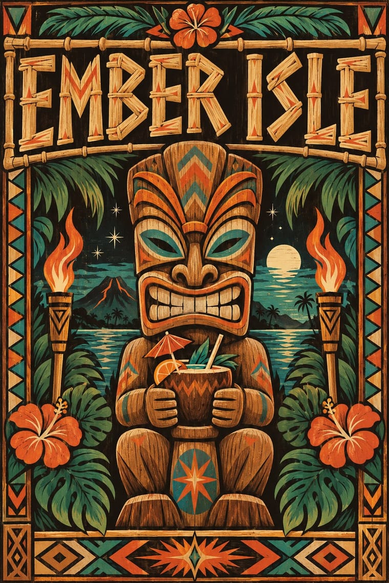
Tiki Pop (Polynesian Pop): Tiki Pop is an outsider's pastiche built from sacred things: Polynesian wood images such as a Mangarevan tiki were carved to hold the mana of deities and stood on marae, and Hawaiian ki'i, Māori and Marquesan tiki belong to particular peoples, yet the style fused them into one grinning bar mascot and paired it with topless 'wahine' and 'savage' jokes, which Pacific artists such as Dan Taulapapa McMullin ('Tiki Manifesto') describe as erasure. Quote it as mid-century American commercial design, not as Polynesian art: invent your own non-sacred mascot rather than copying a named deity or museum carving, drop the sexualised island women and 'cannibal' caricature, do not use tā moko or Hawaiian words as decoration, and commission Pacific Islander artists when the subject is the Pacific itself.
04
The two styles
05
More combinations
With Kōwhaiwhai
- Art Nouveau Pairs well · Both build on the living, curling stem; compare their curves to find a rhythm that is organic without being florid.
- International Typographic Style Contrasts · A rectilinear grid and neutral sans throw mirrored koru bands into relief, which suits bilingual institutional work in Aotearoa.
- Northwest Coast Formline Design Contrasts · Abstract koru bands and figurative formline crests are distinct Indigenous systems, not one 'tribal' look; study the difference and never blend them.
- Pacific Barkcloth (Tapa) Design Contrasts · Curvilinear kōwhaiwhai and ruled, gridded Polynesian barkcloth belong to different peoples and grammars; keep them separate and credit each source.
- Op Art Graphics Pairs well · Kōwhaiwhai figure-ground reversal reads as optical pattern, but Gordon Walters' koru paintings show the appropriation risk, so work with Māori artists.
- Uli & Nsibidi Line and Sign Tradition Contrasts · Both build from curving line and balance positive against negative space, but kōwhaiwhai mirrors koru in continuous bands along a rafter, while uli scatters single motifs asymmetrically over open skin, wall or paper.
- Torres Strait Islander Linocut Contrasts · Another Oceanian pattern tradition, but kōwhaiwhai paints symmetrical koru scrolls in red, black and white along rafters, while Torres Strait linocut carves hatching around narrative figures; never treat Māori and Torres Strait design as one 'Pacific' style.
With Tiki Pop
- Japonisme Contrasts · Both are Western absorptions of another culture's art, but Japonisme learned formal lessons (flat colour, cropping, asymmetry) while tiki took the sacred figures themselves as mascots; borrow a way of composing, not a god.
- Googie & Atomic Age Contrasts · The same post-war roadside America built both, but Googie looks forward with boomerangs, starbursts and pastel space-age optimism while tiki looks back to a pseudo-primitive island in carved wood and torchlight; choose Googie to promise the future and tiki to offer an escape from it.
- Pacific Barkcloth (Tapa) Design Contrasts · Tiki menus borrowed tapa-like zigzag bands as mere borders; real ngatu, siapo and kapa are women's ceremonial wealth with named motifs, so set the two side by side to see what was flattened, and commission tapa makers rather than copying their patterns.
- Hand-Painted Signage & Vernacular Lettering Pairs well · Have a sign writer paint the bar's name in brush script and shaded bamboo capitals on weathered boards, so the lettering is made by hand rather than taken from a tiki font.
- Screenprinted Gig & Alt-Movie Poster Pairs well · For a tiki night or rum festival, hand-pull a flat, hand-lettered screenprint around one invented carved mascot in torch orange and lagoon teal, keeping the date and venue line legible.