Style combination · Pairs well
Googie × Y2K Futurism
Both sell a glossy future; add Googie starbursts and orbit lines to Y2K chrome for retro-futurism that spans both millennia.
Add Googie starbursts and orbit lines to Y2K chrome for a retro-futurism that spans mid-century and millennial optimism.
01
What each style brings
Each part of the design comes from the style with the stronger say in it, and each style gives at least two.
Googie & Atomic Age Y2K Futurism
- Type from Googie
- Colour from Y2K Futurism
- Form from Googie
- Composition from Googie
- Surface from Y2K Futurism
02
The type
Open fonts standing in for each style’s own type, which is often hand-drawn or commercial.
Text · Y2K Futurism
The optimistic, chrome-plated vision of the future that surrounded the turn of the millennium, spread by consumer electronics, music videos, games, fashion and dot-com branding. Translucent candy-coloured plastics, liquid-metal and bubble 3D renders, lens flares, wide techno sans-serifs and icy silver-and-blue palettes sold the digital age as sleek, fluid and weightless, until the dot-com crash dimmed it.
IBM Plex Mono; Y2K Futurism used Eurostile Extended and Microgramma
03
The colours
The ground and leading colours come from Y2K Futurism, with a counter-accent from Googie. The ink reads on the ground at 4.5:1 or more.
Googie & Atomic Age Y2K Futurism
-
#f5f7faground · 36% -
#141414ink · 14% -
#1f6fffaccent · 18% -
#f2673aaccent · 14% -
#b4f02eaccent · 10% -
#f6cf3faccent · 8%
As CSS
:root {
  --ground: #f5f7fa;
  --ink: #141414;
  --accent-1: #1f6fff;
  --accent-2: #f2673a;
  --accent-3: #b4f02e;
  --accent-4: #f6cf3f;
  --font-display: "Yellowtail", cursive;
  --font-text: "IBM Plex Mono", monospace;
}
04
The two styles
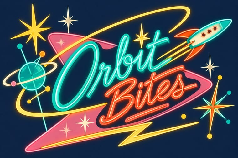
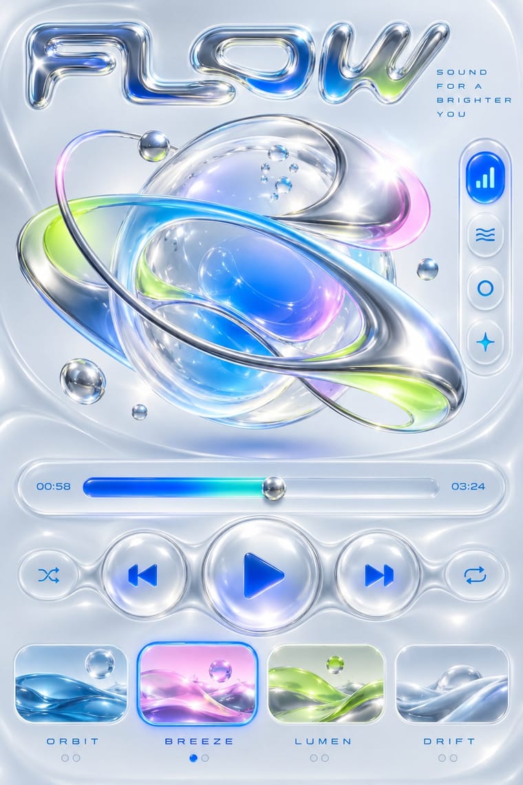
05
More combinations
With Googie
- HfG Ulm Systematic Design Contrasts · Ulm's anti-styling functionalism is its sober opposite; use the contrast to calibrate how much showmanship a brand can bear.
- Hand-Painted Signage & Vernacular Lettering Pairs well · Pair Googie forms with sign-painter scripts and shaded lettering for convincing diner, motel and bowling-alley signage.
- Memphis Design Pairs well · Memphis revived its boomerangs and squiggles; mix the two for a playful atomic-meets-postmodern pattern system.
- City Pop Illustration Pairs well · Googie's motels, diners and boomerang roadside signs are the American architecture these painters idealised; borrow its signage and script for the fascias in a city pop street scene.
- Polish Cold War Neon (PRL Neonisation) Contrasts · Googie sold motels and coffee shops to passing drivers with starbursts, boomerangs and swept-back sign panels; the Polish signs answered to state planners rather than to passing trade and kept to a script name and a line figure on a modernist block. Borrow googie's bounce when a Polish-style sign feels too polite.
- Art Deco Pairs well · Googie's atomic starbursts extend Deco's celestial ornament; mix them for retro hospitality and signage.
- Streamline Moderne Pairs well · Googie is Streamline's post-war heir; combine their curves and speed lines for retro diner, travel or automotive branding.
- Tiki Pop (Polynesian Pop) Contrasts · The same post-war roadside America built both, but Googie looks forward with boomerangs, starbursts and pastel space-age optimism while tiki looks back to a pseudo-primitive island in carved wood and torchlight; choose Googie to promise the future and tiki to offer an escape from it.
With Y2K Futurism
- Ma & Wabi-sabi Aesthetics Contrasts · Weathered, imperfect materiality is the exact opposite of frictionless chrome; one raw texture can ground a too-slick render.
- Frutiger Aero Pairs well · Soften chrome into glass and swap cosmic voids for skies and water to move from Y2K toward Aero's eco-optimism.
- Acid Graphics / New Ugly Pairs well · Acid graphics inherits its chrome and liquid metal; push Y2K renders toward distortion and spiky type for a harder contemporary edge.
- Techno-Futurist Graphics Pairs well · Add Y2K chrome and translucent plastics to techno-futurist pictograms for a late-1990s consumer-electronics look.
- Media-Player & Desktop Skins (Winamp-Era Skinning) Contrasts · Y2K's light candy grounds, translucency and blobs in marketing and print against the skins' dense dark-metal consoles; borrow one translucent blob to lift a heavy chrome player toward the millennium mood.
- Rave & Acid House Graphics Pairs well · Share chrome, gradients and techno optimism; combine them for a late-1990s club-to-millennium look.
- Global Village Coffeehouse Contrasts · CARI notes the pendulum swung from GVC back to minimalist, tech and clean looks such as Y2K; set chrome and translucent blue against terracotta and scratchboard marks to show that turn in one spread.
- Claymorphism & Soft 3D Contrasts · Both float rounded 3D renders on pale grounds, but Y2K is chrome, liquid metal and translucent candy plastic sold as the future; keep claymorphism opaque, soft and cute, with satin or matte surfaces and at most a soft highlight, and borrow chrome only for a retro-tech joke.