Style combination · Pairs well
Generative × Op Art Graphics
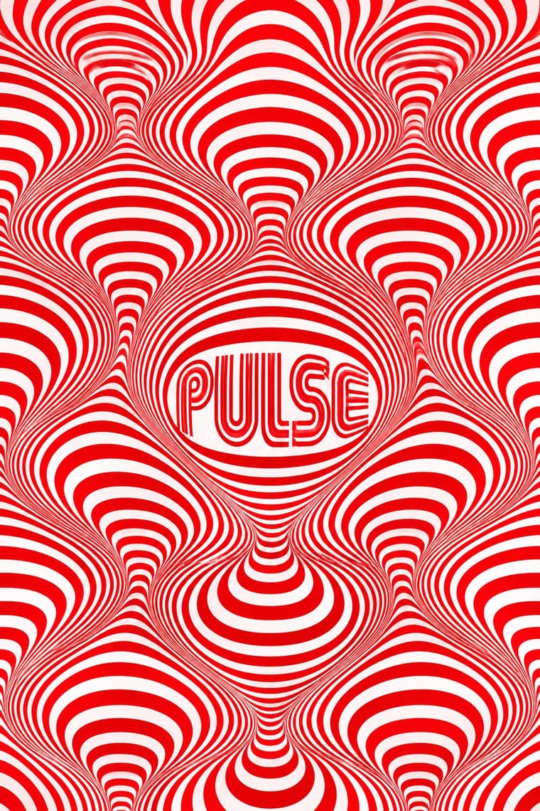
Code op's progressive line modulation so an identity can animate and vary while staying perceptually striking.
Op Art's line modulation and moiré are ready-made rules for patterns that respond to data or motion.
01
What each style brings
Each part of the design comes from the style with the stronger say in it, and each style gives at least two.
Generative & Dynamic Identities Op Art Graphics
- Type from Op Art Graphics
-
Generative avoids ornamented display: this is where the two pull against each other.
- Colour from Op Art Graphics
- Form from Generative
- Composition from Op Art Graphics
- Surface from Generative
02
The type
Open fonts standing in for each style’s own type, which is often hand-drawn or commercial.
Display · Op Art Graphics
Circuit
Monoton, standing in for Mexico 68 multiline lettering (Lance Wyman)
Text · Generative
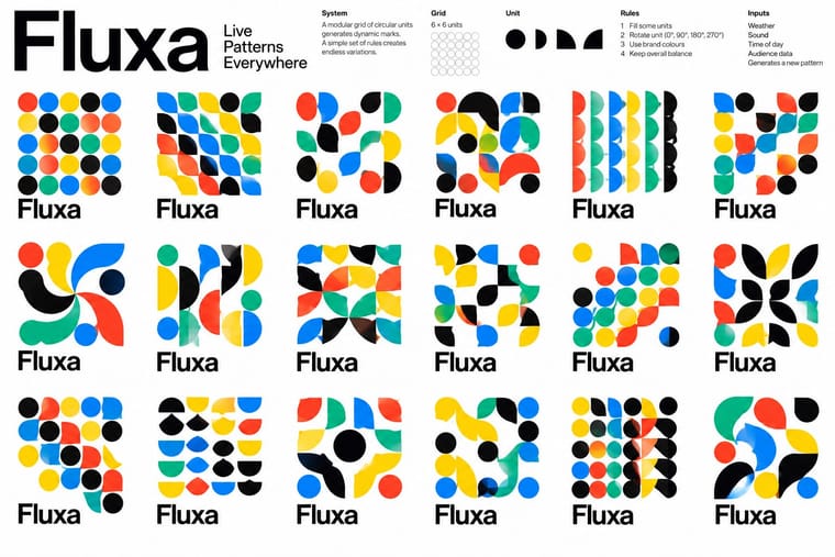
Identity systems designed as rules rather than fixed marks: logos and graphics generated by code, data or parameters so that they vary endlessly while staying recognisable. Anticipated by Karl Gerstner's Designing Programmes (1964) and launched by projects such as Sagmeister's Casa da Música (2007) and TheGreenEyl's MIT Media Lab identity (2011), the approach now spans responsive, data-driven and AI-assisted brands.
Inter; Generative used Neue Haas Grotesk and Variable fonts
03
The colours
The ground and leading colours come from Op Art Graphics, with a counter-accent from Generative. The ink reads on the ground at 4.5:1 or more.
Generative & Dynamic Identities Op Art Graphics
-
#ffffffground · 36% -
#0a0a0aink · 14% -
#e3001baccent · 18% -
#0091ffaccent · 14% -
#0050b5accent · 10% -
#ffd400accent · 8%
As CSS
:root {
  --ground: #ffffff;
  --ink: #0a0a0a;
  --accent-1: #e3001b;
  --accent-2: #0091ff;
  --accent-3: #0050b5;
  --accent-4: #ffd400;
  --font-display: "Monoton", sans-serif;
  --font-text: "Inter", sans-serif;
}
04
The two styles
05
More combinations
With Generative
- Hand-Painted Signage & Vernacular Lettering Contrasts · Hand-painted lettering's one-off irregularity is the human counterpart to algorithmic variation; mix the two only with clear intent.
- Corporate Identity Modernism Pairs well · Keep one invariant element from corporate modernism, such as a fixed wordmark or colour, so the variable identity stays recognisable.
- International Typographic Style Pairs well · Use a Swiss modular grid as the fixed frame so generated variants stay coherent across the whole system.
- Dark Tech Minimalism Pairs well · Run a generative shader or particle field behind the hero to replace stock imagery with live, on-brand texture.
- Kinetic Typography & Variable Type Pairs well · Drive the variable axes with data or sound so the type responds to input rather than merely looping.
- Generative-AI Image Aesthetic Contrasts · Rule-based generative identity designs the system and accepts abstract variation; AI imagery averages toward realism, so decide which kind of 'generative' a brief needs.
- Milanese Industrial Modernism (Olivetti, Pirelli, Studio Boggeri) Pairs well · Pintori's cascades of numerals and dots are proto-generative; code them as rules to drive a contemporary variable identity.
- Data Humanism Pairs well · Let a generative system draw personal data portraits from people's own answers, as What Counts did, but give the code a hand-drawn grammar and a legend so the output reads as made by people.
With Op Art Graphics
- Brazilian Concrete Design Pairs well · Start from concrete design's calm serial module, then introduce op distortions in one zone for controlled movement.
- Ma & Wabi-sabi Aesthetics Contrasts · Wabi-sabi's quiet irregular textures are the antithesis of mechanical vibration; give one op element plenty of calm space to avoid visual fatigue.
- Psychedelic Poster Pairs well · Psychedelic posters borrowed op's vibrating colour edges; combine precise line fields with melting lettering for kinetic music graphics.
- Zagreb Modernist Graphics (EXAT 51 to Teatar &TD) Pairs well · The New Tendencies shows in Zagreb were one of op art's sources; take op's vibrating line fields and hold them inside Picelj's square module and small lowercase credit line for a gallery poster that stays systematic.
- Finnish Bold Print (Marimekko Modernism) Contrasts · Both fill a field edge to edge with one repeated module in the 1960s, but op art's ruled precision makes the eye vibrate while Finnish bold print keeps hand-cut edges and calm flat shapes; choose between perceptual shock and relaxed joy.
- Di Tella Graphic Design (Instituto Torcuato Di Tella) Pairs well · The CLAEM programmes and the Premio Di Tella 64 poster already speak Op; run one heavy grotesque title through an optical field, as Distéfano did, for an event that should vibrate.
- 2 Tone Graphics Pairs well · Let the checkerboard carry optical energy as border and ground around a flat figure.
- Diné (Navajo) Weaving Design Contrasts · Eyedazzlers vibrate because stepped tapestry edges meet saturated yarn colours, not because printed lines are modulated mechanically. Do not confuse the two, and keep the slightly irregular handwoven step.