Style combination · Pairs well
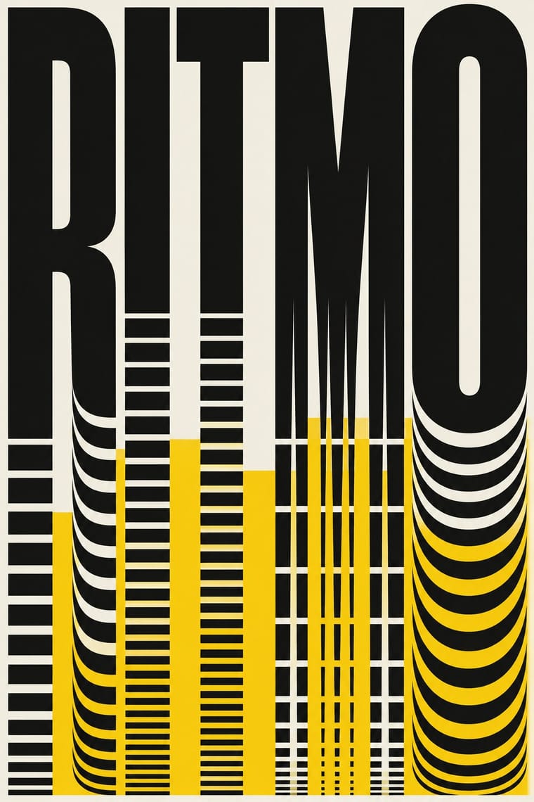
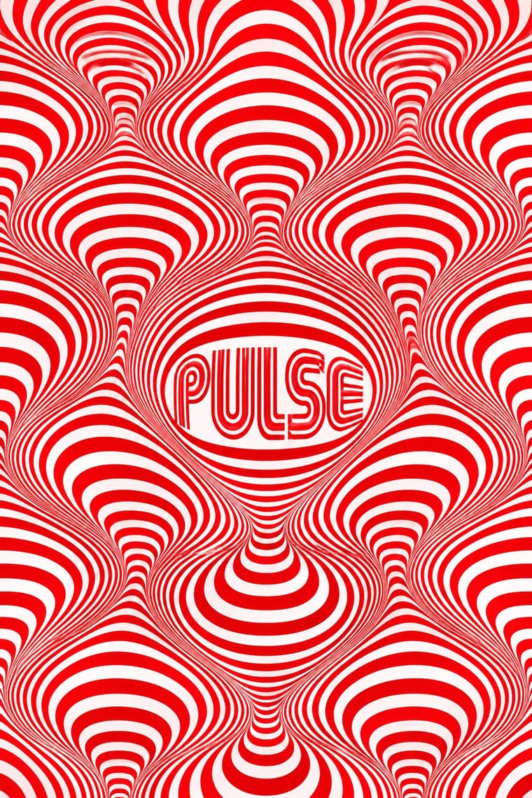
Di Tella Graphic Design × Op Art Graphics
The CLAEM programmes and the Premio Di Tella 64 poster already speak Op; run one heavy grotesque title through an optical field, as Distéfano did, for an event that should vibrate.
Mix them and make something Di Tella Graphic Design Op Art Graphics
01
What each style brings
Each part of the design comes from the style with the stronger say in it, and each style gives at least two.
Di Tella Graphic Design (Instituto Torcuato Di Tella) Op Art Graphics
- Type from Di Tella Graphic Design
- Colour from Di Tella Graphic Design
- Form from Op Art Graphics
- Composition from Op Art Graphics
- Surface from Di Tella Graphic Design
02
The type
Open fonts standing in for each style’s own type, which is often hand-drawn or commercial.
Display · Di Tella Graphic Design
Pop
Inter Tight, standing in for Helvetica (with other neo-grotesques for titles and fact blocks; identified on the 1962 sculpture-prize poster by the UNCuyo reader)
Text · Op Art Graphics
A 1960s style that turned perceptual research into graphic effect: precisely drawn lines, checks, concentric rings and modular grids, usually black and white or complementaries of equal value, that seem to vibrate, swell or move. Rooted in Bauhaus form teaching through Vasarely and Albers and popularised by MoMA's 1965 'The Responsive Eye', it spread quickly into posters, record sleeves, fashion textiles and identities such as Mexico 68.
Jost; Op Art Graphics used Mexico 68 multiline lettering and Futura
03
The colours
The ground and leading colours come from Di Tella Graphic Design, with a counter-accent from Op Art Graphics. The ink reads on the ground at 4.5:1 or more.
Di Tella Graphic Design (Instituto Torcuato Di Tella) Op Art Graphics
-
#f3f0e8ground · 36% -
#111111ink · 14% -
#f5c400accent · 18% -
#e3001baccent · 14% -
#b89668accent · 10% -
#0050b5accent · 8%
As CSS
:root {
  --ground: #f3f0e8;
  --ink: #111111;
  --accent-1: #f5c400;
  --accent-2: #e3001b;
  --accent-3: #b89668;
  --accent-4: #0050b5;
  --font-display: "Inter Tight", sans-serif;
  --font-text: "Jost", sans-serif;
}
04
The two styles
05
More combinations
With Di Tella Graphic Design
- Phototype Expressive Typography (Lubalin & U&lc) Pairs well · Both made the word the picture in the same years; add Lubalin's tight, playful letter-joins to Di Tella's blunt flat-ink title for a headline-led identity.
- Fileteado Porteño Contrasts · Same city, opposite choice: Buenos Aires' ornamental filete against the Di Tella's ornament-free flat-ink modernism; set side by side they show the porteño vernacular and the porteño avant-garde.
- Cuban Revolutionary Poster (OSPAAAL & ICAIC) Contrasts · Cuba's state screenprints used many bright inks for political messages, the Di Tella one or two flat inks for avant-garde events; together they show two Latin American poster cultures of the 1960s.
- Brazilian Concrete Design Pairs well · The other South American modernism of the 1960s; pair São Paulo's concrete modules with Buenos Aires' event-led giant type for a Southern Cone modernist programme.
- Vicente Rojo & Mexican Editorial Modernism Pairs well · Two Latin American cultural presses of the 1960s working in one or two inks: add the Di Tella's giant title word to Rojo's framed image and ordered text for a cultural programme or catalogue.
- Lucerne Poster Scene (Neubad & Südpol Posters) Pairs well · Both make the event title an optical picture for a small cultural institution under tight means; add the Di Tella's one or two flat inks and blunt grotesque to a Lucerne letter construction for a sterner, more 1960s sheet.
With Op Art Graphics
- Brazilian Concrete Design Pairs well · Start from concrete design's calm serial module, then introduce op distortions in one zone for controlled movement.
- Generative & Dynamic Identities Pairs well · Code op's progressive line modulation so an identity can animate and vary while staying perceptually striking.
- Ma & Wabi-sabi Aesthetics Contrasts · Wabi-sabi's quiet irregular textures are the antithesis of mechanical vibration; give one op element plenty of calm space to avoid visual fatigue.
- Psychedelic Poster Pairs well · Psychedelic posters borrowed op's vibrating colour edges; combine precise line fields with melting lettering for kinetic music graphics.
- Zagreb Modernist Graphics (EXAT 51 to Teatar &TD) Pairs well · The New Tendencies shows in Zagreb were one of op art's sources; take op's vibrating line fields and hold them inside Picelj's square module and small lowercase credit line for a gallery poster that stays systematic.
- Finnish Bold Print (Marimekko Modernism) Contrasts · Both fill a field edge to edge with one repeated module in the 1960s, but op art's ruled precision makes the eye vibrate while Finnish bold print keeps hand-cut edges and calm flat shapes; choose between perceptual shock and relaxed joy.
- 2 Tone Graphics Pairs well · Let the checkerboard carry optical energy as border and ground around a flat figure.
- Diné (Navajo) Weaving Design Contrasts · Eyedazzlers vibrate because stepped tapestry edges meet saturated yarn colours, not because printed lines are modulated mechanically. Do not confuse the two, and keep the slightly irregular handwoven step.