Style combination · Contrasts
Diné Weaving Design × Op Art Graphics
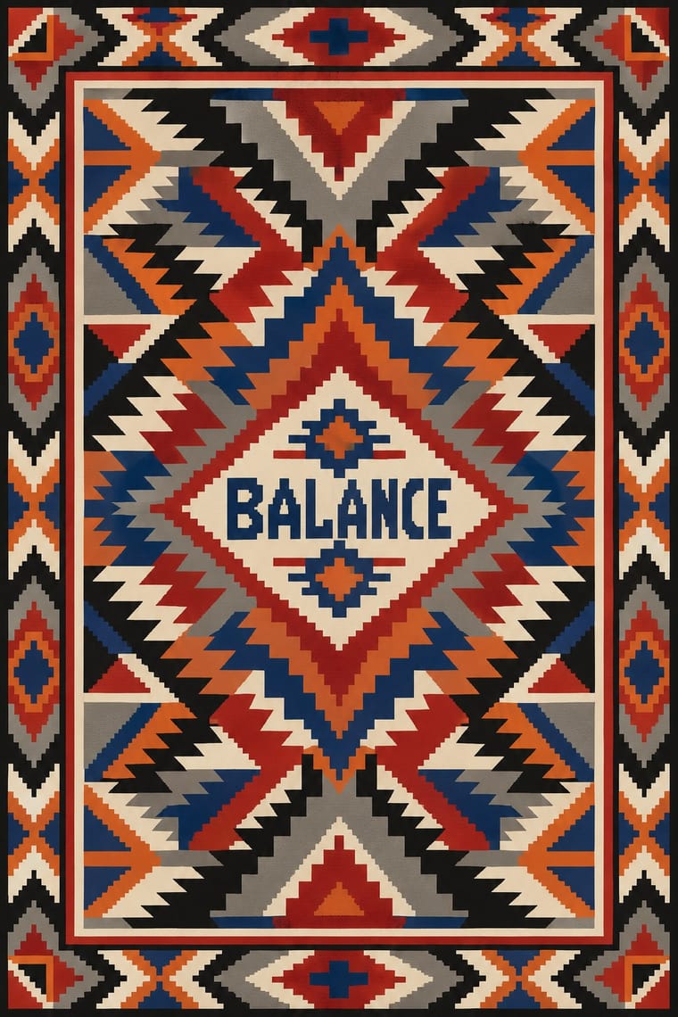
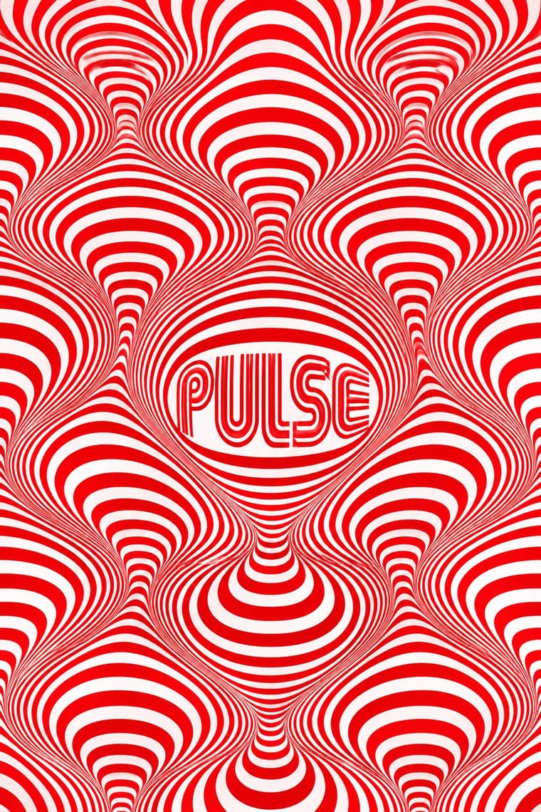
Eyedazzlers vibrate because stepped tapestry edges meet saturated yarn colours, not because printed lines are modulated mechanically. Do not confuse the two, and keep the slightly irregular handwoven step.
Mix them and make something Diné Weaving Design Op Art Graphics
01
What each style brings
Each part of the design comes from the style with the stronger say in it, and each style gives at least two.
Diné (Navajo) Weaving Design Op Art Graphics
- Type from Op Art Graphics
- Colour from Diné Weaving Design
- Form from Diné Weaving Design
- Composition from Op Art Graphics
- Surface from Diné Weaving Design
02
The type
Open fonts standing in for each style’s own type, which is often hand-drawn or commercial.
Display · Op Art Graphics
Orbit
Monoton, standing in for Mexico 68 multiline lettering (Lance Wyman)
Text · Diné Weaving Design
The tapestry-woven design tradition of Diné (Navajo) weavers, recorded in Spanish sources from the early 18th century. Each design is planned as one symmetrical field and built weft by weft, so every diagonal steps. Striped blankets came first, some with terraced diamonds by 1804. After Bosque Redondo came eyedazzlers, Saltillo-derived serrated diamonds in bright Germantown yarn. Then came bordered trading-post rugs, some modelled on Oriental rugs, in regional codes such as Two Grey Hills and Ganado red. Contemporary tapestry artists such as DY Begay extend it into landscape and abstraction.
Oswald; Diné Weaving Design used Stepped capitals built on the weft grid when a title has to share the woven field, such as Silkscreen or another pixel face drawn on the same square grid and Diné bizaad text with full orthographic support (ą, ł, ʼ, nasal and high-tone marks such as ą́), set in a sturdy sans such as Noto Sans
03
The colours
The ground and leading colours come from Diné Weaving Design, with a counter-accent from Op Art Graphics. The ink reads on the ground at 4.5:1 or more.
Diné (Navajo) Weaving Design Op Art Graphics
-
#ede6d6ground · 36% -
#1c1814ink · 14% -
#d8682aaccent · 18% -
#e3001baccent · 14% -
#a3201caccent · 10% -
#0050b5accent · 8%
As CSS
:root {
  --ground: #ede6d6;
  --ink: #1c1814;
  --accent-1: #d8682a;
  --accent-2: #e3001b;
  --accent-3: #a3201c;
  --accent-4: #0050b5;
  --font-display: "Monoton", sans-serif;
  --font-text: "Oswald", sans-serif;
}
Use it with care
Diné (Navajo) Weaving Design: Diné weaving is a living craft, taught within families and tied to the Diné account of Spider Woman, who taught the first weavers to build the loom. It has also been suggested that the Diné learned weaving from Pueblo neighbours, though how far is uncertain; give the Diné account first. Yeibichai and sandpainting designs depict Holy People from healing ceremonies, and weaving them was controversial within the Navajo community even when Hastiin Klah, himself a ceremonial singer, did it. Do not reproduce Yei or sandpainting imagery. Diné weavers may leave a spirit line (Ch'ihónít'i), a deliberate break through a border that gives spiritual elements a way out of the textile; it is their practice, so do not add a spirit line or any 'meaning' to a design as decoration. Do not sell printed or machine-made 'Navajo pattern' as Indian-made: the US Indian Arts and Crafts Act of 1990 prohibits that. The Navajo Nation also holds trademarks in the name 'Navajo', registered since 1943. It sued Urban Outfitters in 2012 over 'Navajo' and 'Navaho' product lines, and the case was settled in 2016 with a supply and licence agreement. Do not label non-Diné products or patterns 'Navajo'; the Nation expects companies to ask its permission before using its name, designs or motifs. Commission, pay and credit Diné weavers by name rather than copying their rugs, for example through the Crownpoint Rug Auction, run since 1968, with breaks, by a community organisation of weavers and volunteers.
04
The two styles
05
More combinations
With Diné Weaving Design
- Andean Woven Graphic Systems Contrasts · Both build stepped geometry on the thread grid. Andean cloth repeats and distorts a figure across cells and columns, while a Diné rug is one planned symmetrical field around a centre, so choose one structural logic.
- Northwest Coast Formline Design Contrasts · Both are North American Indigenous systems. Formline is figurative, curvilinear and built on crests, and Diné weaving is abstract, angular and terraced. Never merge them into a generic 'Native' pattern.
- Bitmap & Pixel Graphics Pairs well · The weft step and the pixel are the same constraint. Draw icons and letters with stepped diagonals on a square grid, and credit the weaving logic rather than lifting particular rug designs.
- Amazigh Sign System & Tifinagh Contrasts · Both are rug-weaving traditions of stepped geometry, made largely by women. Amazigh weavers share a repertoire of protective signs with pots, silver and tattoos, and let a lattice drift or break off by hand, while a Diné rug is one field planned and mirrored around a centre, in a grammar and palette set by period and region. Do not merge them into a generic 'tribal rug'.
With Op Art Graphics
- Brazilian Concrete Design Pairs well · Start from concrete design's calm serial module, then introduce op distortions in one zone for controlled movement.
- Generative & Dynamic Identities Pairs well · Code op's progressive line modulation so an identity can animate and vary while staying perceptually striking.
- Ma & Wabi-sabi Aesthetics Contrasts · Wabi-sabi's quiet irregular textures are the antithesis of mechanical vibration; give one op element plenty of calm space to avoid visual fatigue.
- Psychedelic Poster Pairs well · Psychedelic posters borrowed op's vibrating colour edges; combine precise line fields with melting lettering for kinetic music graphics.
- Zagreb Modernist Graphics (EXAT 51 to Teatar &TD) Pairs well · The New Tendencies shows in Zagreb were one of op art's sources; take op's vibrating line fields and hold them inside Picelj's square module and small lowercase credit line for a gallery poster that stays systematic.
- Finnish Bold Print (Marimekko Modernism) Contrasts · Both fill a field edge to edge with one repeated module in the 1960s, but op art's ruled precision makes the eye vibrate while Finnish bold print keeps hand-cut edges and calm flat shapes; choose between perceptual shock and relaxed joy.
- Di Tella Graphic Design (Instituto Torcuato Di Tella) Pairs well · The CLAEM programmes and the Premio Di Tella 64 poster already speak Op; run one heavy grotesque title through an optical field, as Distéfano did, for an event that should vibrate.
- 2 Tone Graphics Pairs well · Let the checkerboard carry optical energy as border and ground around a flat figure.