Style combination · Contrasts
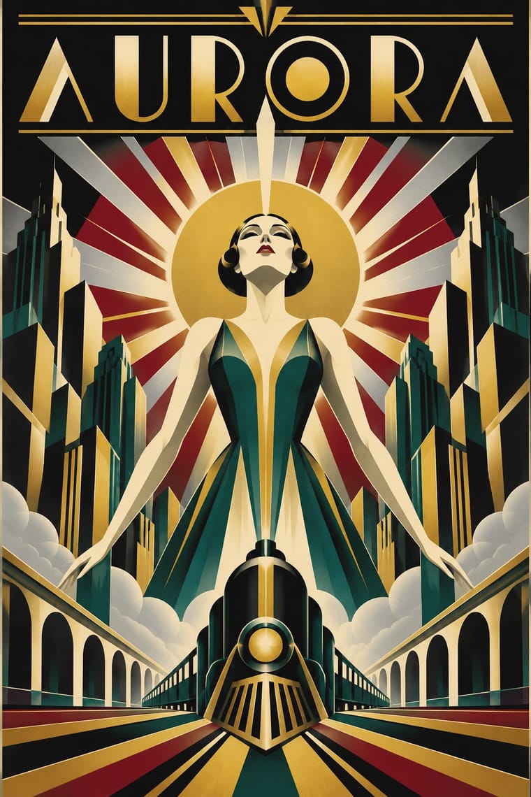
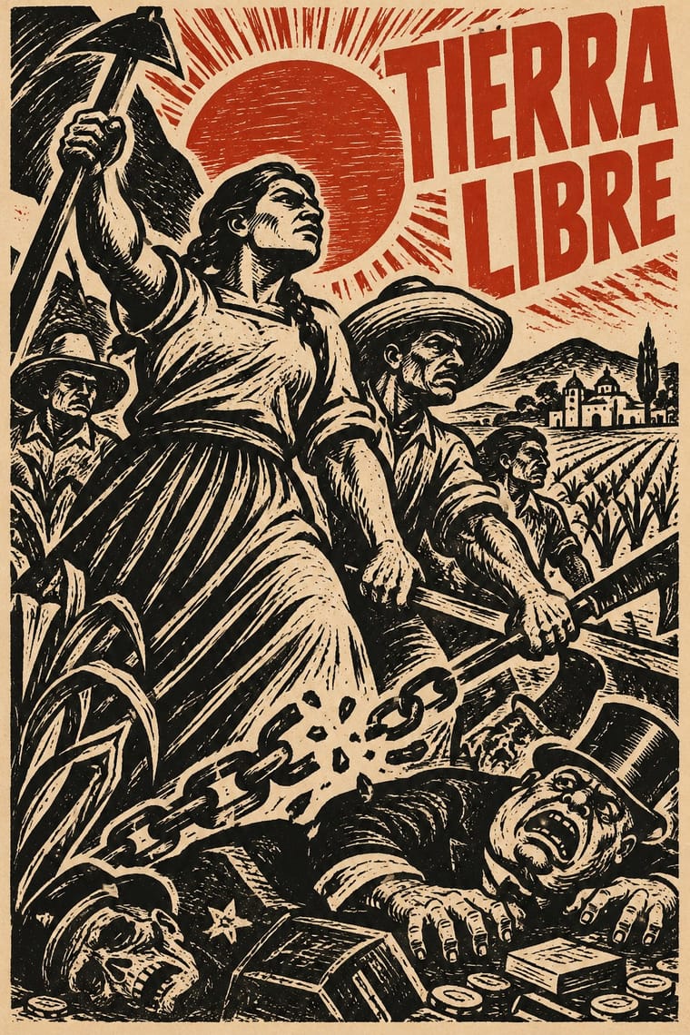
Art Deco × Taller de Gráfica Popular
Glossy Deco glamour versus gouged, populist black and white: use the contrast to separate luxury from solidarity.
Mix them and make something Art Deco Taller de Gráfica Popular
01
What each style brings
Each part of the design comes from the style with the stronger say in it, and each style gives at least two.
Art Deco Taller de Gráfica Popular
- Type from Art Deco
- Colour from Taller de Gráfica Popular
- Form from Art Deco
- Composition from Art Deco
- Surface from Taller de Gráfica Popular
02
The type
Open fonts standing in for each style’s own type, which is often hand-drawn or commercial.
Text · Taller de Gráfica Popular
A Mexico City printmaking collective founded in 1937 around Leopoldo Méndez, Pablo O'Higgins and Luis Arenal to put art at the service of popular and anti-fascist struggles. Heir to Posada's broadsides, it produced cheap linocut, woodcut and lithographic posters, leaflets, portfolios and books: dense black-and-white images of workers, peasants and revolutionary history, often captioned with bold letterpress headlines.
Inter; Taller de Gráfica Popular used Condensed wood-type gothic headlines and Hand-cut linocut lettering
03
The colours
The ground and leading colours come from Taller de Gráfica Popular, with a counter-accent from Art Deco. The ink reads on the ground at 4.5:1 or more.
Art Deco Taller de Gráfica Popular
-
#f0e8d6ground · 36% -
#151515ink · 14% -
#c0392baccent · 18% -
#c9a227accent · 14% -
#d9c39aaccent · 10% -
#8c1c26accent · 8%
As CSS
:root {
  --ground: #f0e8d6;
  --ink: #151515;
  --accent-1: #c0392b;
  --accent-2: #c9a227;
  --accent-3: #d9c39a;
  --accent-4: #8c1c26;
  --font-display: "Poiret One", sans-serif;
  --font-text: "Inter", sans-serif;
}
04
The two styles
05
More combinations
With Art Deco
- Googie & Atomic Age Pairs well · Googie's atomic starbursts extend Deco's celestial ornament; mix them for retro hospitality and signage.
- Punk & DIY Zine Contrasts · Puncture Deco polish with a single torn, photocopied edge when luxury needs irony.
- Art Nouveau Contrasts · Deco straightened Nouveau's whiplash; place a rigid sunburst beside one sinuous curve to show the evolution.
- Streamline Moderne Pairs well · Fold Streamline speed lines and rounded corners into a Deco layout to move from stepped geometry toward aerodynamic sweep.
- Basel Object Poster (Swiss Sachplakat) Contrasts · A source as well as a foil: Leupin studied at the École Paul Colin in Paris in 1935-36 and took strong impressions from Colin and from Colin's rival Cassandre. Both make a product a heroic icon, but Deco stylises it into a geometric silhouette with airbrushed gradation and geometric capitals, while Basel paints the real object, its material and its label, as a still life.
- Estridentismo (Stridentist) Graphics Pairs well · Both drew the 1920s skyline; pair Deco's setback towers and block display letters with Stridentist black-and-white relief for a skyscraper poster with a rougher, revolutionary edge.
- Vienna Secession Pairs well · Carry the Secession's squares, chequers and gold into Deco's stepped geometry for a luxurious but disciplined look.
- Greek Tourism Modernism (EOT) Contrasts · Katzourakis studied poster design under Paul Colin in Paris; set a Deco travel poster's heroic, airbrushed destination beside this flat, cut-out sign to show how the tourist poster was stripped down after the war.
With Taller de Gráfica Popular
- Punk & DIY Zine Pairs well · Both favour cheap, direct, monochrome reproduction; a linocut figure with photocopied type gives protest graphics hand-made urgency.
- Cuban Revolutionary Poster (OSPAAAL & ICAIC) Pairs well · Combine TGP's black linocut figures with Cuban flat colour for politically engaged posters with a hand-made Latin American lineage.
- Chinese Modern Woodcut Movement Pairs well · China's 1930s–40s woodcut movement ran in parallel with the TGP; combine the two black-line traditions for prints about labour and resistance across continents.
- Minjung Woodcut Graphics (Korean People's Art) Contrasts · Nearest in the atlas, and the closest Mexican print lineage to the Mexican Muralism that MMCA names as a source: both cut black-line people's prints for movements, but TGP sets condensed Latin capitals and lithographs, while Minjung prints carry short Hangul slogans and dancing, ritual-derived figures, and are scaled up to geolgae banners.
- Brazilian Concrete Design Contrasts · Mexico's figurative, militant linocuts are Latin America's other modernism; contrast them to choose between abstraction and narrative.
- Vicente Rojo & Mexican Editorial Modernism Pairs well · Rojo set Leopoldo Méndez's engravings in the Revista de la Universidad de México (no. 3, 1971); a black linocut framed by fine rules on a white page joins Mexico City's militant print culture to its editorial modernism.
- Mexican Popular Graphics (Posada) Pairs well · The TGP took Posada as its ancestor; combine his calavera satire with linocut political posters for socially engaged print.
- Estridentismo (Stridentist) Graphics Pairs well · Leopoldo Méndez carried the Stridentist woodcut into the Taller de Gráfica Popular in 1937; give a TGP print a radio mast or a skyline on a steep diagonal and one bright ink to bring back the machine-age optimism.