Style combination · Pairs well
Edo-moji Commercial Lettering × Ukiyo-e Woodblock Prints
Kabuki actor prints and picture playbills shared Edo's theatre world with Kanteiryū; set a flat, keylined actor figure under a Kanteiryū title for a theatre poster that sounds the same note in picture and letter.
Mix them and make something Edo-moji Commercial Lettering Ukiyo-e Woodblock Prints
01
What each style brings
Each part of the design comes from the style with the stronger say in it, and each style gives at least two.
Edo-moji Commercial Lettering (Kanteiryū, Yose-moji, Sumō-ji) Ukiyo-e Woodblock Prints
- Type from Edo-moji Commercial Lettering
- Colour from Edo-moji Commercial Lettering
- Form from Ukiyo-e Woodblock Prints
- Composition from Ukiyo-e Woodblock Prints
- Surface from Ukiyo-e Woodblock Prints
02
The type
Open fonts standing in for each style’s own type, which is often hand-drawn or commercial.
Display · Edo-moji Commercial Lettering
Fiesta
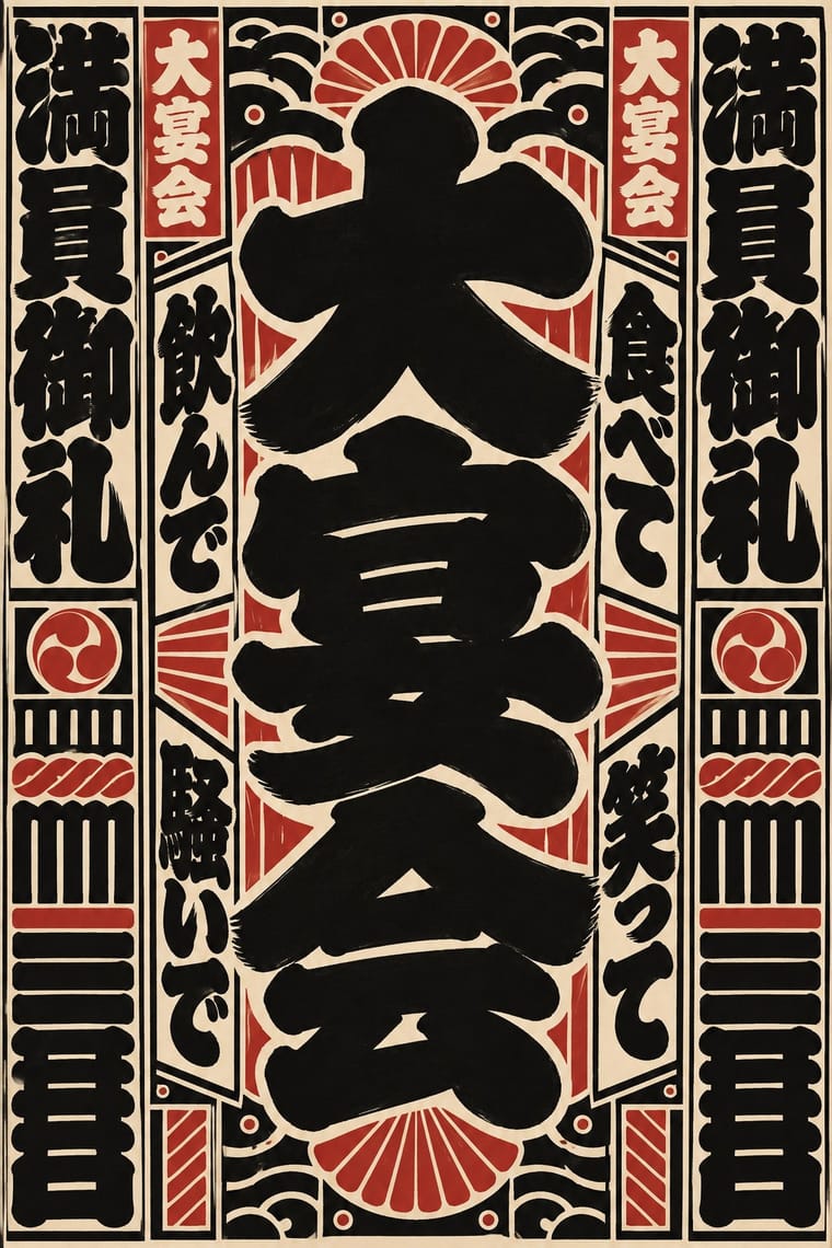
Yatra One; Edo-moji Commercial Lettering used Kanteiryū (勘亭流, shibai-moji) and Yose-moji (寄席文字)
Text · Ukiyo-e Woodblock Prints
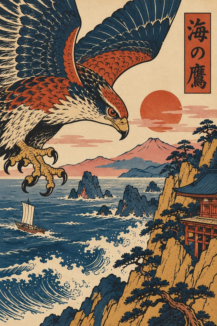
Mass-produced Edo-period woodblock prints of actors, courtesans, legends and landscapes, designed by an artist, cut and printed by specialist craftsmen and sold cheaply by commercial publishers. Flat colour blocks inside a carved keyline, bold cropping, high or oblique viewpoints and diagonal compositions, with titles in small cartouches, later handed Europe a new model for the poster.
Shippori Mincho; Ukiyo-e Woodblock Prints used Brush-written kana and kanji titles and Kantei-ryū kabuki lettering
03
The colours
The ground and leading colours come from Edo-moji Commercial Lettering, with a counter-accent from Ukiyo-e Woodblock Prints. The ink reads on the ground at 4.5:1 or more.
Edo-moji Commercial Lettering (Kanteiryū, Yose-moji, Sumō-ji) Ukiyo-e Woodblock Prints
-
#f4efe3ground · 36% -
#151311ink · 14% -
#b8312aaccent · 18% -
#d8c8a0accent · 14% -
#d4a64aaccent · 10% -
#22324faccent · 8%
As CSS
:root {
  --ground: #f4efe3;
  --ink: #151311;
  --accent-1: #b8312a;
  --accent-2: #d8c8a0;
  --accent-3: #d4a64a;
  --accent-4: #22324f;
  --font-display: "Yatra One", cursive;
  --font-text: "Shippori Mincho", serif;
}
Use it with care
Edo-moji Commercial Lettering (Kanteiryū, Yose-moji, Sumō-ji): These are living professional hands: Kanteiryū is written by kabuki calligraphers, yose-moji is taught by the Tachibana school, and sumō-ji is the trained duty of the Japan Sumo Association's gyōji, so commission or credit those writers instead of passing off a font as their work. Senjafuda are votive slips left at shrines and temples and the banzuke's 蒙御免 is a formula of sumo tradition; do not print real shrine names, performers' names or rankings as decoration, and draw characters with their real meanings rather than as pseudo-Japanese texture.
04
The two styles
05
More combinations
With Edo-moji Commercial Lettering
- Kamon (Japanese Family Crests) Pairs well · Pair a one-colour mon with a packed column of kago-moji or yose-moji for a curtain, label or name card that carries both the house sign and the house name; both reduce to one ink and survive dyeing, painting and printing.
- Victorian Letterpress & Wood Type Contrasts · Victorian playbills crowded a sheet with many wood-type faces; Edo-moji playbills reached the same crowded pull with one hand drawn by a single writer. Choose between eclectic mixing and one consistent hand.
- Ma & Wabi-sabi Aesthetics Contrasts · Wabi-sabi lets one rough brush mark sit in empty space; Edo-moji fills the character and the page to wish for a full house. Use the clash to decide whether a Japanese identity should whisper or call out to the street.
- Hong Kong Neon & Beiwei Shop-Sign Lettering Contrasts · Both are East Asian commercial sign hands, but Beiwei kaishu is square and chisel-cut in coloured light on a night sky while Edo-moji is rounded, swollen black ink on paper; compare them to choose between a chiselled and a plump brush voice.
- Song–Ming Woodblock Book Typography (Songti / Mincho) Contrasts · The Mincho book letter is thin, upright and set in an airy ruled grid for long reading; Edo-moji is fat, packed and made for a name read from far off. Pair a Mincho text block with an Edo-moji title for a programme or menu.
- Hand-Painted Signage & Vernacular Lettering Pairs well · Both are trade-specific hands written by professional sign writers; combine an Edo-moji name with a Western sign-writer's Roman for a bilingual shopfront, keeping the Japanese hand solid black and without drop shadows.
- Showa Modern Commercial Art and Zuan-moji Pairs well · Both treat lettering as drawn design; fill an Edo-moji-style heavy brush shape with Showa modern flat geometry.
- Serizawa Katazome and Mingei Stencil-Dye Graphics Contrasts · Edo-moji crams heavy brush letters for the theatre and the street; Serizawa cuts open, airy letters that share the cloth with pictures.
With Ukiyo-e Woodblock Prints
- Japonisme Pairs well · Its direct European heir: combine ukiyo-e cropping and flat colour with Western display lettering for a Japonisme poster.
- Belle Époque Lithographic Poster Pairs well · Use the flat silhouette and keyline of ukiyo-e inside a lithographic poster, as Toulouse-Lautrec did, to read at a distance.
- Japanese Postwar Modernism Pairs well · Reduce ukiyo-e motifs to flat emblems on a strict grid to get the postwar Japanese blend of tradition and modernism.
- Renaissance Book Typography Contrasts · Set an off-centre, edge-cropped print against a symmetric classical text block to stage East-West contrast deliberately.
- Kamon (Japanese Family Crests) Pairs well · Kabuki actors had their own mon, and actor prints show them on the costume, as on the sleeve of Ichikawa Yaozō III in a print of 1796; pair a flat crest with ukiyo-e figures to identify characters without captions.
- Serizawa Katazome and Mingei Stencil-Dye Graphics Contrasts · Ukiyo-e is carved line, urban pleasure and diagonal drama; Serizawa is a stencil edge, rural work and calm panel grids.
- Taishō Roman & Lyrical Illustration Pairs well · Yumeji's beauties continue the bijin-ga print; pair a woodblock-printed pattern ground with a lyrical modern figure.
- Kinngait (Cape Dorset) Inuit Printmaking Contrasts · Houston studied with the sōsaku-hanga printmaker Un'ichi Hiratsuka in 1958–59, and Kinngait shares ukiyo-e's hand-rubbed relief, Japanese paper, margin seals and a split between designer, cutter and printer (which sōsaku hanga itself rejected); but ukiyo-e fills a cropped scene inside a carved keyline with cartouche text, while Kinngait usually floats a few silhouettes on open paper, so use ukiyo-e for a full scene and Kinngait for a lone presence.