Style combination · Pairs well
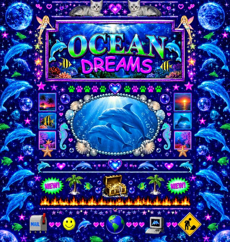
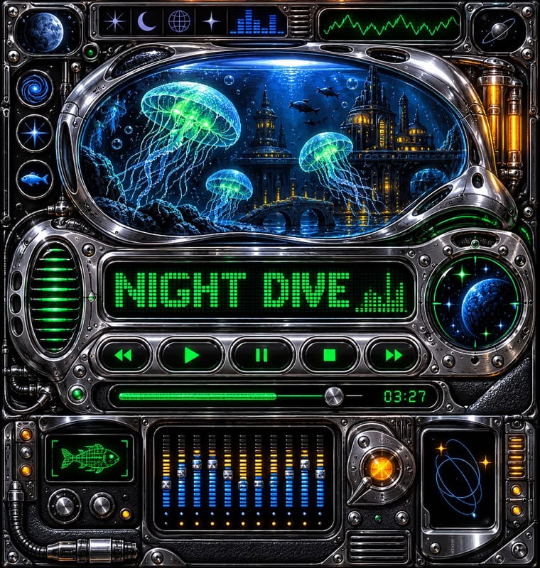
Early Web Vernacular × Media-Player
The same amateur, communal web of the late 1990s; pair a skin with a fan homepage for a full period set.
Mix them and make something Early Web Vernacular Media-Player
01
What each style brings
Each part of the design comes from the style with the stronger say in it, and each style gives at least two.
Early Web Vernacular Media-Player & Desktop Skins (Winamp-Era Skinning)
- Type from Early Web Vernacular
- Colour from Early Web Vernacular
- Form from Early Web Vernacular
- Composition from Media-Player
- Surface from Media-Player
02
The type
Open fonts standing in for each style’s own type, which is often hand-drawn or commercial.
Display · Early Web Vernacular
Together
Newsreader, standing in for Times New Roman (browser default)
Text · Media-Player
An amateur interface craft of the dial-up years in which fans repainted small software windows, above all the Winamp media player, as imaginary hardware: hi-fi faceplates, sci-fi consoles and game props in pixel-painted chrome and brushed metal, with glowing LCD readouts on dark wells, packed transport buttons and spectrum analysers. Freeform formats cut the window into blobs and pods; a large fan strand ranged from simple recolours to anime, game and band art, often in glaring colours and at the cost of legibility.
VT323; Media-Player used Seven-segment LCD and LED digit sets for time readouts and Hand-pixelled bitmap character sheets drawn per skin for scrolling titles
03
The colours
The ground and leading colours come from Early Web Vernacular, with a counter-accent from Media-Player. The ink reads on the ground at 4.5:1 or more.
Early Web Vernacular Media-Player & Desktop Skins (Winamp-Era Skinning)
-
#000080ground · 36% -
#00ff00ink · 14% -
#0000ffaccent · 18% -
#ffae00accent · 14% -
#ff00ffaccent · 10% -
#2f6fd6accent · 8%
As CSS
:root {
  --ground: #000080;
  --ink: #00ff00;
  --accent-1: #0000ff;
  --accent-2: #ffae00;
  --accent-3: #ff00ff;
  --accent-4: #2f6fd6;
  --font-display: "Newsreader", serif;
  --font-text: "VT323", monospace;
}
04
The two styles
05
More combinations
With Early Web Vernacular
- Vaporwave Pairs well · Vaporwave already mines this archive; combine tiled backgrounds and default fonts with its pastel 3D for nostalgic net art.
- Material Design Contrasts · Material's systematic spacing and elevation are everything the amateur web lacked; use it as the ‘after’ to this ‘before’.
- International Typographic Style Contrasts · A single centred Comic Sans headline on a Swiss grid makes a sharp, funny statement about taste and authority.
- Brutalist Web Design Pairs well · Drop the GIFs but keep raw HTML defaults and visible structure for a contemporary, knowingly unpolished site.
- Weirdcore & Dreamcore Pairs well · Frame a weirdcore still in an old browser window, a default dialog box or a low-resolution GIF to make its debt to the amateur early web explicit; keep the window empty rather than crowding it with the early web's badges and counters.
- Flash Vector Cartoon (Newgrounds-Era Web Animation) Pairs well · Its native habitat: put the cartoon in a cluttered portal page of banners and visitor counters for the full dial-up context.
- Japanese Dense Web Design Contrasts · This grew from the early web's link directories and table layouts, but the early web was amateur bricolage on dark tiled grounds, while this is a professional convention on white in system gothics; borrow its column discipline to tame a GeoCities pastiche.
- Emigre & Early Digital Type Pairs well · Low-resolution type and layered layouts carry naturally into table-based web pages and GIF graphics.
With Media-Player
- Y2K Futurism Contrasts · Y2K's light candy grounds, translucency and blobs in marketing and print against the skins' dense dark-metal consoles; borrow one translucent blob to lift a heavy chrome player toward the millennium mood.
- Skeuomorphic UI Contrasts · The platform makers' coherent, usable imitation of leather and paper against the fans' oversized fictional machines.
- Demoscene Graphics (Cracktros, Demos & Text-Mode Art) Pairs well · Shares the dark ground, chrome logos and pixel type; add scene-style raster bars and starfields to a player for a cracktro feel.
- Frutiger Aero Contrasts · Airy glass, sky and nature on light grounds against dense dark-metal consoles; use one aero highlight to soften a skin.
- Flash-Era Web Design (Flash Portfolio Sites) Pairs well · The skinned player shares the era's chrome bevels, pixel-font readouts and dark consoles; its LCD panels sit naturally on a Flash stage.