Style combination · Contrasts
Early Web Vernacular × Material Design
Material's systematic spacing and elevation are everything the amateur web lacked; use it as the ‘after’ to this ‘before’.
Mix them and make something Early Web Vernacular Material Design
01
What each style brings
Each part of the design comes from the style with the stronger say in it, and each style gives at least two.
Early Web Vernacular Material Design
- Type from Early Web Vernacular
- Colour from Material Design
- Form from Early Web Vernacular
-
Material Design avoids abundant decoration: this is where the two pull against each other, which is the point of the contrast.
- Composition from Material Design
-
Early Web Vernacular avoids modular grid: this is where the two pull against each other, which is the point of the contrast.
- Surface from Early Web Vernacular
-
Material Design avoids grain & noise: this is where the two pull against each other, which is the point of the contrast.
02
The type
Open fonts standing in for each style’s own type, which is often hand-drawn or commercial.
Text · Material Design
Google's design system, launched in 2014, which reintroduced controlled depth to flat design through the metaphor of 'material': sheets of digital paper and ink that sit at defined elevations, cast consistent shadows and move with meaningful motion. Built on an 8dp grid, Roboto and a bold primary-and-accent colour scheme, it later evolved into the personalised, tonal Material You (2021).
Inter; Material Design used Roboto and Google Sans
03
The colours
The ground and leading colours come from Material Design, with a counter-accent from Early Web Vernacular. The ink reads on the ground at 4.5:1 or more.
Early Web Vernacular Material Design
-
#fafafaground · 36% -
#212121ink · 14% -
#ffc107accent · 18% -
#0000ffaccent · 14% -
#ff4081accent · 10% -
#ff00ffaccent · 8%
As CSS
:root {
  --ground: #fafafa;
  --ink: #212121;
  --accent-1: #ffc107;
  --accent-2: #0000ff;
  --accent-3: #ff4081;
  --accent-4: #ff00ff;
  --font-display: "Newsreader", serif;
  --font-text: "Inter", sans-serif;
}
04
The two styles
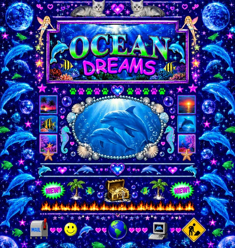
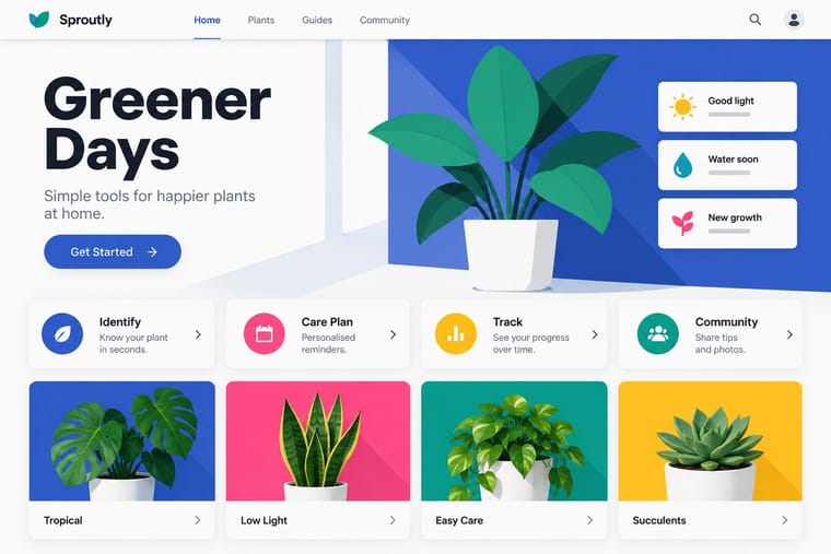
05
More combinations
With Early Web Vernacular
- Vaporwave Pairs well · Vaporwave already mines this archive; combine tiled backgrounds and default fonts with its pastel 3D for nostalgic net art.
- International Typographic Style Contrasts · A single centred Comic Sans headline on a Swiss grid makes a sharp, funny statement about taste and authority.
- Brutalist Web Design Pairs well · Drop the GIFs but keep raw HTML defaults and visible structure for a contemporary, knowingly unpolished site.
- Media-Player & Desktop Skins (Winamp-Era Skinning) Pairs well · The same amateur, communal web of the late 1990s; pair a skin with a fan homepage for a full period set.
- Weirdcore & Dreamcore Pairs well · Frame a weirdcore still in an old browser window, a default dialog box or a low-resolution GIF to make its debt to the amateur early web explicit; keep the window empty rather than crowding it with the early web's badges and counters.
- Flash Vector Cartoon (Newgrounds-Era Web Animation) Pairs well · Its native habitat: put the cartoon in a cluttered portal page of banners and visitor counters for the full dial-up context.
- Japanese Dense Web Design Contrasts · This grew from the early web's link directories and table layouts, but the early web was amateur bricolage on dark tiled grounds, while this is a professional convention on white in system gothics; borrow its column discipline to tame a GeoCities pastiche.
- Emigre & Early Digital Type Pairs well · Low-resolution type and layered layouts carry naturally into table-based web pages and GIF graphics.
With Material Design
- Neumorphism Contrasts · Material's crisp, directional elevation shadows are the accessible answer to neumorphism's ambiguous soft relief; compare both when tuning shadow contrast.
- International Typographic Style Pairs well · Lean on Swiss grid discipline and flush-left grotesque setting to keep card-heavy Material layouts calm and editorial.
- Brutalist Web Design Contrasts · Where Material hides structure behind polished components, brutalism exposes it; one raw, default-styled element signals 'under the hood' in a polished product.
- Glassmorphism Pairs well · Replace opaque sheets with frosted panes at the highest elevations (dialogs, navigation) so the stack stays legible over imagery.
- Nutri-Score (Front-of-Pack Colour-Grade Label) Pairs well · Rounded tiles, a fixed colour ramp and one raised selected state behave like a UI rating chip; Material's elevation and state rules suit screen versions of the grade in shopping apps.
- Metro (Microsoft Design Language) Contrasts · Layered paper and shadow against Metro's single flat plane; mix elevation into tiles only to signal interaction.