Style combination · Contrasts
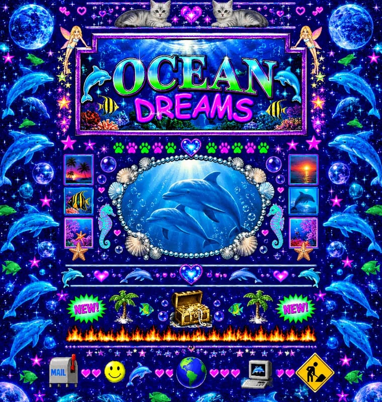
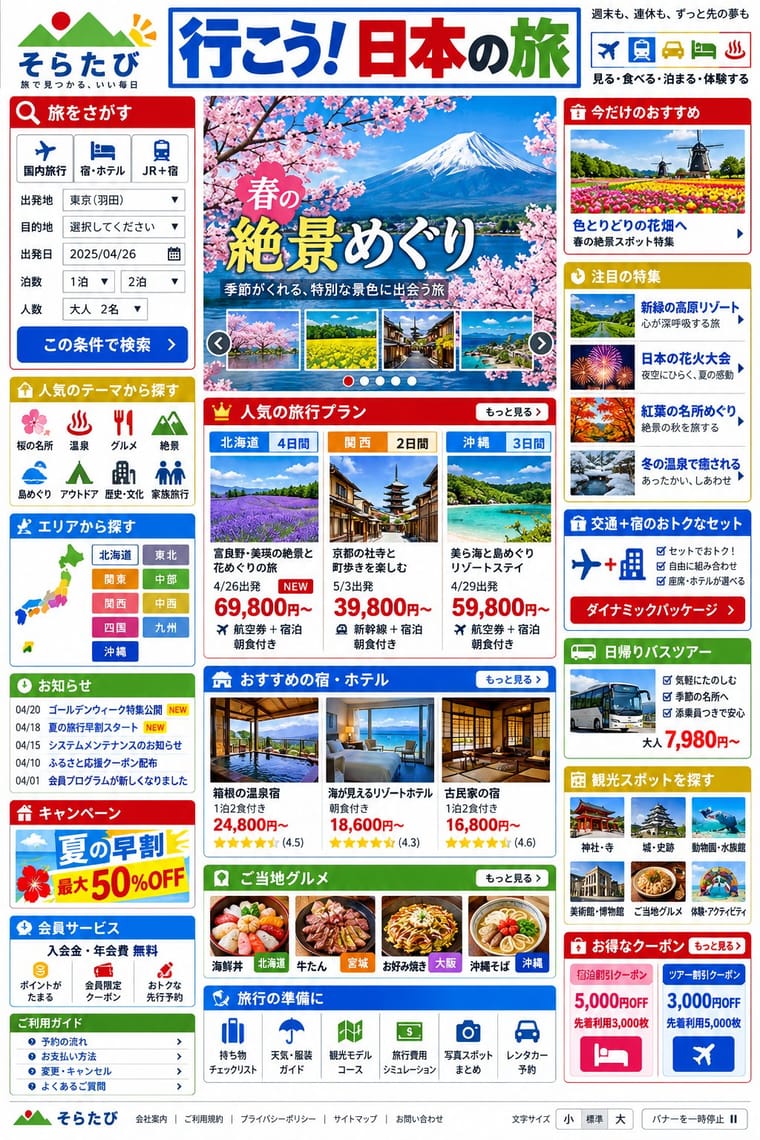
Early Web Vernacular × Japanese Dense Web Design
This grew from the early web's link directories and table layouts, but the early web was amateur bricolage on dark tiled grounds, while this is a professional convention on white in system gothics; borrow its column discipline to tame a GeoCities pastiche.
Mix them and make something Early Web Vernacular Japanese Dense Web Design
01
What each style brings
Each part of the design comes from the style with the stronger say in it, and each style gives at least two.
Early Web Vernacular Japanese Dense Web Design
- Type from Early Web Vernacular
- Colour from Japanese Dense Web Design
- Form from Early Web Vernacular
- Composition from Japanese Dense Web Design
- Surface from Early Web Vernacular
02
The type
Open fonts standing in for each style’s own type, which is often hand-drawn or commercial.
Text · Japanese Dense Web Design
The information-packed look of Japan's big portals, shops, airlines and ministries: three or more narrow columns of boxed modules, crowded with small Japanese text, blue links, tiny thumbnails, dated news lists and rotating ad banners, in bright colours on a white page. Grown from the link directories of the late-1990s portals, often tied to the text-heavy phone web of i-mode, and kept by Yahoo! JAPAN, Rakuten and Kakaku.com into the 2020s, it puts completeness before calm and builds hierarchy with colour and boxes instead of type size.
Zen Kaku Gothic New; Japanese Dense Web Design used MS PGothic (MS Pゴシック), distributed with Windows from Windows 95, the Windows fallback in the font stacks of mhlw.go.jp, kakaku.com and Rakuten Travel and Meiryo (C&G Inc., Eiichi Kōno and Takeharu Suzuki, with Latin letters by Matthew Carter after Verdana), the default Japanese system font from Windows Vista, first in kakaku.com's stack
03
The colours
The ground and leading colours come from Japanese Dense Web Design, with a counter-accent from Early Web Vernacular. The ink reads on the ground at 4.5:1 or more.
Early Web Vernacular Japanese Dense Web Design
-
#ffffffground · 36% -
#333333ink · 14% -
#0650cbaccent · 18% -
#0000ffaccent · 14% -
#bf0000accent · 10% -
#ff00ffaccent · 8%
As CSS
:root {
  --ground: #ffffff;
  --ink: #333333;
  --accent-1: #0650cb;
  --accent-2: #0000ff;
  --accent-3: #bf0000;
  --accent-4: #ff00ff;
  --font-display: "Newsreader", serif;
  --font-text: "Zen Kaku Gothic New", sans-serif;
}
Use it with care
Japanese Dense Web Design: Treat this as one Japanese web convention among several, not as a national essence or simply as bad design: commentators argue the density serves readers who want complete information before deciding (McGowan, 2018; Fujitsu Benelux, 2025), and many Japanese brands (MUJI, UNIQLO, POLA) choose minimal sites. Similar density appears on Korean portals such as Naver, which Fujitsu Benelux sets beside Yahoo! JAPAN, and Cruz found other regions that write in CJK characters close to Japan, so do not present it as uniquely Japanese. Dense pages still need accessibility work: offer a text-size control and a pause button for rotating banners, as mhlw.go.jp does, and give headlines lettered as images real text or alt text.
04
The two styles
05
More combinations
With Early Web Vernacular
- Vaporwave Pairs well · Vaporwave already mines this archive; combine tiled backgrounds and default fonts with its pastel 3D for nostalgic net art.
- Material Design Contrasts · Material's systematic spacing and elevation are everything the amateur web lacked; use it as the ‘after’ to this ‘before’.
- International Typographic Style Contrasts · A single centred Comic Sans headline on a Swiss grid makes a sharp, funny statement about taste and authority.
- Brutalist Web Design Pairs well · Drop the GIFs but keep raw HTML defaults and visible structure for a contemporary, knowingly unpolished site.
- Media-Player & Desktop Skins (Winamp-Era Skinning) Pairs well · The same amateur, communal web of the late 1990s; pair a skin with a fan homepage for a full period set.
- Weirdcore & Dreamcore Pairs well · Frame a weirdcore still in an old browser window, a default dialog box or a low-resolution GIF to make its debt to the amateur early web explicit; keep the window empty rather than crowding it with the early web's badges and counters.
- Flash Vector Cartoon (Newgrounds-Era Web Animation) Pairs well · Its native habitat: put the cartoon in a cluttered portal page of banners and visitor counters for the full dial-up context.
- Emigre & Early Digital Type Pairs well · Low-resolution type and layered layouts carry naturally into table-based web pages and GIF graphics.
With Japanese Dense Web Design
- Emoji Pictographic Language Pairs well · Emoji came out of Japan's phone web (J-Phone in 1997, i-mode in 1999), which commentators also credit with keeping these pages text-heavy; small pictographs set inline with text links add colour and signal to a dense list without taking space.
- Ma & Wabi-sabi Aesthetics Contrasts · Japan's minimalism in the traditional arts and design is what writers on these sites (Zeldman, 2010; Hongkiat) set against them; leave one deliberately empty module in a dense page to make the tension a choice.
- Danmaku Bullet-Comment Overlay Pairs well · Niconico's comment layer brings the same everything-at-once density to video; pair them for a crowded, participatory Japanese web voice.
- GOV.UK Design (GDS Style) Contrasts · GOV.UK's one thing per page answers the same public-information brief the opposite way; set mhlw.go.jp beside gov.uk to weigh completeness on one screen against step-by-step disclosure.
- Cyworld Minihompy & Minimi (Korean Mini-Homepage Culture) Contrasts · Both pack framed panels onto one screen, but the Japanese portal informs strangers while the minihompy decorates one person's page for friends.