Style combination · Contrasts
DTC 'Blanding' × Guochao
Western direct-to-consumer brands strip identity to pastel sans-serif minimalism; guochao sells ornament and heritage instead, so use one to test the other.
01
What each style brings
Each part of the design comes from the style with the stronger say in it, and each style gives at least two.
DTC 'Blanding' / Millennial Minimalism Guochao (China-Chic National Trend)
- Type from Guochao
- Colour from DTC 'Blanding'
- Form from Guochao
- Composition from DTC 'Blanding'
- Surface from Guochao
02
The type
Open fonts standing in for each style’s own type, which is often hand-drawn or commercial.
Display · Guochao
Pop
Kaushan Script, standing in for Bold brush calligraphy (kaishu and xingshu) for hero characters
Text · DTC 'Blanding'
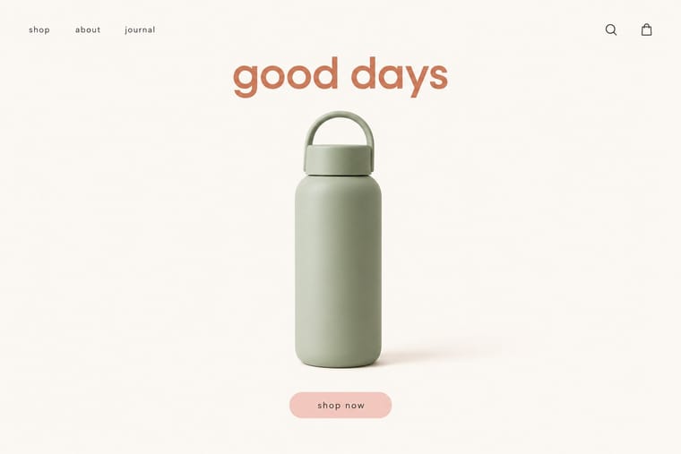
The friendly, frictionless minimalism of 2010s direct-to-consumer start-ups, built for the phone screen, the Instagram feed and the unboxing. Lowercase geometric or neo-grotesque wordmarks, one muted signature colour such as millennial pink, sage or terracotta, seamless-backdrop product photography and chatty copy made mattresses, razors and suitcases look interchangeable, a sameness critics called 'blanding' before brands swung to colourful maximalism around 2021–2022.
Hanken Grotesk; DTC 'Blanding' used Circular and Graphik
03
The colours
The ground and leading colours come from DTC 'Blanding', with a counter-accent from Guochao. The ink reads on the ground at 4.5:1 or more.
DTC 'Blanding' / Millennial Minimalism Guochao (China-Chic National Trend)
-
#faf7f2ground · 36% -
#2b2b2bink · 14% -
#d27c5daccent · 18% -
#e3b33baccent · 14% -
#f4cfc8accent · 10% -
#b8232faccent · 8%
As CSS
:root {
  --ground: #faf7f2;
  --ink: #2b2b2b;
  --accent-1: #d27c5d;
  --accent-2: #e3b33b;
  --accent-3: #f4cfc8;
  --accent-4: #b8232f;
  --font-display: "Kaushan Script", cursive;
  --font-text: "Hanken Grotesk", sans-serif;
}
Use it with care
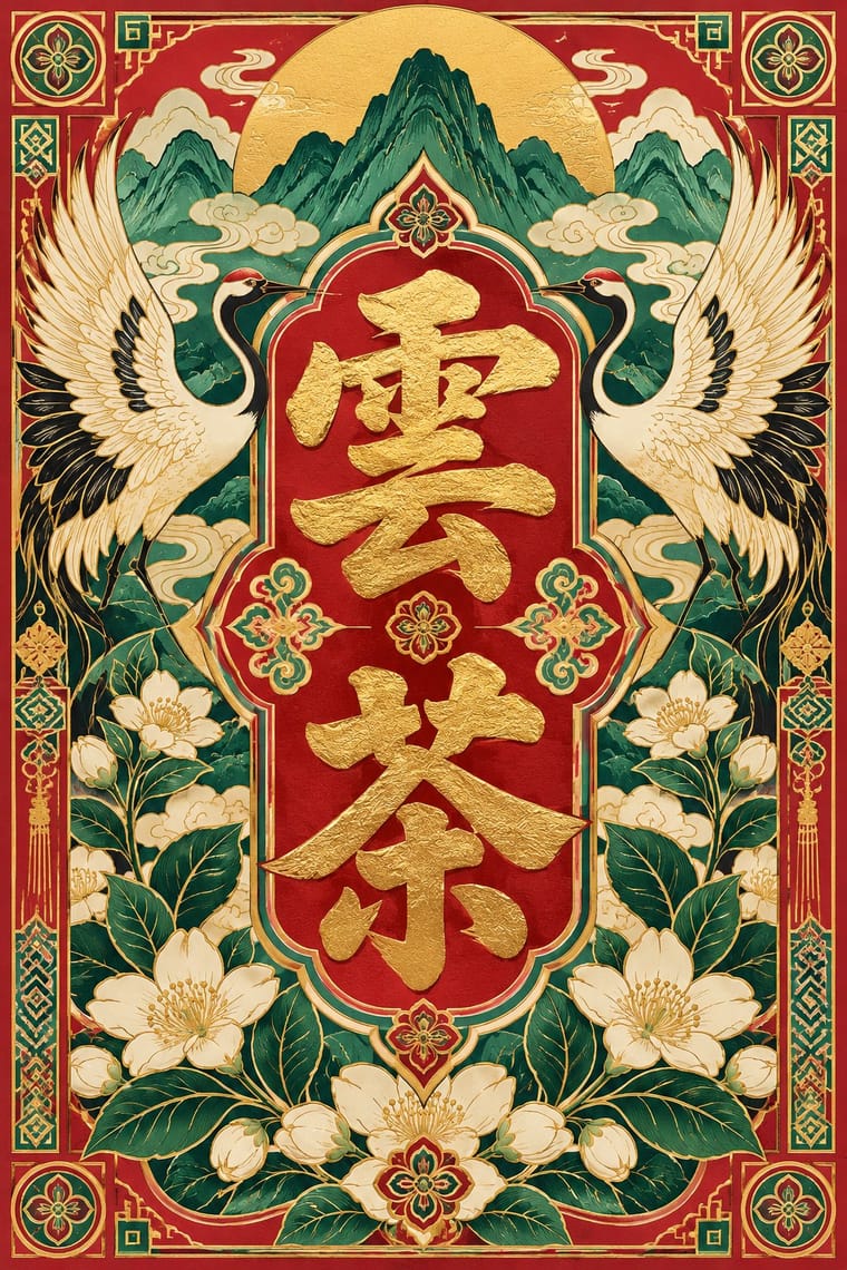
Guochao (China-Chic National Trend): Guochao often lifts ethnic-minority crafts (Miao silverwork and embroidery, Dai and Mongolian motifs) and intangible-heritage techniques as packaging finishes. Credit and pay the communities and craftspeople whose patterns are used, commission or collaborate with practitioners rather than copying motifs, and remember that dragons, imperial yellow and national symbols carry political as well as decorative meaning.
04
The two styles
05
More combinations
With DTC 'Blanding'
- Scandinavian Functionalism Pairs well · Shares a warm, domestic restraint; borrow Nordic materials and craft photography to give a pastel system more texture and credibility.
- Neo-Brutalism Contrasts · The post-blanding swing: thick outlines, clashing brights and hard shadows are the quickest way out of pastel sameness.
- Neoclassical Book Typography Contrasts · Luxury's other reduction: a single Didone wordmark signals heritage where the lowercase sans signals approachability.
- Corporate Memphis Pairs well · Its illustration-led sibling; add a few flat vector figures when seamless-backdrop photography alone feels too cold.
- Minimalist Graphic Design Contrasts · Its austere parent: swap pastel and chatty copy back to monochrome and silence when a brand needs authority rather than friendliness.
- Natural Wine Label Art Contrasts · Blanding sells a frictionless, agency-made brand in lowercase geometric sans and pastels; the natural wine label sells a person through an untrained drawing. Use the contrast to decide whether a product should feel designed or made.
- Hipster Artisanal Revival Contrasts · Where this dressed new firms as old ones, blanding dressed them as frictionless and new, with lowercase geometric sans, pastels and white space; set the two side by side to place a brand between heritage and novelty.
- Muji No-Brand Design (Mujirushi Ryohin) Contrasts · Shares the plain sans and isolated product but replaces its friendly pastel persona and funded brand voice with anonymity.
With Guochao
- Nianhua & Chinese Folk Print Pairs well · Redraw door gods, carp and auspicious babies as clean vector characters for limited-edition packaging, keeping each rebus's meaning intact.
- Graffiti & Hip-Hop Graphics Pairs well · Guochao's streetwear wing already borrows hip-hop lockups; treat a brush character as the tag and keep the heritage palette.
- Shanghai Modern & Yuefenpai Pairs well · Republican-era meishuzi lettering and calendar-poster borders give guochao packaging period depth beyond imperial red and gold.
- Dazibao (Big-Character Posters) Contrasts · Both make huge characters the whole message; compare the handwritten political urgency of the big-character poster with guochao's polished commercial heritage.
- Contemporary Chinese Book Design ('Most Beautiful Books of China') Contrasts · Guochao shouts Chinese heritage with saturated jewel colours, gloss and folk motifs on packaging; these books whisper it with bare paper, thread, one red and at most a matte gilt edge, so choose between the loud and the quiet national voice.
- Chinese Calligraphy & Seal Carving (Shufa & Zhuanke) Pairs well · Guochao branding borrows brush characters and red seals; commission real calligraphy and a properly cut seal instead of a generic brush-texture font and a fake stamp.
- Chinese National-Style Animation (Shanghai Animation Film Studio) Pairs well · For China-chic packaging and campaigns, borrow the method (an opera-mask face, scrolling clouds, an ink wash on empty paper) rather than quoting the studio's licensed characters.
- Chinese Paper-Cut (Jianzhi) Pairs well · Guochao packaging borrows red cut-paper silhouettes; keep the real cut logic (joined lines, folded symmetry, correct auspicious characters) instead of a generic filigree texture.