Style combination · Contrasts
Hipster Artisanal Revival × Newtro
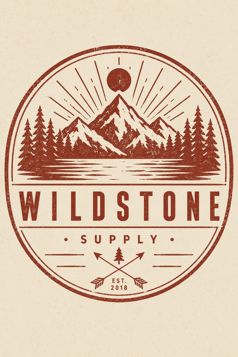
Both dress a product in the past, but hipster badges invent a Victorian heritage for a new firm while newtro reissues a real firm's own recent archive.
Mix them and make something Hipster Artisanal Revival Newtro
01
What each style brings
Each part of the design comes from the style with the stronger say in it, and each style gives at least two.
Hipster Artisanal Revival Newtro (Korean New-Retro)
- Type from Hipster Artisanal Revival
- Colour from Newtro
- Form from Newtro
- Composition from Hipster Artisanal Revival
- Surface from Hipster Artisanal Revival
02
The type
Open fonts standing in for each style’s own type, which is often hand-drawn or commercial.
Display · Hipster Artisanal Revival
Daydream
Jost, standing in for Futura (Paul Renner, Bauer, 1927), as on the Field Notes cover
Text · Newtro
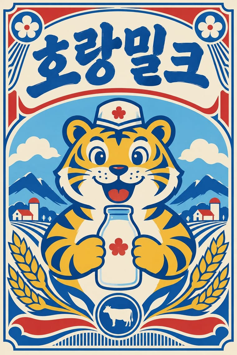
A South Korean branding trend, named 'Going New-tro' in Seoul National University's Trend Korea 2019 (October 2018), in which heritage firms reissue their own postwar to 1990s labels, trademarks and mascots, polished for young buyers. Jinro's sky-blue bottle and toad label (2019) and Gompyo flour's white bear on beer cans (2020) set the look: centred labels and badges, two or three flat colours on pale grounds, brush, cursive or hand-drawn logotypes, often Hanja with Hangul beside them, and a cartoon mascot as hero. Its source is the recent consumer past, reinterpreted, not reproduced.
Zen Maru Gothic; Newtro used Revived label logotypes in Hanja with Hangul beside them, such as Jinro's Hanja name from its 1970s–80s labels and Daesun soju's cursive lettering from its 1965 launch and Thick brush and hand-drawn Hangul display lettering of postwar Korean packaging and shop signboards
03
The colours
The ground and leading colours come from Newtro, with a counter-accent from Hipster Artisanal Revival. The ink reads on the ground at 4.5:1 or more.
Hipster Artisanal Revival Newtro (Korean New-Retro)
-
#f4ecd8ground · 36% -
#1c1c1cink · 14% -
#f0b929accent · 18% -
#8e2f25accent · 14% -
#d7322baccent · 10% -
#c4a27aaccent · 8%
As CSS
:root {
  --ground: #f4ecd8;
  --ink: #1c1c1c;
  --accent-1: #f0b929;
  --accent-2: #8e2f25;
  --accent-3: #d7322b;
  --accent-4: #c4a27a;
  --font-display: "Jost", sans-serif;
  --font-text: "Zen Maru Gothic", sans-serif;
}
Use it with care
Hipster Artisanal Revival: The hipster fashion and branding of the same years also borrowed pseudo-Native 'tribal' dress: Adrienne Keene's Native Appropriations (2010) answered the fashion for 'hipster headdresses' by noting that eagle feathers 'have to be earned', and in 2012 the Navajo Nation sued Urban Outfitters over goods sold under the 'Navajo' name. Keep to arrows, triangles and trade-mark devices; do not add feathered headdresses, war bonnets or 'tribal' and 'Navajo' patterns as a heritage shorthand.
Newtro (Korean New-Retro): Newtro revives a firm's own archive: for any other client draw on that client's history, not Jinro's toad or Gompyo's bear, which their owners guard. In 2023 the first cans of 7Bräu's Daepyo Wheat Beer, which kept Gompyo's colour scheme and a bear, drew Daehan Flour Mills' warning that copying the brand's design could be unfair competition, and 7Bräu promised a redesign with a tiger. Keep Hangul and Hanja correct and legible, and do not swap in Japanese Shōwa-retro or colonial-era 'Gyeongseong' imagery: a 2018 JoongAng Ilbo column called restaurants that mix Japanese food with Gyeongseong nostalgia 'tasteless', since those who lived through the occupation remember it as 'shameful and painful'.
04
The two styles
05
More combinations
With Hipster Artisanal Revival
- DTC 'Blanding' / Millennial Minimalism Contrasts · Where this dressed new firms as old ones, blanding dressed them as frictionless and new, with lowercase geometric sans, pastels and white space; set the two side by side to place a brand between heritage and novelty.
- Victorian Letterpress & Wood Type Pairs well · Go back to the source: swap the stock badge parts for real jobbing type, printers' rules and stock borders to turn pastiche into the trade print it quotes.
- Risograph & Indie Print Culture Pairs well · The same small-batch maker economy; print the badge in one riso ink on uncoated stock to get real ink grain instead of a distress overlay.
- Flat Design Contrasts · Its contemporary on screen was textureless and many-coloured where this was single-ink and worn; one stamped badge inside a flat interface marks a product as hand-made.
- Hand-Painted Signage & Vernacular Lettering Pairs well · Sign painting revived alongside it; paint the badge on the shop window or chalkboard so the lettering is made by hand instead of aged with a texture filter.
- Phototype Expressive Typography (Lubalin & U&lc) Contrasts · Both pair a script with a geometric sans, but the craft badge tracks its capitals wide in a centred one-ink frame, while Lubalin kerns the same pairing until the letters touch and join. Set one against the other to decide whether the letters should breathe or fuse.
- Cottagecore Contrasts · Shares handmade, small-batch values, but swap its black-and-white urban badges for soft colour and florals to get cottagecore.
- European Heraldry Contrasts · The craft badge borrows heraldry's air of lineage with an 'Est.' date and crossed arrows on kraft paper, while a real coat of arms is a granted or inherited, blazoned identity in strong tinctures; set the two side by side to show the difference between quoting heritage and holding it.
With Newtro
- Out-of-Square Hangul Typography Contrasts · Set the modernist, geometric de-squared Hangul of Ahn Sang-soo against newtro's revived brush and cursive label lettering to show two ideas of fashionable Hangul.
- Synthwave / Outrun Contrasts · Synthwave imagines an eighties that never shipped, in neon gradients; newtro reprints packaging that actually sat on Korean shelves, in flat spot colours.
- Guochao (China-Chic National Trend) Contrasts · China's contemporary heritage trend draws on imperial and folk motifs in red and gold; newtro draws on late-twentieth-century consumer packaging and its mascots.
- Hand-Painted Signage & Vernacular Lettering Pairs well · Newtro's lettering is borrowed from Korean signboards; pair a revived label with real sign-painted shopfronts, as Euljiro's cafés keep their old hardware-store signs.
- Kawaii Design Pairs well · Revived trademarks become cute merchandise and emoticons; push the toad or bear toward kawaii roundness for spin-offs while keeping the label's period lettering.
- Showa and Heisei Retro Revival (Japanese Packaging and Kissaten Graphics) Contrasts · Both revive old everyday graphics, but newtro is Korean heritage-brand reissue with badge-led logic, while this is Japanese katakana-led kissaten and dagashi graphics in pastel spot colour.
- Taiwan Floral Cloth (Huabu) Pairs well · Both turn a postwar household look into nostalgia for young buyers; pair a reissued retro label or mascot with a floral-cloth band for packaging that recalls a grandmother's home.
- Korean Commercial Calligraphy (Kaelligeurapi) Contrasts · Both meet on Korean soju shelves: newtro redraws a firm's old label lettering and mascot in flat spot colours, while commercial calligraphy writes a new brushed name in black on a pale label.