Style combination · Pairs well
Demoscene Graphics × Rave
Rave flyers and scene logos share chrome lettering on black and the same 1990s tracker-and-techno culture; animate a flyer's line-up as a demo-style scroller for party visuals.
01
What each style brings
Each part of the design comes from the style with the stronger say in it, and each style gives at least two.
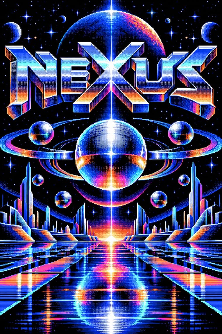
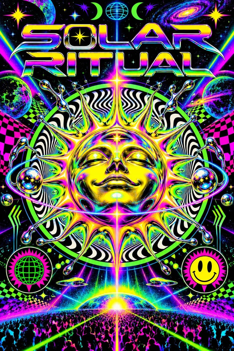
Demoscene Graphics (Cracktros, Demos & Text-Mode Art) Rave & Acid House Graphics
- Type from Demoscene Graphics
- Colour from Rave
- Form from Rave
- Composition from Demoscene Graphics
- Surface from Demoscene Graphics
02
The type
Open fonts standing in for each style’s own type, which is often hand-drawn or commercial.
Display · Demoscene Graphics
Square
VT323, standing in for The IBM PC code page 437 character set in the VGA 9×16 text-mode font, whose block, shade and box-drawing glyphs build ANSI art and the ASCII logos of NFO release files
Text · Rave
The pocket-sized promotional art of acid house, rave and early techno, handed out in record shops and car parks to advertise all-night parties. Fronts revived psychedelia through smileys, trippy eyes, fractals and airbrushed fantasy landscapes; backs crammed DJ line-ups, sound-system credits and info-line numbers. Early desktop software, chrome 3D logotypes and fluorescent or metallic inks gave it a synthetic, hedonistic glow.
IBM Plex Mono; Rave used Eurostile Extended and OCR-A
03
The colours
The ground and leading colours come from Rave, with a counter-accent from Demoscene Graphics. The ink reads on the ground at 4.5:1 or more.
Demoscene Graphics (Cracktros, Demos & Text-Mode Art) Rave & Acid House Graphics
-
#0a0a0aground · 36% -
#ffe600ink · 14% -
#ff00b4accent · 18% -
#ff7a1aaccent · 14% -
#00e5ffaccent · 10% -
#ff3fa4accent · 8%
As CSS
:root {
  --ground: #0a0a0a;
  --ink: #ffe600;
  --accent-1: #ff00b4;
  --accent-2: #ff7a1a;
  --accent-3: #00e5ff;
  --accent-4: #ff3fa4;
  --font-display: "VT323", monospace;
  --font-text: "IBM Plex Mono", monospace;
}
Use it with care
Demoscene Graphics (Cracktros, Demos & Text-Mode Art): The demoscene is a living, non-commercial community whose practice is on the national inventories of intangible heritage of Finland (2020), Germany and Poland (2021), Switzerland and the Netherlands (2023), Sweden and France (2025) and Norway (2026), and its pictures are signed work: party rules throw out ripped entries, ban AI-generated or AI-inspired graphics and ask for working stages as proof of hand work. Never copy a group's logo or an artist's pixels, do not pass a generated chrome-logo-and-copper-bar pastiche off as scene work, and credit or commission scene graphicians when a project borrows the look; the crack-intro roots lie in software piracy, which the scene has long distanced itself from, so do not borrow real cracking-group names for new work or glamourise warez. Keep flashing raster and strobe effects to three flashes or fewer per second when the look moves into interfaces, broadcast or public screens.
04
The two styles
05
More combinations
With Demoscene Graphics
- Kinetic Typography & Variable Type Pairs well · The sine scroller is an early kinetic type system; set greetings or credits as a waving bitmap scroller over raster bars for event openers and title sequences.
- Bitmap & Pixel Graphics Contrasts · Bitmap graphics is the legible, flat pixel of icons, sprites and system fonts; scene graphics spend the same pixels on chrome, gradients and motion for show. Pick the icon grid for an interface and the scene logo for a title screen.
- Glitch Art & Datamosh Graphics Contrasts · Glitch art lets the machine fail and keeps the damage; the demoscene makes it do the impossible without a dropped frame. Decide whether a piece about technology should show breakdown or mastery.
- Generative & Dynamic Identities Pairs well · Both make the picture from code; borrow the scene's size-coding and real-time plasma, tunnel and particle effects to drive a dynamic identity live instead of from rendered video.
- Synthwave / Outrun Contrasts · Synthwave paints chrome logos and neon grids as 1980s nostalgia; scene graphics are the working practice that never stopped. For credibility with a technical audience, build the effect in code rather than painting its look.
- Analog Horror Graphics Contrasts · Both put bitmap type on black screens, but the demoscene shows a machine running flawlessly at its limit and analog horror shows one failing. Pick mastery or breakdown.
- PS1 / Lo-Fi 3D Revival (PSX Aesthetic) Contrasts · The demoscene shows a machine performing flawlessly at its limit in chrome and gradients; the PSX revival fakes old hardware's flaws on a modern engine and keeps them murky. Pick mastery or imitation of limits.
- Forum Signature Art (Sig & C4D Render Graphics) Pairs well · Another amateur scene of competitions and handles; its pixelled logos give a sig a crafted name plate.
With Rave
- Acid Graphics / New Ugly Pairs well · Acid graphics is rave's digital heir; reuse the chrome logotype and fluorescent-on-black palette with contemporary 3D tools.
- Corporate Identity Modernism Contrasts · Rave flyers parodied corporate logos; set a sober corporate mark beside its flyer pastiche to make the détournement legible.
- Y2K Futurism Pairs well · Share chrome, gradients and techno optimism; combine them for a late-1990s club-to-millennium look.
- Dark Tech Minimalism Contrasts · Both live on black, but one whispers and one shouts; borrow a single neon gradient to wake up a restrained dark interface.
- Brazilian Baile Funk Digital Flyer Contrasts · Both advertise a club night, but the rave flyer uses a central emblem and dense printed text, while this idiom puts a portrait group in front of one giant title.
- Psychedelic Poster Pairs well · Carry the vibrating fluorescent palette into rave-style chrome and airbrush to signal the 1960s-to-1990s lineage on purpose.
- Synthwave / Outrun Pairs well · Both put chrome logotypes and airbrushed fantasy horizons in neon on black; borrow the flyer's crammed line-up reverse to turn a synthwave key visual into a working event poster.
- Gabber and Hardcore Graphics (Rotterdam and Thunderdome) Pairs well · Shares the flyer's info-heavy format and logotype culture, but hardens psychedelia into horror and menace and avoids the gradient and iridescence.