Style combination · Contrasts
Mexican Calendar Chromo × Shanghai Modern
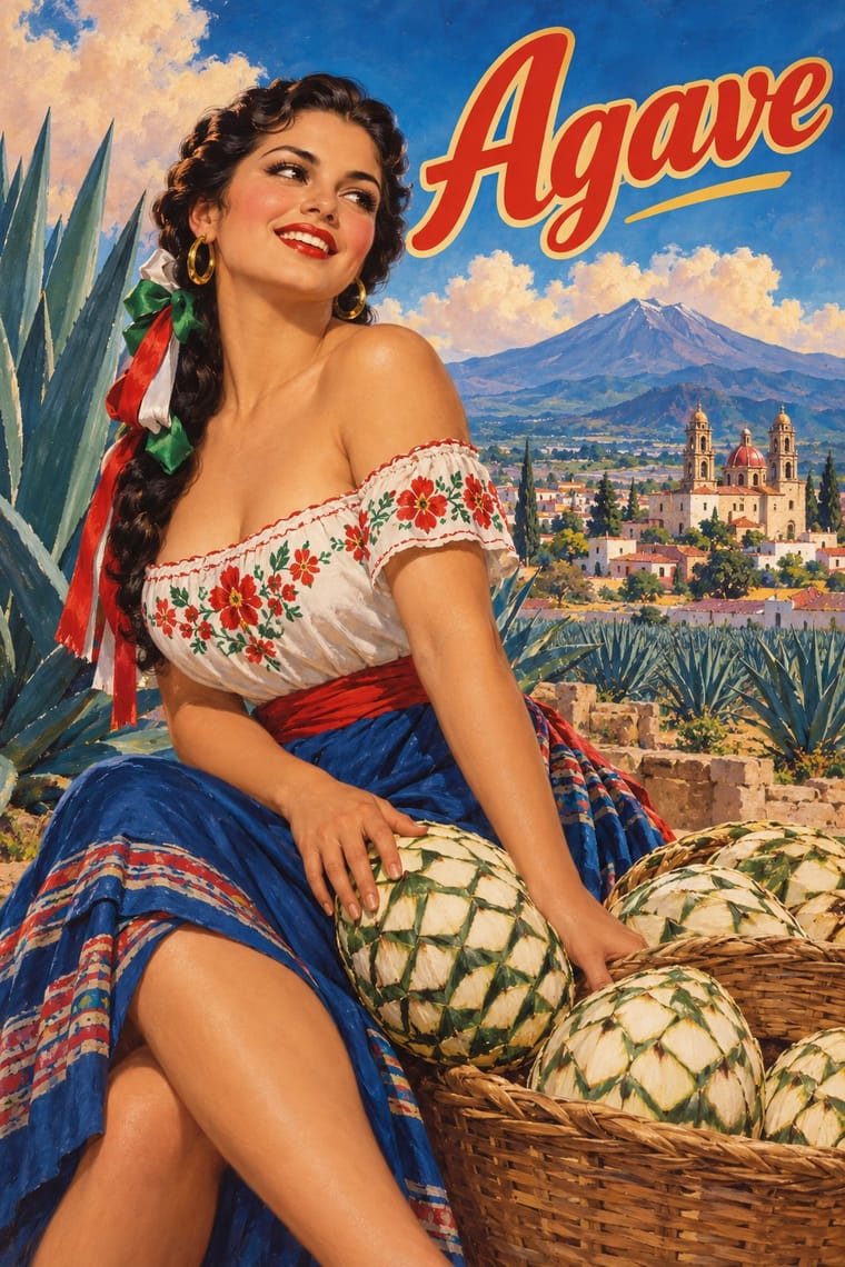
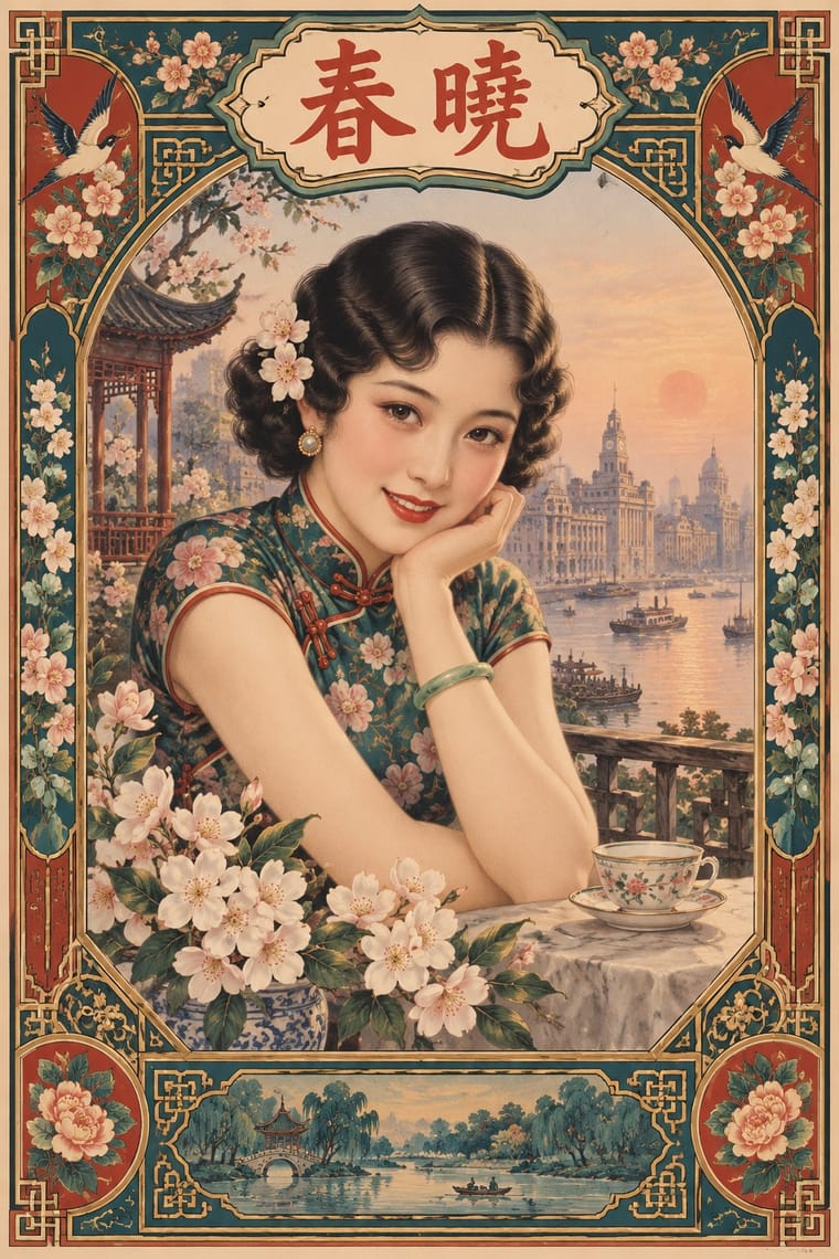
Both are tobacco-sponsored calendar pictures of beauties, but yuefenpai set softly rubbed watercolour women inside decorative borders with the products alongside, while the Mexican chromo is an oil painting of a whole scene that fills the sheet, with the pad pasted at its foot.
Mix them and make something Mexican Calendar Chromo Shanghai Modern
01
What each style brings
Each part of the design comes from the style with the stronger say in it, and each style gives at least two.
Mexican Calendar Chromo (Cromos calendáricos) Shanghai Modern & Yuefenpai
- Type from Shanghai Modern
- Colour from Mexican Calendar Chromo
- Form from Shanghai Modern
- Composition from Mexican Calendar Chromo
- Surface from Mexican Calendar Chromo
02
The type
Open fonts standing in for each style’s own type, which is often hand-drawn or commercial.
Text · Mexican Calendar Chromo
Mexico's give-away advertising calendars, at their height from the 1930s to the late 1960s. Printers led by Galas de México kept studios of painters, among them Jesús Helguera, Eduardo Cataño, Jorge González Camarena and Josep Renau, whose large oil paintings were printed by offset above a sponsor's name and a small calendar pad. In an idealising academic realism touched by Hollywood glamour they staged Aztec legends as melodrama, charros and chinas poblanas, saints, film stars and pin-ups, and hung all year in homes, shops and workshops.
Archivo; Mexican Calendar Chromo used The sponsor's name and address overprinted in the band left blank below the picture and Brand logotypes painted into the picture or carried on the product
03
The colours
The ground and leading colours come from Mexican Calendar Chromo, with a counter-accent from Shanghai Modern. The ink reads on the ground at 4.5:1 or more.
Mexican Calendar Chromo (Cromos calendáricos) Shanghai Modern & Yuefenpai
-
#f0c4a8ground · 36% -
#1f4e8cink · 14% -
#c8372daccent · 18% -
#a8693faccent · 14% -
#c8a24aaccent · 10% -
#3d8b4faccent · 8%
As CSS
:root {
  --ground: #f0c4a8;
  --ink: #1f4e8c;
  --accent-1: #c8372d;
  --accent-2: #a8693f;
  --accent-3: #c8a24a;
  --accent-4: #3d8b4f;
  --font-display: "Limelight", sans-serif;
  --font-text: "Archivo", sans-serif;
}
Use it with care
Mexican Calendar Chromo (Cromos calendáricos): The Aztec scenes are a nationalist fantasy of the pre-Hispanic past painted by academically trained artists, several of them born or raised in Spain, not Indigenous art: do not present them as Nahua or Mexica tradition or copy their feathered costumes as if they were ethnography. The saints and the Virgin of Guadalupe are devotional images that many owners pray before, so do not parody them, and the pin-ups were painted, as a UNAM study of the Galas archive puts it, to satisfy male longing and promote the sponsors' brands, carrying old and new stereotypes of women. The paintings are still in copyright (Helguera died in 1971) and Grupo Carso holds the rights to the Galas archive, while Alta reported in 2023 that Calendarios Landin owns the rights to Helguera, so paint new pictures in the manner rather than retouching old chromos.
04
The two styles
05
More combinations
With Mexican Calendar Chromo
- Egyptian Painted Film Poster Contrasts · Both paint the stars of a national cinema's golden age, but the Egyptian poster collages star heads under huge calligraphic titles, while the chromo paints one unified scene and keeps its lettering to a small band below.
- Socialist Realist Propaganda Poster Contrasts · Both idealise the nation in heroic academic realism, but the Socialist Realist poster adds slogans and marching crowds to mobilise, while the chromo sells beer and cigarettes with romance and nostalgia; borrow its heroic anatomy for a national-history scene and leave the slogan out.
- Mexican Popular Graphics (Posada) Contrasts · Posada's broadsheets are black relief cuts under shouting type, sold for news and satire; the chromo is a full-colour oil painting given away to be admired all year, with the type kept small and out of the picture.
- Lotería Card Imagery (Mexican Lotería) Contrasts · Both are popular Mexican colour prints for everyday use, but the lotería sets one flat, outlined emblem figure per numbered card in a ruled frame, named in capitals at the foot, for a game, while the chromo paints one modelled scene in deep landscape to hang for a year.
- Hand-Painted Signage & Vernacular Lettering Pairs well · Grocery stores, poultry shops and workshops gave the calendars to their customers; pair a painted rótulo for the shop's name with a chromo-style painting for the look of a mid-century Mexican neighbourhood business.
- Taller de Gráfica Popular Contrasts · Both grew out of post-revolutionary Mexico and picture its history, but the TGP cut black-and-white linocuts and woodcuts with bold headlines for popular and anti-fascist struggles, while the calendar painters made saturated oils of an idealised Mexico to sell beer and cigarettes.
- Indian Calendar & Bazaar Art Contrasts · Both are give-away calendars that reproduce commissioned paintings above a sponsor's name, but Indian bazaar art centres a frontal deity in haloes, gold and ornamental frames for worship, while the Mexican chromo stages a secular scene in deep landscape (a legend, a charro, a film star, a pin-up) with no frame around it; its saints are one genre among many.
- Chicano Screenprint Poster Contrasts · Many Chicanos grew up with these give-away calendars hanging at home, and Chicano workshops took up the calendar as a fundraising print (Méchicano Art Center's 1977 Calendario), but, in Terezita Romo's words, revised its single image format, offset medium and commercial objective: screenprinted flat colour and political and cultural messages in place of a brand's modelled oil scene.
With Shanghai Modern
- Socialist Realist Propaganda Poster Contrasts · After 1949 the same painters and rubbed-watercolour technique served propaganda; compare how one rendering style sells glamour versus ideology.
- Nianhua & Chinese Folk Print Pairs well · Fold nianhua's auspicious symbols and bright folk colour into a calendar-poster layout for festive packaging.
- International Typographic Style Contrasts · Its framed, ornamented, figurative poster is the opposite of Swiss reduction; strip elements one by one to find what carries the mood.
- Art Deco Pairs well · Wrap a softly painted yuefenpai figure in Deco borders and geometric lettering for East–West period glamour.
- Republican Chinese Book Cover Design (Lu Xun & Tao Yuanqing) Contrasts · Same city and decades, opposite intent: calendar posters model glamorous women in soft polychrome with ornamental borders, while New Literature covers leave a plain field to one flat, symbolic motif and a drawn title.
- Cuban Tobacco Lithography (Habilitaciones & Marquillas) Pairs well · Shanghai's calendar posters were also given away by tobacco firms; pair their softly modelled women and ornamental borders with the Havana label's medals and arms for a cross-continental tobacco or spirits heritage line.
- Showa Modern Commercial Art and Zuan-moji Pairs well · Both put a modern-girl figure in East Asian commercial posters; combine the Japanese geometric lettering with Shanghai's painterly figure for a pan-Asian Deco look.
- Lianhuanhua Picture-Story Books Pairs well · Its parent print culture: pair a lianhuanhua line sequence with a yuefenpai-style painted cover for a period Shanghai feel.