Style combination · Contrasts
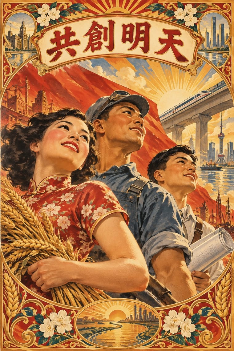
Shanghai Modern × Socialist Realist Propaganda Poster
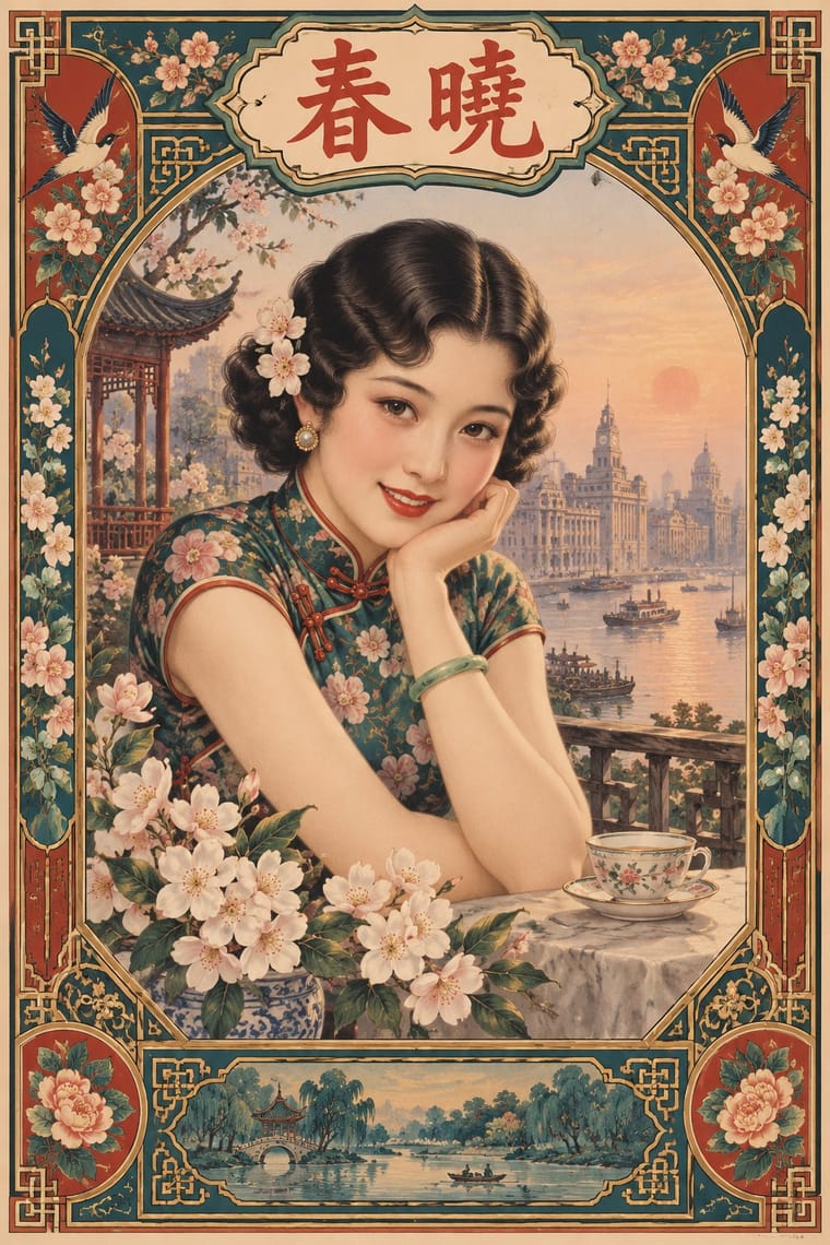
After 1949 the same painters and rubbed-watercolour technique served propaganda; compare how one rendering style sells glamour versus ideology.
Mix them and make something Shanghai Modern Socialist Realist Propaganda Poster
01
What each style brings
Each part of the design comes from the style with the stronger say in it, and each style gives at least two.
Shanghai Modern & Yuefenpai Socialist Realist Propaganda Poster
- Type from Shanghai Modern
- Colour from Socialist Realist Propaganda Poster
- Form from Shanghai Modern
- Composition from Socialist Realist Propaganda Poster
- Surface from Shanghai Modern
02
The type
Open fonts standing in for each style’s own type, which is often hand-drawn or commercial.
Text · Socialist Realist Propaganda Poster
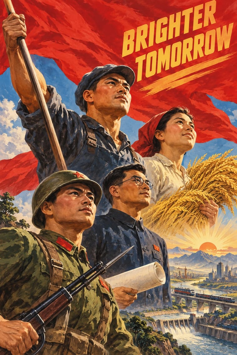
The official art doctrine of the Soviet Union from 1932, later exported across the socialist world, which replaced avant-garde experiment with legible, heroic realism 'national in form, socialist in content'. Its posters show idealised workers, soldiers and leaders on rising diagonals and low horizons, bathed in red, with bold slogans promising a radiant future; in China they merged with New Year print and calendar-poster conventions.
Zen Kaku Gothic New; Socialist Realist Propaganda Poster used Hand-drawn Cyrillic poster capitals in condensed grotesque and slab forms and Songti and Heiti display characters
03
The colours
The ground and leading colours come from Socialist Realist Propaganda Poster, with a counter-accent from Shanghai Modern. The ink reads on the ground at 4.5:1 or more.
Shanghai Modern & Yuefenpai Socialist Realist Propaganda Poster
-
#f3e8d2ground · 36% -
#1d1d1bink · 14% -
#f2c230accent · 18% -
#b8322faccent · 14% -
#c8a24aaccent · 10% -
#b5651daccent · 8%
As CSS
:root {
  --ground: #f3e8d2;
  --ink: #1d1d1b;
  --accent-1: #f2c230;
  --accent-2: #b8322f;
  --accent-3: #c8a24a;
  --accent-4: #b5651d;
  --font-display: "Limelight", sans-serif;
  --font-text: "Zen Kaku Gothic New", sans-serif;
}
04
The two styles
05
More combinations
With Shanghai Modern
- Nianhua & Chinese Folk Print Pairs well · Fold nianhua's auspicious symbols and bright folk colour into a calendar-poster layout for festive packaging.
- International Typographic Style Contrasts · Its framed, ornamented, figurative poster is the opposite of Swiss reduction; strip elements one by one to find what carries the mood.
- Art Deco Pairs well · Wrap a softly painted yuefenpai figure in Deco borders and geometric lettering for East–West period glamour.
- Republican Chinese Book Cover Design (Lu Xun & Tao Yuanqing) Contrasts · Same city and decades, opposite intent: calendar posters model glamorous women in soft polychrome with ornamental borders, while New Literature covers leave a plain field to one flat, symbolic motif and a drawn title.
- Mexican Calendar Chromo (Cromos calendáricos) Contrasts · Both are tobacco-sponsored calendar pictures of beauties, but yuefenpai set softly rubbed watercolour women inside decorative borders with the products alongside, while the Mexican chromo is an oil painting of a whole scene that fills the sheet, with the pad pasted at its foot.
- Cuban Tobacco Lithography (Habilitaciones & Marquillas) Pairs well · Shanghai's calendar posters were also given away by tobacco firms; pair their softly modelled women and ornamental borders with the Havana label's medals and arms for a cross-continental tobacco or spirits heritage line.
- Showa Modern Commercial Art and Zuan-moji Pairs well · Both put a modern-girl figure in East Asian commercial posters; combine the Japanese geometric lettering with Shanghai's painterly figure for a pan-Asian Deco look.
- Lianhuanhua Picture-Story Books Pairs well · Its parent print culture: pair a lianhuanhua line sequence with a yuefenpai-style painted cover for a period Shanghai feel.
With Socialist Realist Propaganda Poster
- Cuban Revolutionary Poster (OSPAAAL & ICAIC) Contrasts · Cuban designers rejected Soviet realism for pop and op graphics; compare them to decide whether a cause needs heroes or wit.
- Taller de Gráfica Popular Pairs well · TGP shared the social commitment with a carved linocut line; borrow its grit to make heroic imagery feel grassroots.
- WPA Silkscreen Posters Pairs well · Both mobilised a 1930s public; combine WPA flat silkscreen colour with heroic low-angle diagonals for civic campaigns.
- Russian Constructivism Contrasts · Same revolution, opposite means: set Constructivist abstraction beside heroic realism to show the 1932 turn from experiment to doctrine.
- Chinese National-Style Animation (Shanghai Animation Film Studio) Contrasts · Made in the same state and decades, and like it an official art: the national style was pursued with state backing and its fables carried lessons. But where socialist realism pictured idealised heroes in legible, illusionistic realism, the studio found its forms in ink painting, cut paper, opera and murals; set one against the other to separate a painted, traditional idiom from heroic realism.
- ROSTA Windows Contrasts · The heroic, naturalistic painting that displaced it in the 1930s is the exact opposite of its crude, satirical shorthand.
- Minjung Woodcut Graphics (Korean People's Art) Contrasts · State posters paint polished heroes from above; Minjung prints cut rough, grieving and dancing people from below.
- Soviet Central Asian Ornamental Modernism Contrasts · The parent doctrine in its painted poster form, with leaders, slogans and rising diagonals, is the foil: choose ornament, folklore and a flat frontal figure where it chooses the call to arms.
All 32 combinations with Socialist Realist Propaganda Poster