Style combination · Pairs well
Art Deco × Shanghai Modern
Wrap a softly painted yuefenpai figure in Deco borders and geometric lettering for East–West period glamour.
01
What each style brings
Each part of the design comes from the style with the stronger say in it, and each style gives at least two.
Art Deco Shanghai Modern & Yuefenpai
- Type from Shanghai Modern
- Colour from Art Deco
- Form from Art Deco
- Composition from Art Deco
- Surface from Shanghai Modern
02
The type
Open fonts standing in for each style’s own type, which is often hand-drawn or commercial.
Text · Art Deco
The glamorous modern style named after the 1925 Paris Exposition des Arts Décoratifs, which disciplined ornament into geometry: sunbursts, chevrons, stepped forms and sleek stylised figures rendered in lacquer-smooth colour with metallic accents. In Cassandre's and Colin's posters, fashion magazines, cinemas and luxury packaging it spoke of speed, travel, jazz and wealth.
Jost; Art Deco used Broadway and Bifur
03
The colours
The ground and leading colours come from Art Deco, with a counter-accent from Shanghai Modern. The ink reads on the ground at 4.5:1 or more.
Art Deco Shanghai Modern & Yuefenpai
-
#111111ground · 36% -
#f1e6cfink · 14% -
#c9a227accent · 18% -
#b8322faccent · 14% -
#8c1c26accent · 10% -
#0f5c55accent · 8%
As CSS
:root {
  --ground: #111111;
  --ink: #f1e6cf;
  --accent-1: #c9a227;
  --accent-2: #b8322f;
  --accent-3: #8c1c26;
  --accent-4: #0f5c55;
  --font-display: "Limelight", sans-serif;
  --font-text: "Jost", sans-serif;
}
04
The two styles
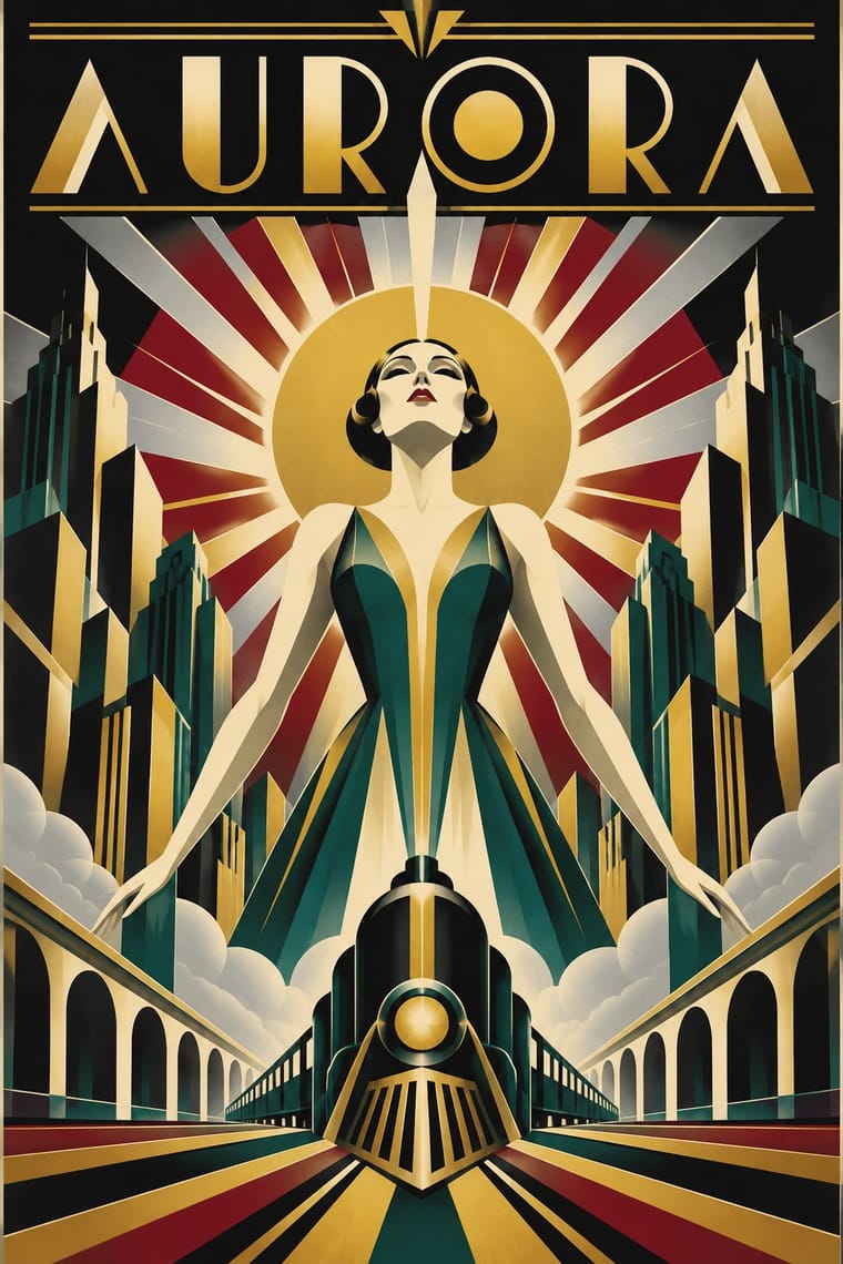
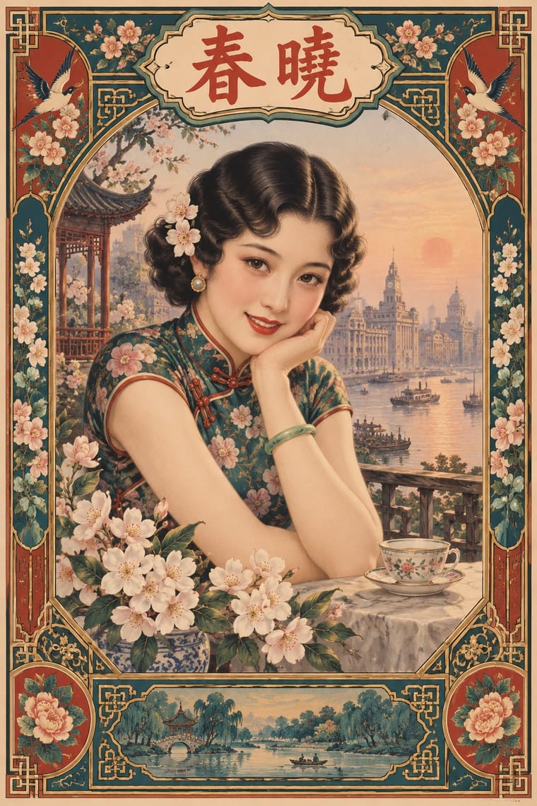
05
More combinations
With Art Deco
- Googie & Atomic Age Pairs well · Googie's atomic starbursts extend Deco's celestial ornament; mix them for retro hospitality and signage.
- Punk & DIY Zine Contrasts · Puncture Deco polish with a single torn, photocopied edge when luxury needs irony.
- Art Nouveau Contrasts · Deco straightened Nouveau's whiplash; place a rigid sunburst beside one sinuous curve to show the evolution.
- Streamline Moderne Pairs well · Fold Streamline speed lines and rounded corners into a Deco layout to move from stepped geometry toward aerodynamic sweep.
- Basel Object Poster (Swiss Sachplakat) Contrasts · A source as well as a foil: Leupin studied at the École Paul Colin in Paris in 1935-36 and took strong impressions from Colin and from Colin's rival Cassandre. Both make a product a heroic icon, but Deco stylises it into a geometric silhouette with airbrushed gradation and geometric capitals, while Basel paints the real object, its material and its label, as a still life.
- Estridentismo (Stridentist) Graphics Pairs well · Both drew the 1920s skyline; pair Deco's setback towers and block display letters with Stridentist black-and-white relief for a skyscraper poster with a rougher, revolutionary edge.
- Vienna Secession Pairs well · Carry the Secession's squares, chequers and gold into Deco's stepped geometry for a luxurious but disciplined look.
- Greek Tourism Modernism (EOT) Contrasts · Katzourakis studied poster design under Paul Colin in Paris; set a Deco travel poster's heroic, airbrushed destination beside this flat, cut-out sign to show how the tourist poster was stripped down after the war.
With Shanghai Modern
- Socialist Realist Propaganda Poster Contrasts · After 1949 the same painters and rubbed-watercolour technique served propaganda; compare how one rendering style sells glamour versus ideology.
- Nianhua & Chinese Folk Print Pairs well · Fold nianhua's auspicious symbols and bright folk colour into a calendar-poster layout for festive packaging.
- International Typographic Style Contrasts · Its framed, ornamented, figurative poster is the opposite of Swiss reduction; strip elements one by one to find what carries the mood.
- Republican Chinese Book Cover Design (Lu Xun & Tao Yuanqing) Contrasts · Same city and decades, opposite intent: calendar posters model glamorous women in soft polychrome with ornamental borders, while New Literature covers leave a plain field to one flat, symbolic motif and a drawn title.
- Mexican Calendar Chromo (Cromos calendáricos) Contrasts · Both are tobacco-sponsored calendar pictures of beauties, but yuefenpai set softly rubbed watercolour women inside decorative borders with the products alongside, while the Mexican chromo is an oil painting of a whole scene that fills the sheet, with the pad pasted at its foot.
- Cuban Tobacco Lithography (Habilitaciones & Marquillas) Pairs well · Shanghai's calendar posters were also given away by tobacco firms; pair their softly modelled women and ornamental borders with the Havana label's medals and arms for a cross-continental tobacco or spirits heritage line.
- Showa Modern Commercial Art and Zuan-moji Pairs well · Both put a modern-girl figure in East Asian commercial posters; combine the Japanese geometric lettering with Shanghai's painterly figure for a pan-Asian Deco look.
- Lianhuanhua Picture-Story Books Pairs well · Its parent print culture: pair a lianhuanhua line sequence with a yuefenpai-style painted cover for a period Shanghai feel.