Style combination · Contrasts
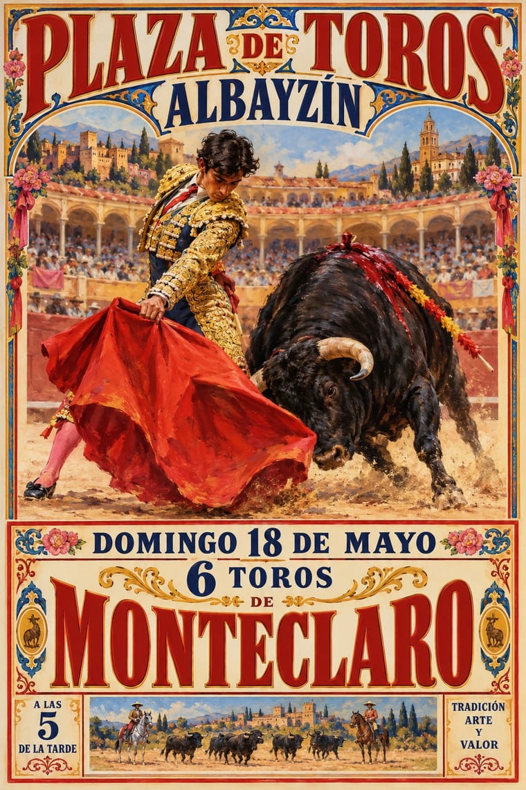
Spanish Bullfight Poster × International Typographic Style
One grotesque, flush left on a grid, against a centred clamour of mixed faces under a painting: use the pair to decide whether a festival programme needs ceremony or clarity.
Mix them and make something Spanish Bullfight Poster International Typographic Style
01
What each style brings
Each part of the design comes from the style with the stronger say in it, and each style gives at least two.
Spanish Bullfight Poster (Cartel Taurino) International Typographic Style
- Type from Spanish Bullfight Poster
-
International Typographic Style avoids eclectic mixing: this is where the two pull against each other, which is the point of the contrast.
- Colour from International Typographic Style
- Form from Spanish Bullfight Poster
- Composition from International Typographic Style
-
Spanish Bullfight Poster avoids modular grid: this is where the two pull against each other, which is the point of the contrast.
- Surface from Spanish Bullfight Poster
02
The type
Open fonts standing in for each style’s own type, which is often hand-drawn or commercial.
Display · Spanish Bullfight Poster
Public
Anton, standing in for Mecana (even-stroke slab serif) and heavy condensed grotesque capitals for the matadors' names, printed in black, red or blue
Text · International Typographic Style
A post-war refinement of the New Typography in which the mathematical grid, objective photography and neo-grotesque sans-serifs were used to communicate with clarity and neutrality. Taught at the Basel and Zurich schools, it became the default language of international corporate and institutional communication.
Inter; International Typographic Style used Akzidenz-Grotesk and Helvetica
03
The colours
The ground and leading colours come from International Typographic Style, with a counter-accent from Spanish Bullfight Poster. The ink reads on the ground at 4.5:1 or more.
Spanish Bullfight Poster (Cartel Taurino) International Typographic Style
-
#f2f0e9ground · 36% -
#111111ink · 14% -
#e1251baccent · 18% -
#dcaa34accent · 14% -
#1f4e9caccent · 10% -
#7a7a7aaccent · 8%
As CSS
:root {
  --ground: #f2f0e9;
  --ink: #111111;
  --accent-1: #e1251b;
  --accent-2: #dcaa34;
  --accent-3: #1f4e9c;
  --accent-4: #7a7a7a;
  --font-display: "Anton", sans-serif;
  --font-text: "Inter", sans-serif;
}
Use it with care
Spanish Bullfight Poster (Cartel Taurino): Bullfighting is a living but contested practice, opposed by animal-welfare campaigners in Spain and abroad, so borrowing its imagery for unrelated products brings that dispute with it; the painted manolas also belong to a folkloric picture of Andalusia rather than a record of it. Ruano Llopis (d. 1950), Roberto Domingo (d. 1956) and Juan Reus (d. 2003) are still in copyright in Spain, so paint new pictures in the manner rather than reprinting their motifs.
04
The two styles

05
More combinations
With Spanish Bullfight Poster
- Hand-Painted Signage & Vernacular Lettering Pairs well · Pair a painted rótulo for a bar or peña with a cartel-style scene and ranked capitals for a festive, local Spanish look.
- Mexican Calendar Chromo (Cromos calendáricos) Contrasts · Both print a commissioned academic oil in quantity and add text afterwards, but the calendar gives the painting the whole sheet with a sponsor band, while the cartel keeps a full ranked programme of ring, bulls and matadors below it.
- Spanish Civil War Poster Contrasts · Josep Renau learned lithography at Ortega's Valencia works while a student; his generation traded the cartel's naturalistic brushwork and long programme for flat, foreshortened figures, diagonal slogans and photomontage.
- Victorian Letterpress & Wood Type Pairs well · The cartel's lower half is a jobbing printer's bill; set its ranked lines of mixed faces and rules under one painted scene to rebuild the two-zone sheet for any festival programme.
- Cuban Tobacco Lithography (Habilitaciones & Marquillas) Contrasts · Both are lithographic trades of the Spanish-speaking world that print naturalistic paintings, but the Havana label frames allegories, medals and arms in borders within borders around a brand lettered on the stone, while the cartel vignettes one scene and sets a long programme below it in type.
- Belle Époque Lithographic Poster Contrasts · Both are colour lithographs for the street, but the Belle Époque artist drew one animated figure and the lettering together on the stone, while the cartel sets a conservative painted scene above a typeset bill it usually keeps apart; borrow the integrated lettering when the programme is short.
- Egyptian Painted Film Poster Contrasts · Both are painted lithographs that announce star performers, but the Egyptian poster collages star heads under huge calligraphic titles, while the cartel paints one scene and names its matadors in set capitals beneath.
With International Typographic Style
- Art Nouveau Contrasts · Ornamental curves against an orthogonal grid make a strong deliberate tension.
- Brutalist Web Design Pairs well · Strip the grid to raw HTML defaults to get a rawer, contemporary take on Swiss honesty.
- Psychedelic Poster Contrasts · Its exact opposite on legibility; borrow one swirling element to break a too-cold Swiss layout.
- Japanese Postwar Modernism Pairs well · Add Japanese restraint and emblematic colour fields to the grid for warmth without losing order.
- American Traditional Tattoo Flash Contrasts · Rational grid and sans-serif against sentimental, hand-lettered emblems: one flash motif on a Swiss layout makes a sharp contrast.
- Graffiti & Hip-Hop Graphics Contrasts · Put a single tag or throw-up over a strict Swiss grid to stage the clash between institutional order and a street voice.
- Pop Art Graphics Contrasts · Set one loud appropriated Pop image inside a strict grid with a neutral grotesque so the irony reads as deliberate rather than chaotic.
- Italian Painted Film Poster (Rome Studios) Contrasts · Grid, restraint and photographic objectivity are the opposite of a crowded painted montage.