Style combination · Pairs well
Indian Calendar × Pop Art Graphics
Treat a calendar print as found imagery, repeated and flattened Pop-style, while respecting devotional subjects.
Mix them and make something Indian Calendar Pop Art Graphics
01
What each style brings
Each part of the design comes from the style with the stronger say in it, and each style gives at least two.
Indian Calendar & Bazaar Art Pop Art Graphics
- Type from Pop Art Graphics
- Colour from Pop Art Graphics
- Form from Indian Calendar
- Composition from Indian Calendar
- Surface from Pop Art Graphics
02
The type
Open fonts standing in for each style’s own type, which is often hand-drawn or commercial.
Display · Pop Art Graphics
Together
Bangers; Pop Art Graphics used Comic-book hand lettering and Franklin Gothic
Text · Indian Calendar
Mass-printed images of Hindu deities, epic scenes, saints, nationalist heroes and film stars, sold in bazaars and given away as business calendars, from the chromolithographs of the Calcutta Art Studio and Ravi Varma Press to Sivakasi offset. Frontal, idealised figures painted with academic naturalism glow against dreamy landscapes, in saturated colour with gold, haloes and ornate frames above the sponsor's name and calendar pad.
Archivo; Indian Calendar used Hand-drawn Devanagari display lettering and Hand-lettered Tamil and Bengali titles
03
The colours
The ground and leading colours come from Pop Art Graphics, with a counter-accent from Indian Calendar. The ink reads on the ground at 4.5:1 or more.
Indian Calendar & Bazaar Art Pop Art Graphics
-
#fbf8f0ground · 36% -
#111111ink · 14% -
#ffd400accent · 18% -
#e8822aaccent · 14% -
#e10600accent · 10% -
#c8202faccent · 8%
As CSS
:root {
  --ground: #fbf8f0;
  --ink: #111111;
  --accent-1: #ffd400;
  --accent-2: #e8822a;
  --accent-3: #e10600;
  --accent-4: #c8202f;
  --font-display: "Bangers", sans-serif;
  --font-text: "Archivo", sans-serif;
}
Use it with care
Indian Calendar & Bazaar Art: These are devotional images that many viewers worship, so do not crop, distort or deface deities or place them on footwear, floors, underwear or in mocking contexts. Many original painters went uncredited; name the artist and press where known.
04
The two styles
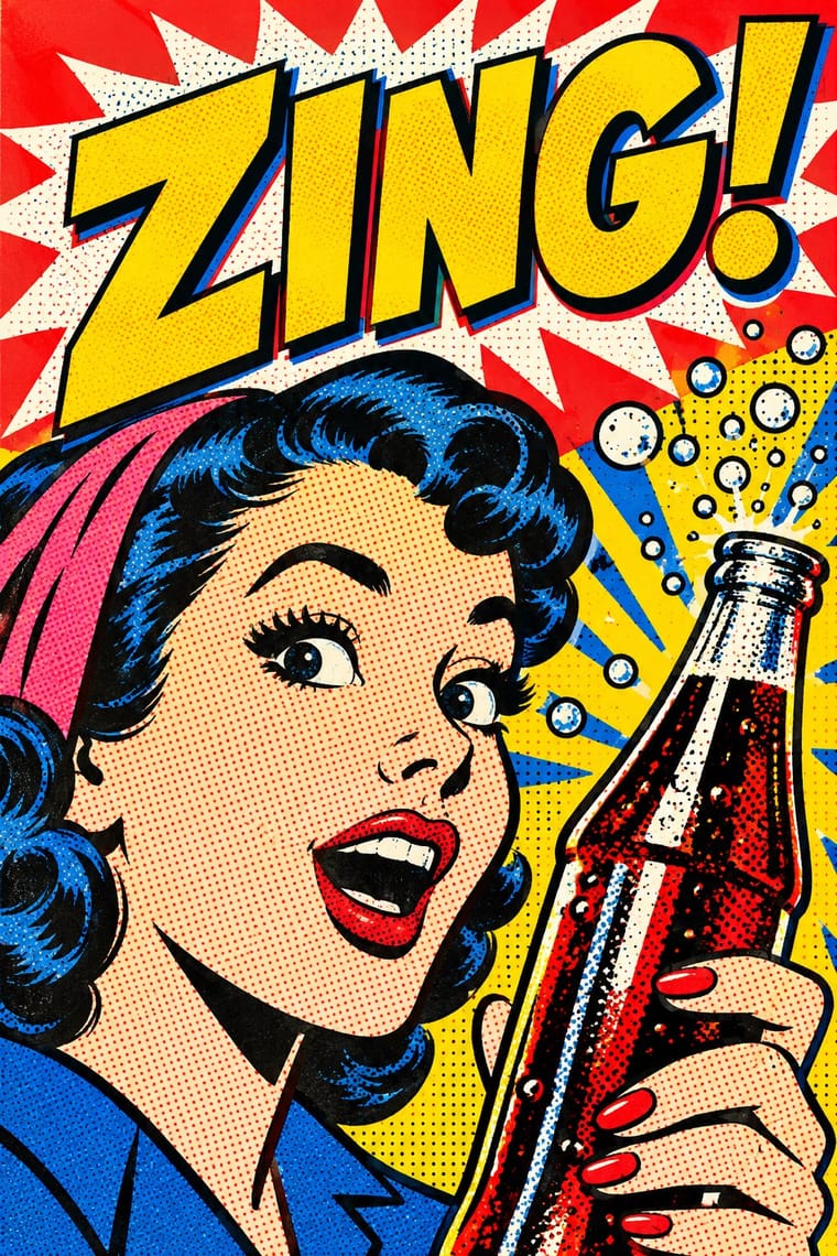
05
More combinations
With Indian Calendar
- International Typographic Style Contrasts · A neutral grid and grotesque type make a calm frame for one lush calendar image, letting it read as the single focal point.
- Nianhua & Chinese Folk Print Pairs well · Both are festive devotional bazaar prints; share frontal figures, rich borders and auspicious symbols across a festival campaign.
- Hand-Painted Bollywood Poster Pairs well · Hand-painted film posters grew from calendar art; reuse its glowing faces and saturated colour for entertainment work.
- Santiniketan & Bengal School Graphics Contrasts · The Bengal School defined itself against the academic naturalism of Raja Ravi Varma, whose paintings the oleograph presses reproduced; set the two side by side to show soft wash and earth pigment against glossy, saturated chromolithograph.
- Thai Hand-Painted Film Poster and Billboard Pairs well · A parallel in saturated naturalistic painting of idealised figures, not a documented influence; adds devotional frontality to the romantic mood.
- Nirnaya Sagar Devanagari Typography (Bombay Metal Type) Pairs well · For a devotional book, put one chromolithographed god picture from the Bombay presses opposite a black, typeset text page, and keep the type itself free of colour.
- Amar Chitra Katha Comics Pairs well · Borrow the calendar print's frontal, haloed deity and saturated jewel colour for a cover or a single full-page epiphany panel, and keep the pages around it to flat colour and ruled panels.
- 'Good Morning' Greeting Images (WhatsApp Forward Vernacular) Pairs well · Take calendar art's frontal deities, haloes and radiant gold for the devotional strand, and treat them with the same reverence.
With Pop Art Graphics
- International Typographic Style Contrasts · Set one loud appropriated Pop image inside a strict grid with a neutral grotesque so the irony reads as deliberate rather than chaotic.
- Ma & Wabi-sabi Aesthetics Contrasts · Where Pop multiplies glossy commodities, wabi-sabi values the single worn object; use one to puncture the mood of the other.
- Guna Mola Pairs well · Guna women redraw brand logos and cartoons (RCA Victor, Bullwinkle) in reverse appliqué; let that act of translation inspire Pop work, but buy or commission molas rather than imitating them.
- Neo-Brutalism Pairs well · Lift Pop's thick black outlines and flat primaries into UI cards and buttons for a confident, comic-strip interface.
- Risograph & Indie Print Culture Pairs well · Print Ben-Day dot screens in fluorescent pink and yellow riso inks to give Pop's mass-media imagery a small-run, handmade warmth.
- Screenprinted Gig & Alt-Movie Poster Pairs well · Shepard Fairey called Kozik 'the punk rock Warhol'; take Pop's appropriated cartoons and halftones and give them a gig poster's single idea and hand-lettered title.
- Finnish Bold Print (Marimekko Modernism) Pairs well · Contemporaries in saturated flat colour at a giant scale; borrow pop's isolated, enlarged object for a poster, but drop its halftone and irony to keep Marimekko's sincerity.
- Superflat Contrasts · Both turn commodities into art; take Pop's repetition and frontal commodity but swap its halftone and off-register silkscreen for Superflat's smooth vector fills and anime characters, so the print process disappears.