Style combination · Contrasts
Indian Calendar × Santiniketan
The Bengal School defined itself against the academic naturalism of Raja Ravi Varma, whose paintings the oleograph presses reproduced; set the two side by side to show soft wash and earth pigment against glossy, saturated chromolithograph.
01
What each style brings
Each part of the design comes from the style with the stronger say in it, and each style gives at least two.
Indian Calendar & Bazaar Art Santiniketan & Bengal School Graphics
- Type from Indian Calendar
- Colour from Santiniketan
- Form from Indian Calendar
-
Santiniketan avoids naturalistic depiction: this is where the two pull against each other, which is the point of the contrast.
- Composition from Indian Calendar
- Surface from Santiniketan
02
The type
Open fonts standing in for each style’s own type, which is often hand-drawn or commercial.
Text · Santiniketan
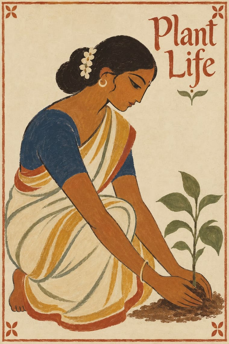
The nationalist, anti-academic art of Calcutta and Santiniketan, which turned from oil-paint naturalism and chromolithograph gloss to Indian and pan-Asian sources. Abanindranath Tagore's circle painted in soft, layered Japanese-derived washes (Bharat Mata, 1905); Nandalal Bose's Kala Bhavana took the pata's brush line, earth pigments and alpana motifs into the Dandi March linocut (1930), the Haripura panels (1938) and the illuminated Constitution (1949). R. Siva Kumar calls subsuming the Santiniketan masters under the Bengal School misleading; the entry joins them by shared graphic choices.
EB Garamond; Santiniketan used Prem Behari Narain Raizada's flowing italic pen calligraphy for the English text of the Constitution of India and Vasant Krishan Vaidya's Devanagari calligraphy for the Hindi Constitution
03
The colours
The ground and leading colours come from Santiniketan, with a counter-accent from Indian Calendar. The ink reads on the ground at 4.5:1 or more.
Indian Calendar & Bazaar Art Santiniketan & Bengal School Graphics
-
#ece2c9ground · 36% -
#221d19ink · 14% -
#c8932faccent · 18% -
#a3432aaccent · 14% -
#c8202faccent · 10% -
#35506caccent · 8%
As CSS
:root {
  --ground: #ece2c9;
  --ink: #221d19;
  --accent-1: #c8932f;
  --accent-2: #a3432a;
  --accent-3: #c8202f;
  --accent-4: #35506c;
  --font-display: "Rozha One", serif;
  --font-text: "EB Garamond", serif;
}
Use it with care
Indian Calendar & Bazaar Art: These are devotional images that many viewers worship, so do not crop, distort or deface deities or place them on footwear, floors, underwear or in mocking contexts. Many original painters went uncredited; name the artist and press where known.
Santiniketan & Bengal School Graphics: Alpana is a living ritual practice of women in Bengali homes, taught at Kala Bhavana by Sukumari Devi and others, and the pata line Santiniketan borrowed belongs to patua families who still paint: credit and commission these makers rather than lifting motifs. Bharat Mata and the Constitution's vignettes show Hindu, Buddhist, Jain and Sikh figures that are still worshipped or revered, and the Bharat Mata image has since become associated with Hindu nationalism and is contested by some Muslims and Sikhs, so do not crop, mock or recast it as party propaganda. The State Emblem's use is restricted by the State Emblem of India (Prohibition of Improper Use) Act, 2005.
04
The two styles
05
More combinations
With Indian Calendar
- International Typographic Style Contrasts · A neutral grid and grotesque type make a calm frame for one lush calendar image, letting it read as the single focal point.
- Nianhua & Chinese Folk Print Pairs well · Both are festive devotional bazaar prints; share frontal figures, rich borders and auspicious symbols across a festival campaign.
- Hand-Painted Bollywood Poster Pairs well · Hand-painted film posters grew from calendar art; reuse its glowing faces and saturated colour for entertainment work.
- Pop Art Graphics Pairs well · Treat a calendar print as found imagery, repeated and flattened Pop-style, while respecting devotional subjects.
- Thai Hand-Painted Film Poster and Billboard Pairs well · A parallel in saturated naturalistic painting of idealised figures, not a documented influence; adds devotional frontality to the romantic mood.
- Nirnaya Sagar Devanagari Typography (Bombay Metal Type) Pairs well · For a devotional book, put one chromolithographed god picture from the Bombay presses opposite a black, typeset text page, and keep the type itself free of colour.
- Amar Chitra Katha Comics Pairs well · Borrow the calendar print's frontal, haloed deity and saturated jewel colour for a cover or a single full-page epiphany panel, and keep the pages around it to flat colour and ruled panels.
- 'Good Morning' Greeting Images (WhatsApp Forward Vernacular) Pairs well · Take calendar art's frontal deities, haloes and radiant gold for the devotional strand, and treat them with the same reverence.
With Santiniketan
- Bengali Modernist Book Cover (Prachchhad) Pairs well · Satyajit Ray studied at Kala Bhavana from 1940 to 1942 before designing Signet Press covers; pair Santiniketan's brush line and earth colours with the prachchhad's hand-drawn Bengali titles.
- Kalighat Pat & Battala Bazaar Prints Pairs well · Santiniketan took its quick, loaded brush contour from Bengal's pata painters; combine the two for single figures on bare paper, with Kalighat's satire or Haripura's dignity.
- WPA Silkscreen Posters Pairs well · In the same years both put workers and village life on public walls for a national programme; WPA screenprinted flat inks, Haripura painted every panel by hand.
- Indian Institutional Modernism (NID) Contrasts · Independent India's next public face, from NID, swapped hand-painted figures and illumination for geometric symbols and sans-serif logotypes; the pair marks the turn from craft nationalism to systematic identity.