Style combination · Pairs well
Indian Calendar × Nirnaya Sagar Devanagari Typography
For a devotional book, put one chromolithographed god picture from the Bombay presses opposite a black, typeset text page, and keep the type itself free of colour.
Mix them and make something Indian Calendar Nirnaya Sagar Devanagari Typography
01
What each style brings
Each part of the design comes from the style with the stronger say in it, and each style gives at least two.
Indian Calendar & Bazaar Art Nirnaya Sagar Devanagari Typography (Bombay Metal Type)
- Type from Nirnaya Sagar Devanagari Typography
- Colour from Indian Calendar
-
Nirnaya Sagar Devanagari Typography avoids full polychrome: this is where the two pull against each other.
- Form from Indian Calendar
-
Nirnaya Sagar Devanagari Typography avoids abundant decoration: this is where the two pull against each other.
- Composition from Indian Calendar
- Surface from Nirnaya Sagar Devanagari Typography
02
The type
Open fonts standing in for each style’s own type, which is often hand-drawn or commercial.
Display · Nirnaya Sagar Devanagari Typography
Light
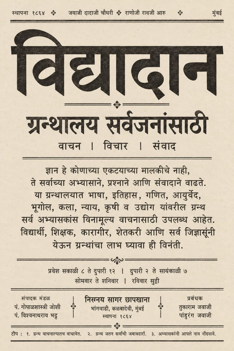
Yatra One, standing in for Nirnaya-sagar Pica No. 1, the basis of Monotype's 12 pt Devanagari, and the Nirnaya-sagar pica struck from Ranoji Raoji Aru's punches that Tilak's Kesari used
Text · Indian Calendar
Mass-printed images of Hindu deities, epic scenes, saints, nationalist heroes and film stars, sold in bazaars and given away as business calendars, from the chromolithographs of the Calcutta Art Studio and Ravi Varma Press to Sivakasi offset. Frontal, idealised figures painted with academic naturalism glow against dreamy landscapes, in saturated colour with gold, haloes and ornate frames above the sponsor's name and calendar pad.
Archivo; Indian Calendar used Hand-drawn Devanagari display lettering and Hand-lettered Tamil and Bengali titles
03
The colours
The ground and leading colours come from Indian Calendar, with a counter-accent from Nirnaya Sagar Devanagari Typography. The ink reads on the ground at 4.5:1 or more.
Indian Calendar & Bazaar Art Nirnaya Sagar Devanagari Typography (Bombay Metal Type)
-
#d4a537ground · 36% -
#141414ink · 14% -
#c8202faccent · 18% -
#a08a62accent · 14% -
#1e6fa3accent · 10% -
#5c564caccent · 8%
As CSS
:root {
  --ground: #d4a537;
  --ink: #141414;
  --accent-1: #c8202f;
  --accent-2: #a08a62;
  --accent-3: #1e6fa3;
  --accent-4: #5c564c;
  --font-display: "Yatra One", cursive;
  --font-text: "Archivo", sans-serif;
}
Use it with care
Indian Calendar & Bazaar Art: These are devotional images that many viewers worship, so do not crop, distort or deface deities or place them on footwear, floors, underwear or in mocking contexts. Many original painters went uncredited; name the artist and press where known.
Nirnaya Sagar Devanagari Typography (Bombay Metal Type): Much of the press's output is scripture and ritual text, from the Vedas with their accents to Purāṇas, stotras and the almanac that fixes the dates of rites and festivals, so never use mantras, verses or divine names as texture, crop, mirror or garble them, or put them on floors, footwear or throwaway goods. Have every Sanskrit, Marathi or Hindi word set with correct conjuncts and read by a fluent reader, since image models invent pseudo-Devanagari with broken headlines and impossible ligatures, never present a generated page as a Nirnaya Sagar imprint, and credit the founder and his punch-cutter Ranoji Aru as well as the pandit editors.
04
The two styles
05
More combinations
With Indian Calendar
- International Typographic Style Contrasts · A neutral grid and grotesque type make a calm frame for one lush calendar image, letting it read as the single focal point.
- Nianhua & Chinese Folk Print Pairs well · Both are festive devotional bazaar prints; share frontal figures, rich borders and auspicious symbols across a festival campaign.
- Hand-Painted Bollywood Poster Pairs well · Hand-painted film posters grew from calendar art; reuse its glowing faces and saturated colour for entertainment work.
- Pop Art Graphics Pairs well · Treat a calendar print as found imagery, repeated and flattened Pop-style, while respecting devotional subjects.
- Santiniketan & Bengal School Graphics Contrasts · The Bengal School defined itself against the academic naturalism of Raja Ravi Varma, whose paintings the oleograph presses reproduced; set the two side by side to show soft wash and earth pigment against glossy, saturated chromolithograph.
- Thai Hand-Painted Film Poster and Billboard Pairs well · A parallel in saturated naturalistic painting of idealised figures, not a documented influence; adds devotional frontality to the romantic mood.
- Amar Chitra Katha Comics Pairs well · Borrow the calendar print's frontal, haloed deity and saturated jewel colour for a cover or a single full-page epiphany panel, and keep the pages around it to flat colour and ruled panels.
- 'Good Morning' Greeting Images (WhatsApp Forward Vernacular) Pairs well · Take calendar art's frontal deities, haloes and radiant gold for the devotional strand, and treat them with the same reverence.
With Nirnaya Sagar Devanagari Typography
- Urdu Katib Lithography Contrasts · Urdu kept the katib's hand on the litho stone because type could not hold Nastaʿlīq, while Javaji took a lithographed almanac into metal type; choose a written page or a set one deliberately.
- Bulaq (Amiriyya) Naskh Book Printing Pairs well · Both turned a calligraphic hand into a book type for classics and scripture; in a multilingual edition, let an unframed Devanagari page with its apparatus face a rule-framed Naskh page.
- Tibetan Woodblock Print Culture (Pecha & Prayer Flags) Contrasts · Set against the carved, oblong pecha page, it shows what cast metal type did to an Indic script: repeatable sorts, sizes and tiers of commentary instead of one carved block per page.
- Song–Ming Woodblock Book Typography (Songti / Mincho) Contrasts · Song–Ming squares each character into an equal cell inside a ruled woodblock frame; Nirnaya Sagar hangs syllables of varying width from a continuous headline in an unframed metal-type block.
- Victorian Letterpress & Wood Type Pairs well · Front a sober Sanskrit text block with a centred English title page in mixed jobbing faces and ornamental dashes, as the Kāvyamālā volumes did.