Style combination · Pairs well
Indian Calendar × Nianhua
Both are devotional bazaar prints; share frontal deities, saturated colour and decorative frames across a festive campaign.
Both are festive devotional bazaar prints; share frontal figures, rich borders and auspicious symbols across a festival campaign.
01
What each style brings
Each part of the design comes from the style with the stronger say in it, and each style gives at least two.
Indian Calendar & Bazaar Art Nianhua & Chinese Folk Print
- Type from Indian Calendar
- Colour from Indian Calendar
- Form from Nianhua
- Composition from Indian Calendar
- Surface from Nianhua
-
Indian Calendar avoids flat: this is where the two pull against each other.
02
The type
Open fonts standing in for each style’s own type, which is often hand-drawn or commercial.
Text · Nianhua
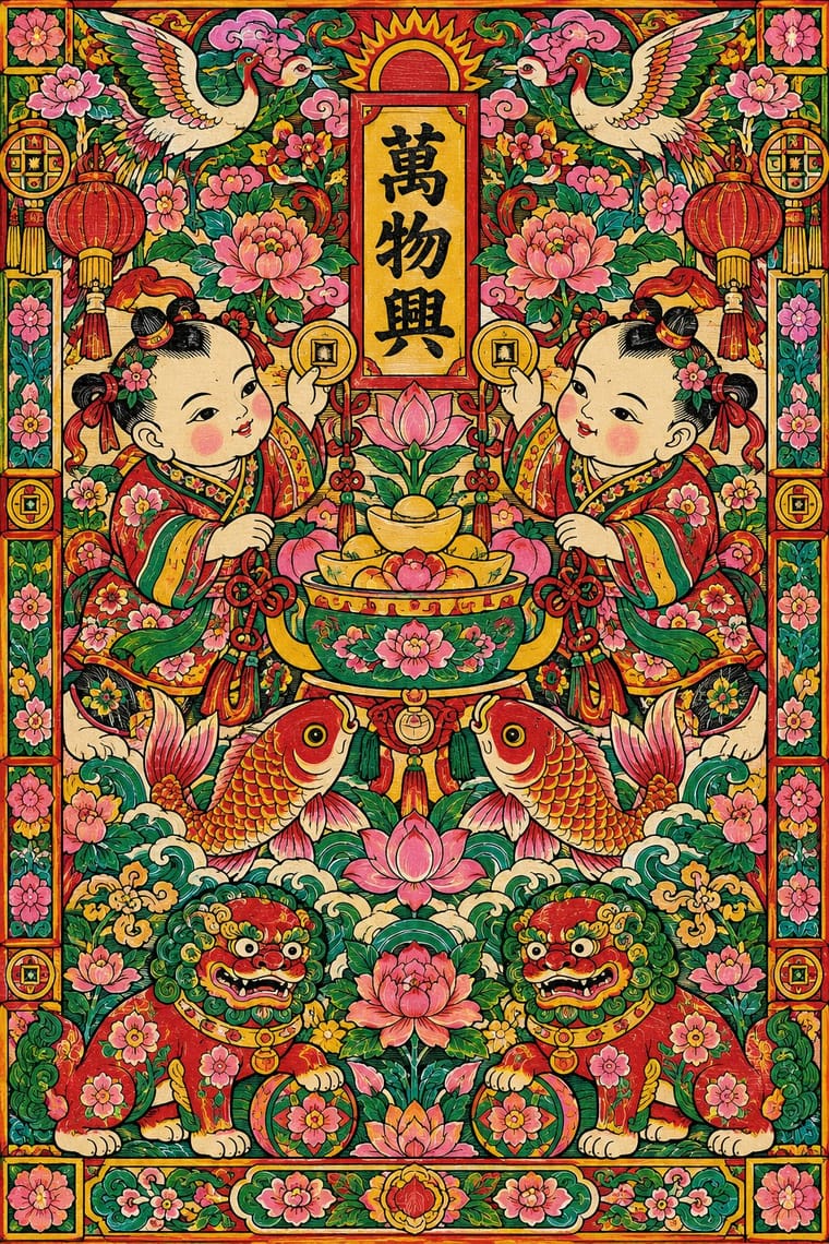
Woodblock pictures bought each New Year and pasted on doors, walls and kitchen shrines to invite luck and ward off harm: paired door gods, plump babies with carp, the Kitchen God, opera scenes and auspicious rebuses. A black keyline block is overprinted or hand-coloured in saturated red, green, yellow and pink, and compositions are dense, frontal and often mirrored in pairs.
Shippori Mincho; Nianhua used Kaishu and Lishu (clerical script) for auspicious couplets
03
The colours
The ground and leading colours come from Indian Calendar, with a counter-accent from Nianhua. The ink reads on the ground at 4.5:1 or more.
Indian Calendar & Bazaar Art Nianhua & Chinese Folk Print
-
#d4a537ground · 36% -
#141414ink · 14% -
#c8202faccent · 18% -
#1e6fa3accent · 14% -
#e5739aaccent · 10% -
#2e6b3caccent · 8%
As CSS
:root {
  --ground: #d4a537;
  --ink: #141414;
  --accent-1: #c8202f;
  --accent-2: #1e6fa3;
  --accent-3: #e5739a;
  --accent-4: #2e6b3c;
  --font-display: "Rozha One", serif;
  --font-text: "Shippori Mincho", serif;
}
Use it with care
Indian Calendar & Bazaar Art: These are devotional images that many viewers worship, so do not crop, distort or deface deities or place them on footwear, floors, underwear or in mocking contexts. Many original painters went uncredited; name the artist and press where known.
04
The two styles
05
More combinations
With Indian Calendar
- International Typographic Style Contrasts · A neutral grid and grotesque type make a calm frame for one lush calendar image, letting it read as the single focal point.
- Hand-Painted Bollywood Poster Pairs well · Hand-painted film posters grew from calendar art; reuse its glowing faces and saturated colour for entertainment work.
- Pop Art Graphics Pairs well · Treat a calendar print as found imagery, repeated and flattened Pop-style, while respecting devotional subjects.
- Santiniketan & Bengal School Graphics Contrasts · The Bengal School defined itself against the academic naturalism of Raja Ravi Varma, whose paintings the oleograph presses reproduced; set the two side by side to show soft wash and earth pigment against glossy, saturated chromolithograph.
- Thai Hand-Painted Film Poster and Billboard Pairs well · A parallel in saturated naturalistic painting of idealised figures, not a documented influence; adds devotional frontality to the romantic mood.
- Nirnaya Sagar Devanagari Typography (Bombay Metal Type) Pairs well · For a devotional book, put one chromolithographed god picture from the Bombay presses opposite a black, typeset text page, and keep the type itself free of colour.
- Amar Chitra Katha Comics Pairs well · Borrow the calendar print's frontal, haloed deity and saturated jewel colour for a cover or a single full-page epiphany panel, and keep the pages around it to flat colour and ruled panels.
- 'Good Morning' Greeting Images (WhatsApp Forward Vernacular) Pairs well · Take calendar art's frontal deities, haloes and radiant gold for the devotional strand, and treat them with the same reverence.
With Nianhua
- Shanghai Modern & Yuefenpai Pairs well · Yuefenpai calendar posters grew from nianhua; mix its auspicious symbols with Shanghai's airbrushed modern figures.
- Socialist Realist Propaganda Poster Pairs well · The 1950s 'new New Year pictures' show how nianhua symmetry and colour can carry a contemporary message without losing folk warmth.
- Lubok Popular Print Pairs well · Russia's lubok is nianhua's closest counterpart, a hand-coloured market woodblock with captions and satire; share flat folk figures and rhymed text across a festive print series.
- Minimalist Graphic Design Contrasts · Isolate a single nianhua motif, such as a carp, on a blank minimalist ground to turn abundance into an emblem.
- Guochao (China-Chic National Trend) Pairs well · Redraw door gods, carp and auspicious babies as clean vector characters for limited-edition packaging, keeping each rebus's meaning intact.
- Tibetan Woodblock Print Culture (Pecha & Prayer Flags) Contrasts · Both are popular devotional woodblock prints pasted or hung for good fortune. Nianhua floods the paper with saturated figure scenes, whereas the Tibetan print keeps to one ink and lets the dyed cloth or the lines of script carry the effect.
- Taiwan Floral Cloth (Huabu) Pairs well · Both use saturated red, pink and green and the same auspicious peony, phoenix and treasure vocabulary; set a nianhua-style figure or couplet on a plain panel over a floral-cloth ground for festive New Year packaging.
- Tarot de Marseille Woodcut Cards Pairs well · Door gods and many tarot trumps are single frontal figures cut in wood and brightly coloured by hand; set them side by side for a cross-cultural series of guardian or allegorical figures.