Style combination · Pairs well
Amar Chitra Katha Comics × Indian Calendar
Borrow the calendar print's frontal, haloed deity and saturated jewel colour for a cover or a single full-page epiphany panel, and keep the pages around it to flat colour and ruled panels.
Mix them and make something Amar Chitra Katha Comics Indian Calendar
01
What each style brings
Each part of the design comes from the style with the stronger say in it, and each style gives at least two.
Amar Chitra Katha Comics Indian Calendar & Bazaar Art
- Type from Amar Chitra Katha Comics
- Colour from Amar Chitra Katha Comics
- Form from Indian Calendar
- Composition from Amar Chitra Katha Comics
- Surface from Indian Calendar
02
The type
Open fonts standing in for each style’s own type, which is often hand-drawn or commercial.
Display · Amar Chitra Katha Comics
Vow
Londrina Solid, standing in for Upright hand-lettered capitals (dialogue in round speech balloons, evenly spaced and drawn by hand)
Text · Indian Calendar
Mass-printed images of Hindu deities, epic scenes, saints, nationalist heroes and film stars, sold in bazaars and given away as business calendars, from the chromolithographs of the Calcutta Art Studio and Ravi Varma Press to Sivakasi offset. Frontal, idealised figures painted with academic naturalism glow against dreamy landscapes, in saturated colour with gold, haloes and ornate frames above the sponsor's name and calendar pad.
Archivo; Indian Calendar used Hand-drawn Devanagari display lettering and Hand-lettered Tamil and Bengali titles
03
The colours
The ground and leading colours come from Amar Chitra Katha Comics, with a counter-accent from Indian Calendar. The ink reads on the ground at 4.5:1 or more.
Amar Chitra Katha Comics Indian Calendar & Bazaar Art
-
#f3ecd4ground · 36% -
#1e1c1aink · 14% -
#e8772eaccent · 18% -
#6fa3d8accent · 14% -
#c8202faccent · 10% -
#b97a50accent · 8%
As CSS
:root {
  --ground: #f3ecd4;
  --ink: #1e1c1a;
  --accent-1: #e8772e;
  --accent-2: #6fa3d8;
  --accent-3: #c8202f;
  --accent-4: #b97a50;
  --font-display: "Londrina Solid", cursive;
  --font-text: "Archivo", sans-serif;
}
Use it with care
Amar Chitra Katha Comics: The series, its covers, characters and sunburst logo belong to its publisher (Amar Chitra Katha Pvt Ltd) and its artists: draw your own figures, covers and badge, never ask an image model for an ACK title or a named artist's hand, and never present a generated page as an ACK comic. Many of its subjects are deities whom readers worship, so do not mock, crop or deface them. Scholars have criticised the series for giving heroes extremely fair skin while coding dark skin with violence, brutality and low caste, for casting Muslims as either secular heroes or zealous villains, for drawing the British as ugly caricatures, and for leaving women, Muslims and lower castes out of its history: give gods, demons, villains, Muslims, Dalit and Adivasi characters the same drawing care, never use skin colour, features or dress as markers of evil, caste or religion, draw people across the real range of South Asian skin tones rather than one pale, uniform type, and do not present one Hindu reading as the whole of India's past.
Indian Calendar & Bazaar Art: These are devotional images that many viewers worship, so do not crop, distort or deface deities or place them on footwear, floors, underwear or in mocking contexts. Many original painters went uncredited; name the artist and press where known.
04
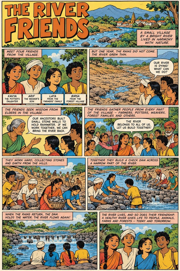
The two styles
05
More combinations
With Amar Chitra Katha Comics
- Lianhuanhua Picture-Story Books Contrasts · Both are didactic picture-story series of classical and historical tales; lianhuanhua gives each page one black-ink picture over a printed caption, Amar Chitra Katha puts several coloured panels with balloons on every page.
- American Four-Colour Comic Book (Golden to Bronze Age) Contrasts · The same ruled panels, balloons and hand-lettered capitals; the newsstand comic shouts with slanted panels, dot tints and sound effects, while Amar Chitra Katha keeps a calm regular grid, long narration captions and an edifying voice.
- Hand-Painted Bollywood Poster Pairs well · Painted Hindi-film publicity from the same Bombay decades; its floating star heads, melodramatic colour and hand-drawn title logos suit an Amar Chitra Katha cover pushed louder.
- Ligne Claire (Franco-Belgian Clear Line) Contrasts · Both fill clean contours with flat colour; ligne claire draws one even, unhatched line around caricatural figures, Amar Chitra Katha a swelling brush contour with heavy blacks around idealised, near-naturalistic bodies.
- Bonelli Fumetto (Italian Popular Adventure Comics) Contrasts · Both lay out regular tiers of ruled panels with white gutters and hand-lettered capitals. Amar Chitra Katha fills every page with flat colour and teaches myth and history in about 32 pages in an authoritative voice; a Bonelli issue keeps about a hundred interior pages in black ink and tells a serial hero's adventure for entertainment.
- Javanese Wayang Kulit (Tatah Sungging) Contrasts · Both retell the Mahabharata and Ramayana with a fixed iconography, but Amar Chitra Katha draws idealised, near-naturalistic bodies in panels, while wayang codes character into impossible proportions.
- Arab Children's Comic Magazines (Samir to Majid) Pairs well · Another postcolonial children's comic that teaches heritage in flat colour; combine its narrated caption boxes with the Arab weekly's gag strips and puzzle pages.
- Filipino Komiks Contrasts · Both retell local myth and history as comics in Asian languages. Amar Chitra Katha prints flat colour on every page in an educational, authoritative voice; komiks keep black-and-white interiors for melodrama, fantasy and folk heroes.
With Indian Calendar
- International Typographic Style Contrasts · A neutral grid and grotesque type make a calm frame for one lush calendar image, letting it read as the single focal point.
- Nianhua & Chinese Folk Print Pairs well · Both are festive devotional bazaar prints; share frontal figures, rich borders and auspicious symbols across a festival campaign.
- Hand-Painted Bollywood Poster Pairs well · Hand-painted film posters grew from calendar art; reuse its glowing faces and saturated colour for entertainment work.
- Pop Art Graphics Pairs well · Treat a calendar print as found imagery, repeated and flattened Pop-style, while respecting devotional subjects.
- Santiniketan & Bengal School Graphics Contrasts · The Bengal School defined itself against the academic naturalism of Raja Ravi Varma, whose paintings the oleograph presses reproduced; set the two side by side to show soft wash and earth pigment against glossy, saturated chromolithograph.
- Thai Hand-Painted Film Poster and Billboard Pairs well · A parallel in saturated naturalistic painting of idealised figures, not a documented influence; adds devotional frontality to the romantic mood.
- Nirnaya Sagar Devanagari Typography (Bombay Metal Type) Pairs well · For a devotional book, put one chromolithographed god picture from the Bombay presses opposite a black, typeset text page, and keep the type itself free of colour.
- 'Good Morning' Greeting Images (WhatsApp Forward Vernacular) Pairs well · Take calendar art's frontal deities, haloes and radiant gold for the devotional strand, and treat them with the same reverence.