Style combination · Contrasts
Republican Chinese Book Cover Design × Song–Ming Woodblock Book Typography
The ruled woodblock page and Songti type that the new covers left behind; set a Song-type text block against a drawn, off-centre cover title to show old book and new.
Mix them and make something Republican Chinese Book Cover Design Song–Ming Woodblock Book Typography
01
What each style brings
Each part of the design comes from the style with the stronger say in it, and each style gives at least two.
Republican Chinese Book Cover Design (Lu Xun & Tao Yuanqing) Song–Ming Woodblock Book Typography (Songti / Mincho)
- Type from Republican Chinese Book Cover Design
- Colour from Republican Chinese Book Cover Design
- Form from Song–Ming Woodblock Book Typography
- Composition from Song–Ming Woodblock Book Typography
- Surface from Song–Ming Woodblock Book Typography
02
The type
Open fonts standing in for each style’s own type, which is often hand-drawn or commercial.
Display · Republican Chinese Book Cover Design
Calm
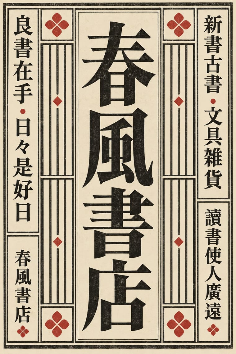
Shippori Mincho, standing in for Songti (Song/Ming) lead type for author, publisher and running text, and for plain printed covers such as Huagai ji
Text · Republican Chinese Book Cover Design
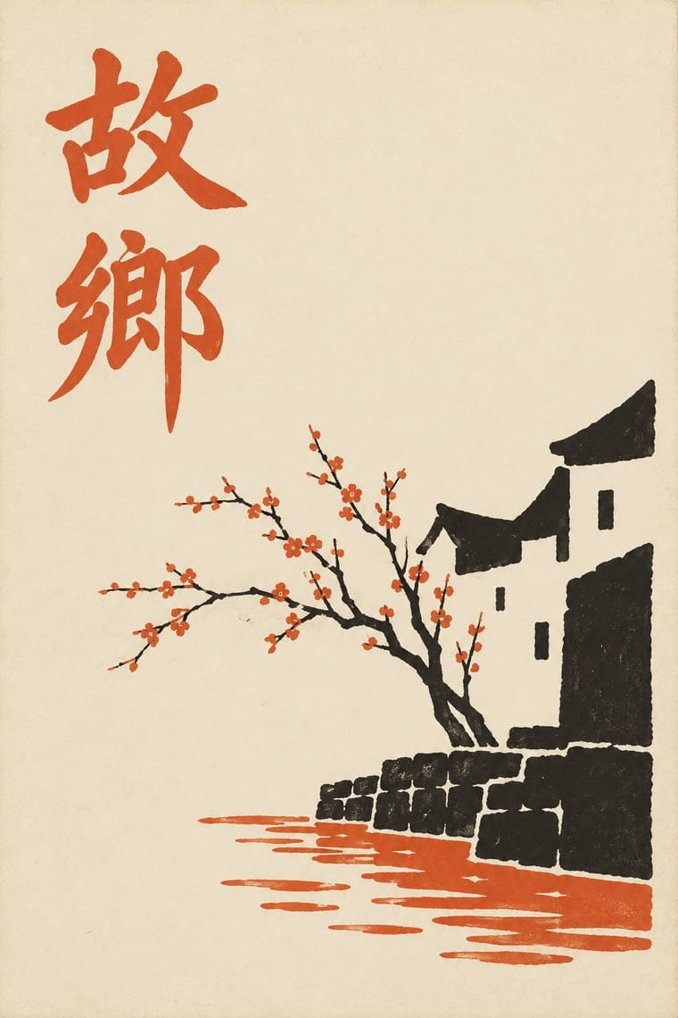
The covers of China's New Literature. From 1923 the writer Lu Xun took up cover design in earnest, and from 1924 he commissioned the painter Tao Yuanqing; he called covers with titles inscribed by famous people or set in lead type 'old hat' (老套). A hand-drawn title, two or three flat colours and one symbolic motif sit on a wide, plain field with generous margins. The motif is often taken from Han and Six Dynasties stone carvings, cut into angular silhouettes or, more rarely, painted in free brush. Qian Juntao and Feng Zikai carried the manner on at Shanghai's Kaiming Bookstore.
Shippori Mincho; Republican Chinese Book Cover Design used Lu Xun's hand-drawn and brush-written title characters and Meishuzi (美术字, 'art lettering')
03
The colours
The ground and leading colours come from Republican Chinese Book Cover Design, with a counter-accent from Song–Ming Woodblock Book Typography. The ink reads on the ground at 4.5:1 or more.
Republican Chinese Book Cover Design (Lu Xun & Tao Yuanqing) Song–Ming Woodblock Book Typography (Songti / Mincho)
-
#efe8d8ground · 36% -
#1e1b16ink · 14% -
#e39a2daccent · 18% -
#b5342baccent · 14% -
#d6c49caccent · 10% -
#2e3d5caccent · 8%
As CSS
:root {
  --ground: #efe8d8;
  --ink: #1e1b16;
  --accent-1: #e39a2d;
  --accent-2: #b5342b;
  --accent-3: #d6c49c;
  --accent-4: #2e3d5c;
  --font-display: "Shippori Mincho", serif;
  --font-text: "Shippori Mincho", serif;
}
Use it with care
Republican Chinese Book Cover Design (Lu Xun & Tao Yuanqing): Hand-drawn titles must be real, correctly formed Chinese characters checked by a fluent reader: pseudo-characters, mirrored strokes or random hanzi used as texture read as nonsense, a common failure of image models imitating this style. Tao Yuanqing's and Lu Xun's designs are in the public domain, but Qian Juntao's (he died in 1998) and Feng Zikai's (he died in 1975, so still protected in life-plus-70 countries) are not; draw new motifs, and do not copy an artist's personal seal or monogram as decoration.
Song–Ming Woodblock Book Typography (Songti / Mincho): Have any Chinese, Japanese or Korean text set and proofread by a fluent reader: Song, Mincho and Myeongjo fonts draw some characters differently for each locale, and pseudo-characters, mirrored glyphs or random hanzi used as texture read as nonsense or worse. Pages of Buddhist sutras and other scripture carry devotional text; do not crop them into decoration.
04
The two styles
05
More combinations
With Republican Chinese Book Cover Design
- Shanghai Modern & Yuefenpai Contrasts · Same city and decades, opposite intent: calendar posters model glamorous women in soft polychrome with ornamental borders, while New Literature covers leave a plain field to one flat, symbolic motif and a drawn title.
- Bengali Modernist Book Cover (Prachchhad) Pairs well · A parallel literary cover culture two decades later: hand-drawn titles, two or three flat inks and pale stock, with Bengali letters and folk contours in place of Chinese characters and Han reliefs.
- Chinese Modern Woodcut Movement Pairs well · Lu Xun launched the woodcut movement in 1931 and edited woodcut books such as Yinyu ji; a black carved print on a pale cover with a drawn title joins the two.
- Taishō Roman & Lyrical Illustration Pairs well · Feng Zikai found Takehisa Yumeji's lyrical drawings in Tokyo; Yumeji's soft line suits the quiet, literary register of these covers.
- Contemporary Chinese Book Design ('Most Beautiful Books of China') Contrasts · Lu Xun and Tao Yuanqing made the cover the work: a hand-drawn title and one motif on a plain field, with the untrimmed (毛边) edges that Bu Cai takes up again. In 1996 Lü Jingren and three colleagues called for moving from zhuangzhen (装帧), which by the 1990s had narrowed to dressing the cover, to shuji sheji (书籍设计), designing the whole object: paper, sewing, edges, sequence. Choose between dressing a book and building one.
With Song–Ming Woodblock Book Typography
- Dazibao (Big-Character Posters) Contrasts · The big-character poster is the hand-brushed, crowded, personal opposite of the quiet official printed page; set one against the other to weigh public urgency against canonical calm.
- Urdu Katib Lithography Contrasts · Urdu turned down type to keep the calligrapher's hand while Song–Ming printing depersonalised the brush for the block cutter; choose deliberately between a written page and a cut one.
- Out-of-Square Hangul Typography Contrasts · Ahn Sang-soo's typeface broke exactly the equal square that Myeongjo keeps; run Myeongjo body text under out-of-square headings to stage tradition against experiment.
- Chaekgeori & Minhwa Screen Painting Pairs well · Chaekgeori screens paint stacks of the scholar's books; pair a painted bookcase grid with real ruled, framed Myeongjo text pages for a Korean scholarly identity.
- Japanese Postwar Modernism Pairs well · The postwar school set Mincho beside gothic and Latin sans; use a vertical Mincho column beside a flat colour field to give a modern grid a literary voice.
- Renaissance Book Typography Pairs well · Its Western counterpart: both fix one justified text block in a proportioned page with deep margins, so set a Ming face and a Garalde side by side in a bilingual book and let each keep its own grid.
- Ten Bamboo Studio Colour Woodblock (Douban & Gonghua) Pairs well · The same Nanjing book trade cut both: put a ruled Song-style text page opposite a graded colour leaf, as an album or a book with plates.
- Contemporary Chinese Book Design ('Most Beautiful Books of China') Pairs well · Tea Canon prints its vertical text in the red line grid of the woodblock page and then loosens the grid into black hairlines on its picture leaves; quote the ruled frame on the text pages and let it dissolve where images begin.
All 18 combinations with Song–Ming Woodblock Book Typography