Style combination · Pairs well
Arabic Calligraffiti × Islamic Geometric
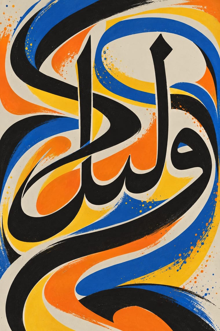
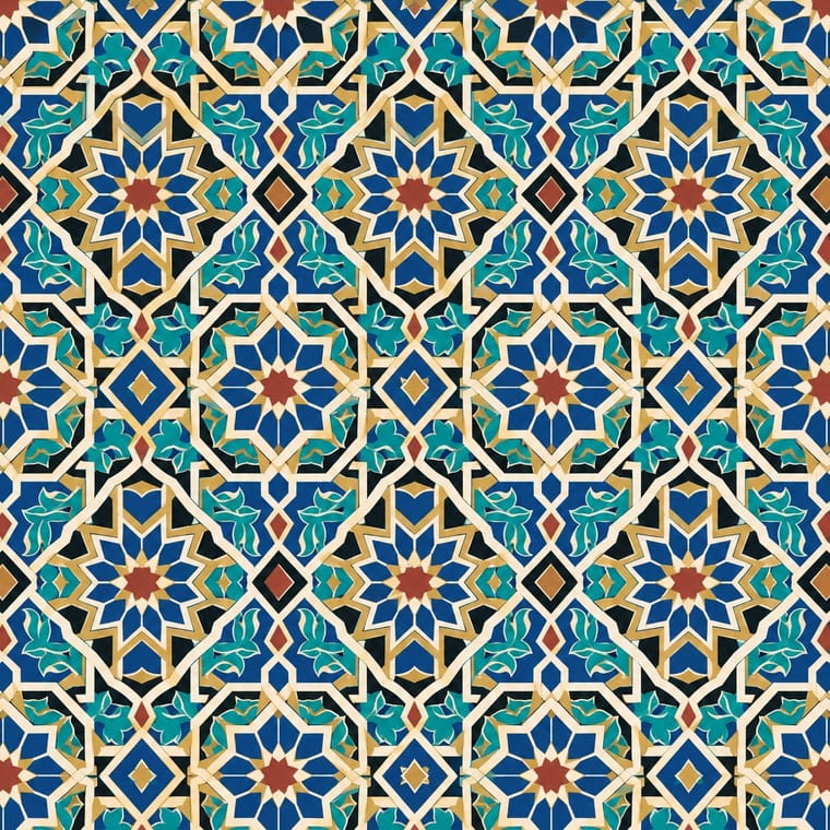
Run a strict geometric band or tiling behind freely written letters, as Zepha sets Arabic script among geometric shapes, so the piece answers its classical source.
Mix them and make something Arabic Calligraffiti Islamic Geometric
01
What each style brings
Each part of the design comes from the style with the stronger say in it, and each style gives at least two.
Arabic Calligraffiti Islamic Geometric & Calligraphic Tradition
- Type from Arabic Calligraffiti
- Colour from Arabic Calligraffiti
- Form from Islamic Geometric
- Composition from Islamic Geometric
- Surface from Arabic Calligraffiti
02
The type
Open fonts standing in for each style’s own type, which is often hand-drawn or commercial.
Display · Arabic Calligraffiti
Halo
Rakkas, standing in for Freehand Arabic script sprayed or painted rather than written with a reed pen, after calligraphy but without its rules or a uniform hand (as the Museum für Islamische Kunst describes eL Seed's work)
Text · Islamic Geometric
A visual system shared across the Islamic world in which proportioned calligraphy, compass-and-straightedge geometry and the vegetal arabesque carry meaning and beauty in place of figurative imagery. Star-and-polygon tilings repeat across whole surfaces as if continuing beyond the frame, while Kufic, Thuluth and Naskh inscriptions give hierarchy to buildings, manuscripts and objects.
Reem Kufi; Islamic Geometric used Kufic and Thuluth
03
The colours
The ground and leading colours come from Arabic Calligraffiti, with a counter-accent from Islamic Geometric. The ink reads on the ground at 4.5:1 or more.
Arabic Calligraffiti Islamic Geometric & Calligraphic Tradition
-
#f7f5f0ground · 36% -
#151515ink · 14% -
#f07f1eaccent · 18% -
#c8a046accent · 14% -
#f6c32baccent · 10% -
#a63d2faccent · 8%
As CSS
:root {
  --ground: #f7f5f0;
  --ink: #151515;
  --accent-1: #f07f1e;
  --accent-2: #c8a046;
  --accent-3: #f6c32b;
  --accent-4: #a63d2f;
  --font-display: "Rakkas", cursive;
  --font-text: "Reem Kufi", cursive;
}
Use it with care
Arabic Calligraffiti: Many works carry Qur'anic verses, the names of God or devotional sayings, written on mosques and in religious communities: never use such text as texture or put it on floors, footwear or throwaway items, and have every Arabic or Persian word read and approved by a fluent reader before it is painted or printed. The style stretches and interlaces letters, so put a Qur'anic verse or a name of God into it only when a skilled Arabic-script writer composes it and the mosque or community approves it, as at the Jara Mosque; never digitally warp, crop or mirror existing sacred text. Never fill a design with invented pseudo-Arabic, which image models readily produce; do not ask an image model for eL Seed's Liquid Alphabet or any named writer's hand, and never present a generated wall as their work. The best-known walls rest on the consent of governors, imams, priests and residents, so get the owner's permission (spraying without it is a crime in most places), work with the people of the place, and commission and credit Arabic-script writers rather than faking the script for a brand.
Islamic Geometric & Calligraphic Tradition: Qur'anic verses, the names of God and the Prophet and other sacred phrases must not be cropped, distorted, mirrored, used as texture or printed on floors, footwear or throwaway packaging; have any Arabic-script text read and approved by a fluent reader or calligrapher. Abstract geometric pattern is far less sensitive than script, but credit the traditions and makers it comes from.
04
The two styles
05
More combinations
With Arabic Calligraffiti
- International Typographic Style Contrasts · A neutral grotesque on a modular grid is the opposite of one sweeping Arabic gesture; put a small Swiss caption block against a calligraffiti wall for a sharp bilingual identity.
- Contemporary Arabic & Dual-Script Type Design Pairs well · Set names, dates and captions in a dual-script type family beside a calligraffiti wall, so the gesture stays the image and the information stays legible.
- Baybayin Revival Graphics Pairs well · Kabuay applies calligraphy and graffiti methods to baybayin; borrow calligraffiti's large painted gesture for murals, but keep each glyph legible and correctly spelled.
- Syrian Revolution Graphics (Kafranbel Banners & Poster Collectives) Pairs well · Scale a brushed slogan from the poster up to a wall with calligraffiti's architectural sweep, keeping the words short and checked by a fluent reader.
With Islamic Geometric
- International Typographic Style Contrasts · Drop one tessellated panel into an asymmetric Swiss grid to make the tension between infinite pattern and white space the subject.
- Art Deco Pairs well · Borrow star polygons and stepped borders for Deco-style framing; both depend on strict symmetry and metallic accents.
- Iranian Modernist Graphic Design Pairs well · Set one calligraphic word or a fragment of girih against flat colour and a modernist grid instead of reproducing whole tile panels.
- Armenian Manuscript Illumination Contrasts · Horseshoe arches and vegetal and geometric ornament are shared, but the Islamic geometric tradition keeps its arches and fields aniconic, while Armenian books fill the same arches with birds, beasts and painted saints; choose whether a frame should carry figures or only pattern.
- Kamon (Japanese Family Crests) Contrasts · Both are built with compass and straight edge, but girih tiles the whole surface without end while a mon closes one motif inside a ring; borrow the tessellation for a ground and the crest for the single sign on it.
- Baghdad School of Arab Book Painting (Maqamat Illustration) Contrasts · Non-figural Islamic art is the contrast: this style puts people and satire where geometry would be. No descent is implied.
- Ethiopian Ge'ez Manuscript & Haräg Illumination Pairs well · Haräg interlace and Islamic strapwork share frame-and-band logic; compare them for headpieces, but keep the Ethiopian bands varied rather than strictly tiled.
- Andean Woven Graphic Systems Contrasts · Islamic pattern interlaces stars around radial centres while Andean geometry is orthogonal, stepped and deliberately irregular; choose one as the structural logic rather than blending them.